Flowpass
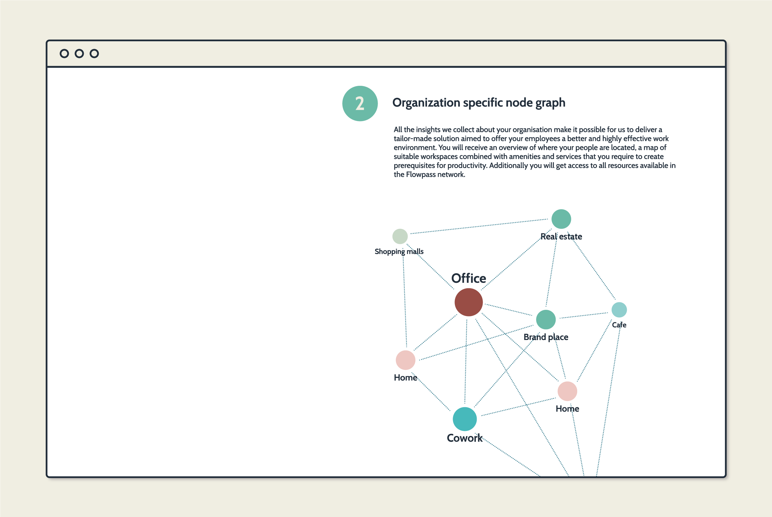
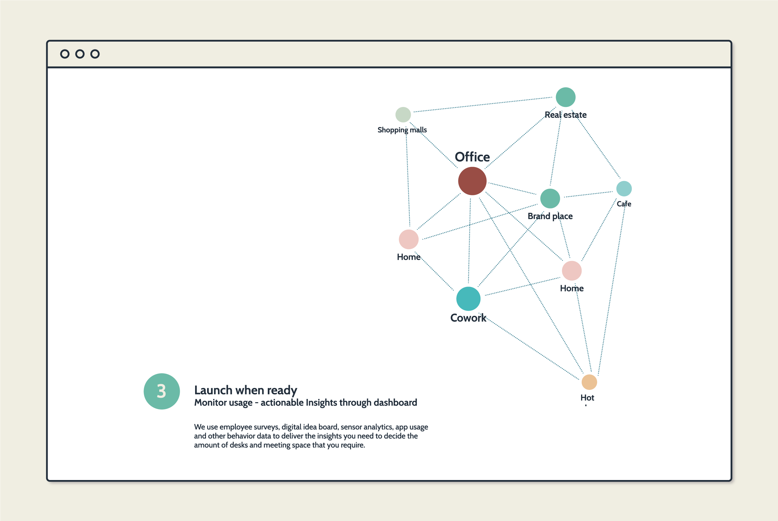
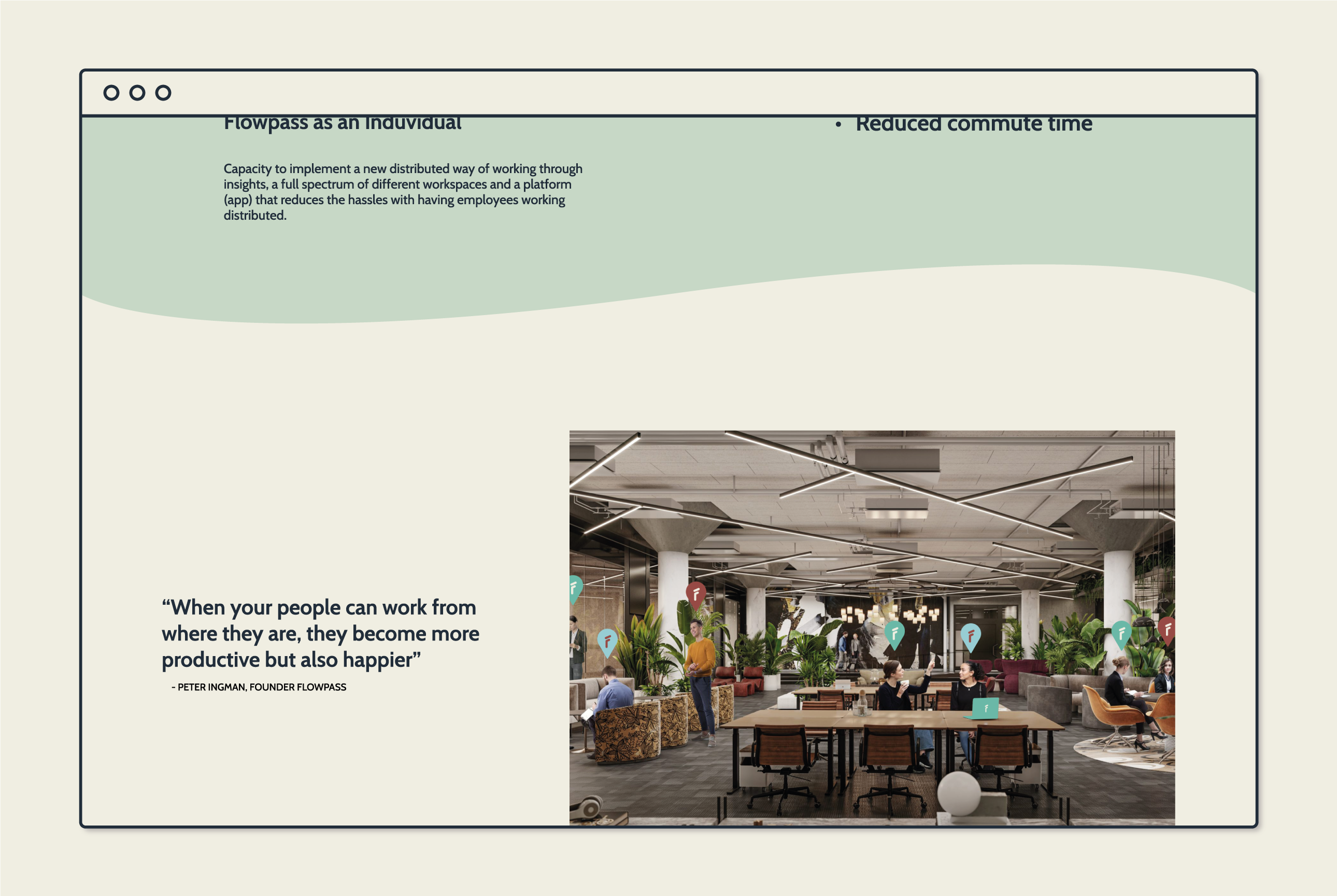
Flowpass is a company that helps businesses transform their workspaces into smart hubs and a network of professional flexible spaces. Offering the employee the freedom to choose where to work. Giving each employer the option to flow between the office and different co-working spaces catering to the different necessities of each employer on any given day.
I was contracted to create the visual identity and UI for their website. The brief was to create an identity that gave a serious impression and inspired trust, like a sage and explorer archetype, and with some surprising elements to give it some flare and flow.
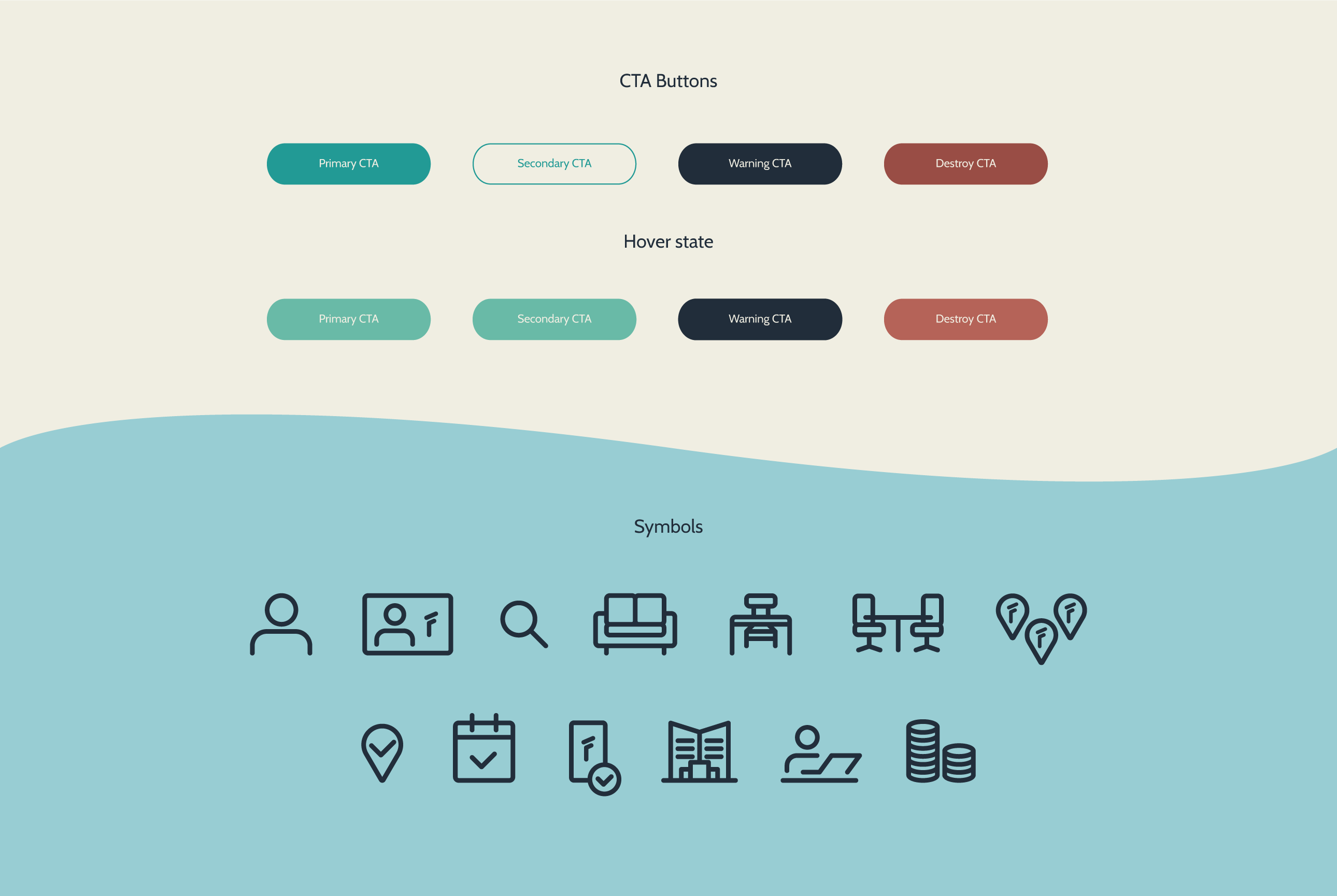
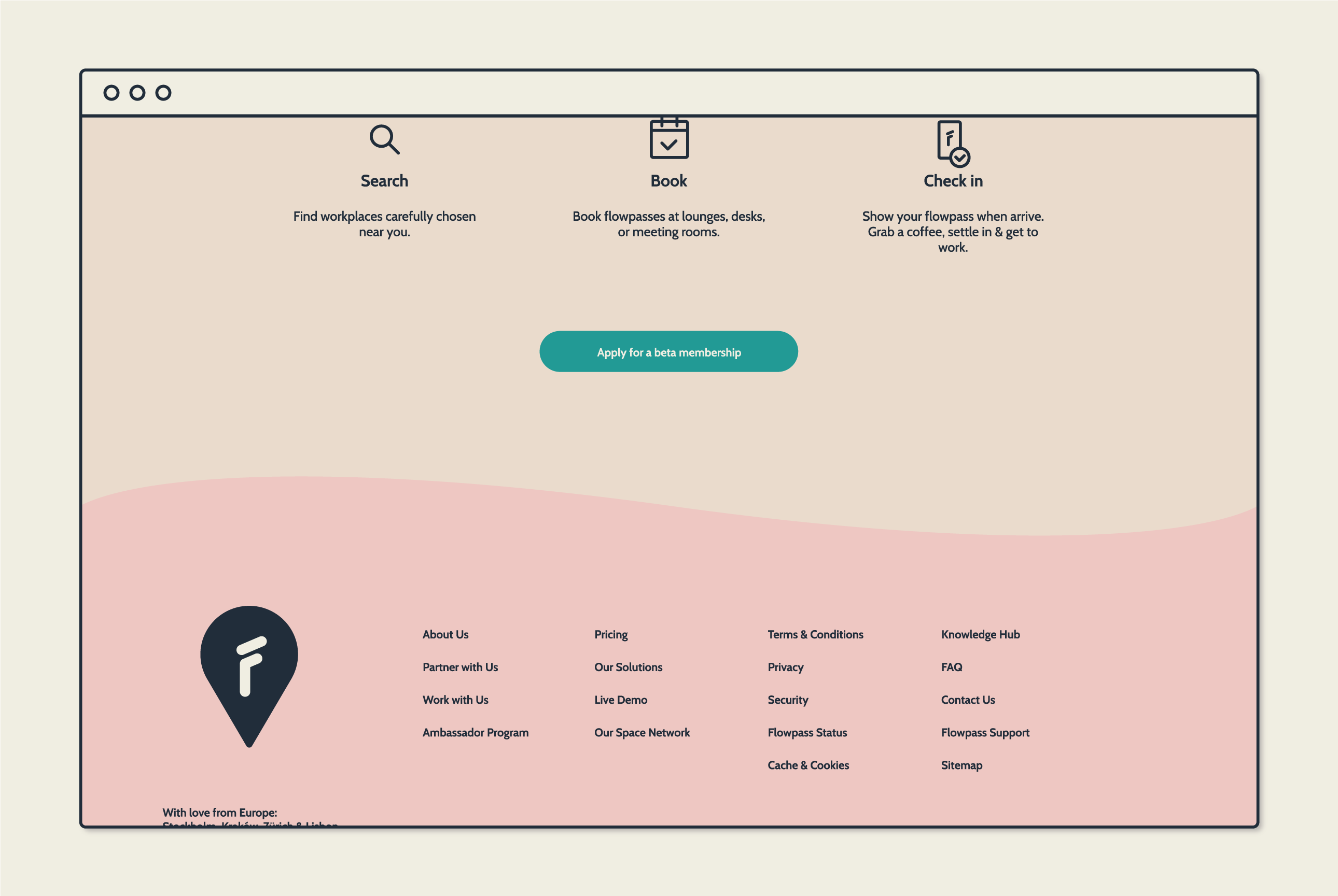
I based the identity on 2 main colors a metallic dark blue and a light sand khaki. These colors represent the serious part, the sage and explorer archetype and then I added a wide range of fun happy colors to be splashed ut as fun elements of surprise. Making the identity flexible to adapt to each situation, fluid like water.
I was contracted to create the visual identity and UI for their website. The brief was to create an identity that gave a serious impression and inspired trust, like a sage and explorer archetype, and with some surprising elements to give it some flare and flow.
I based the identity on 2 main colors a metallic dark blue and a light sand khaki. These colors represent the serious part, the sage and explorer archetype and then I added a wide range of fun happy colors to be splashed ut as fun elements of surprise. Making the identity flexible to adapt to each situation, fluid like water.

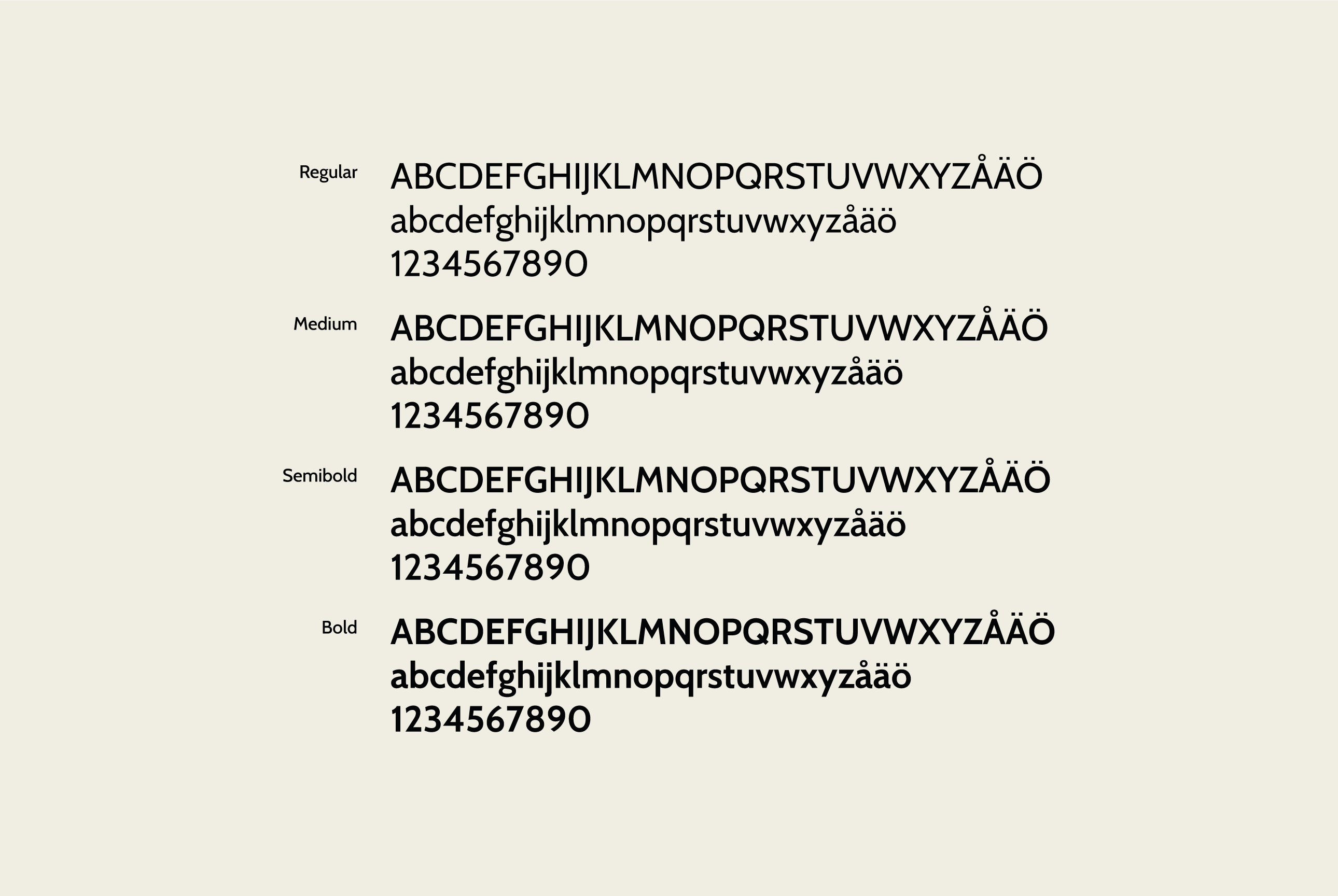
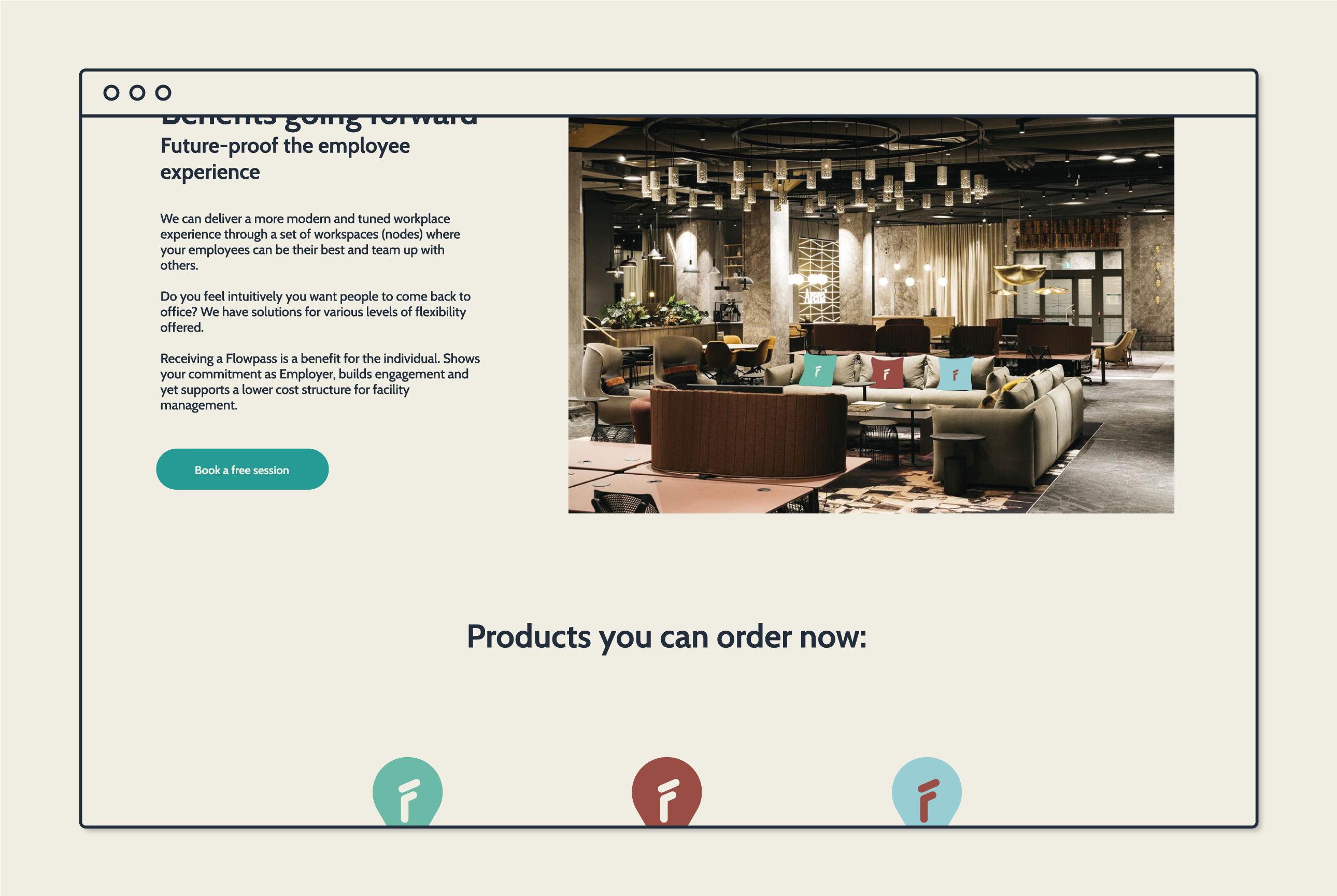
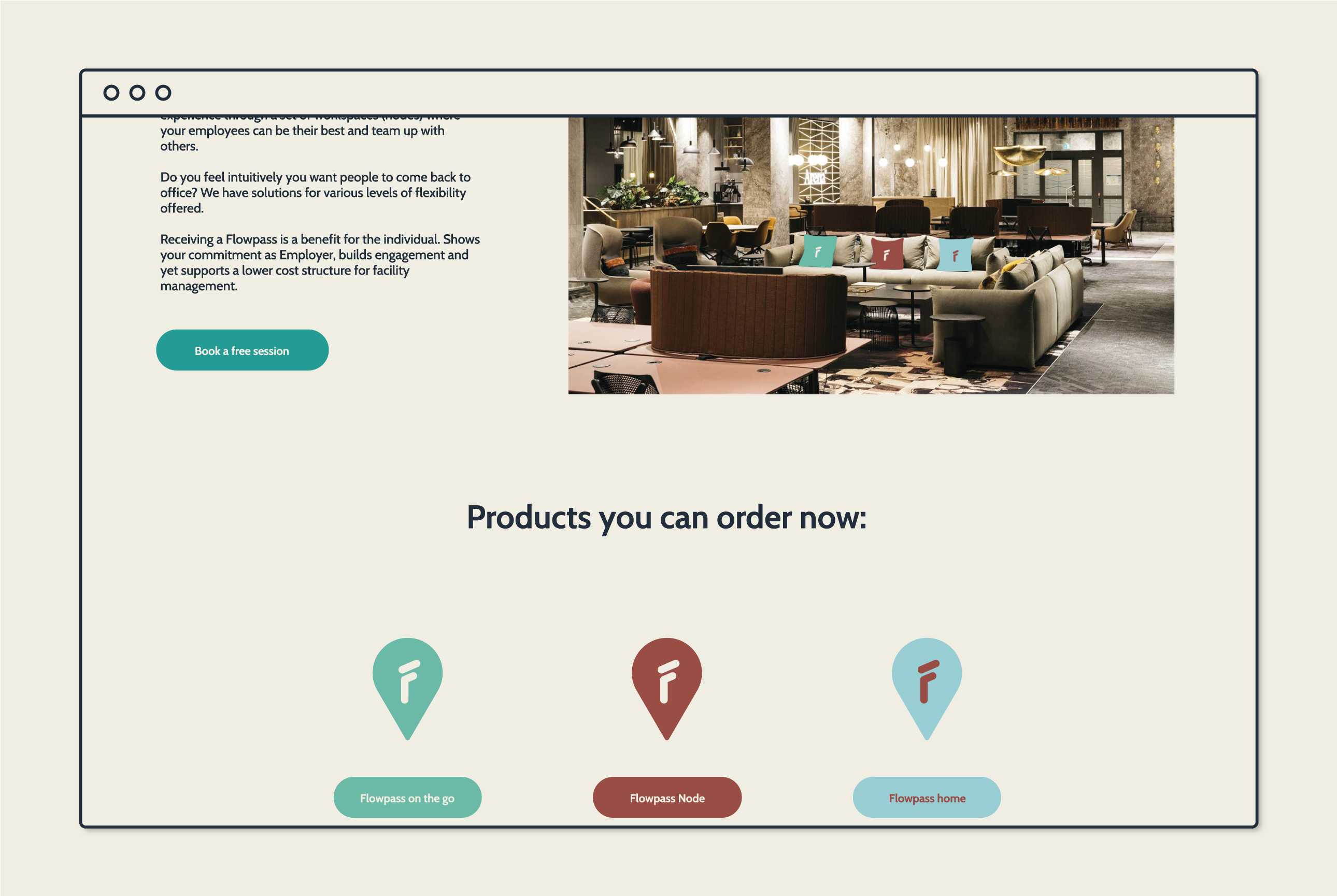
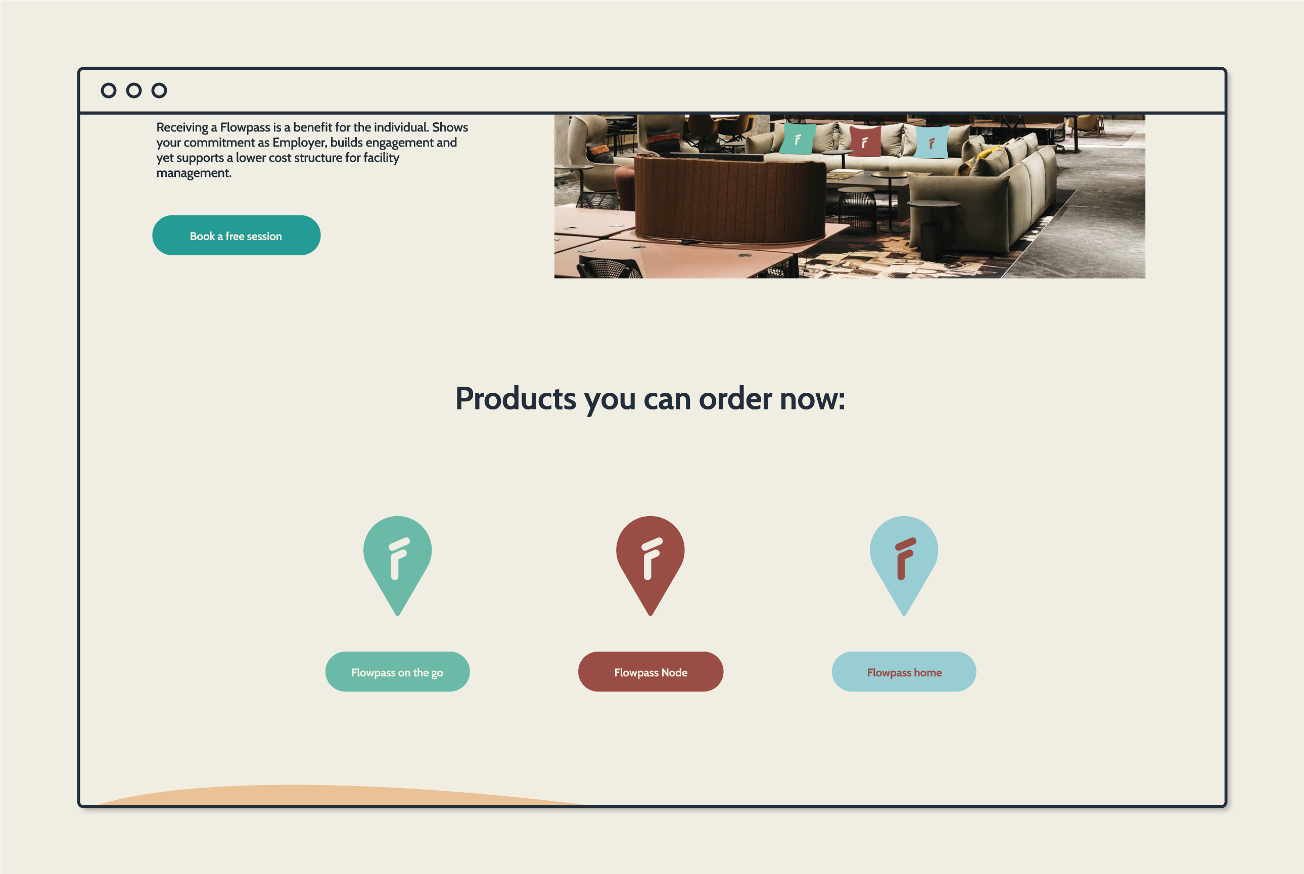
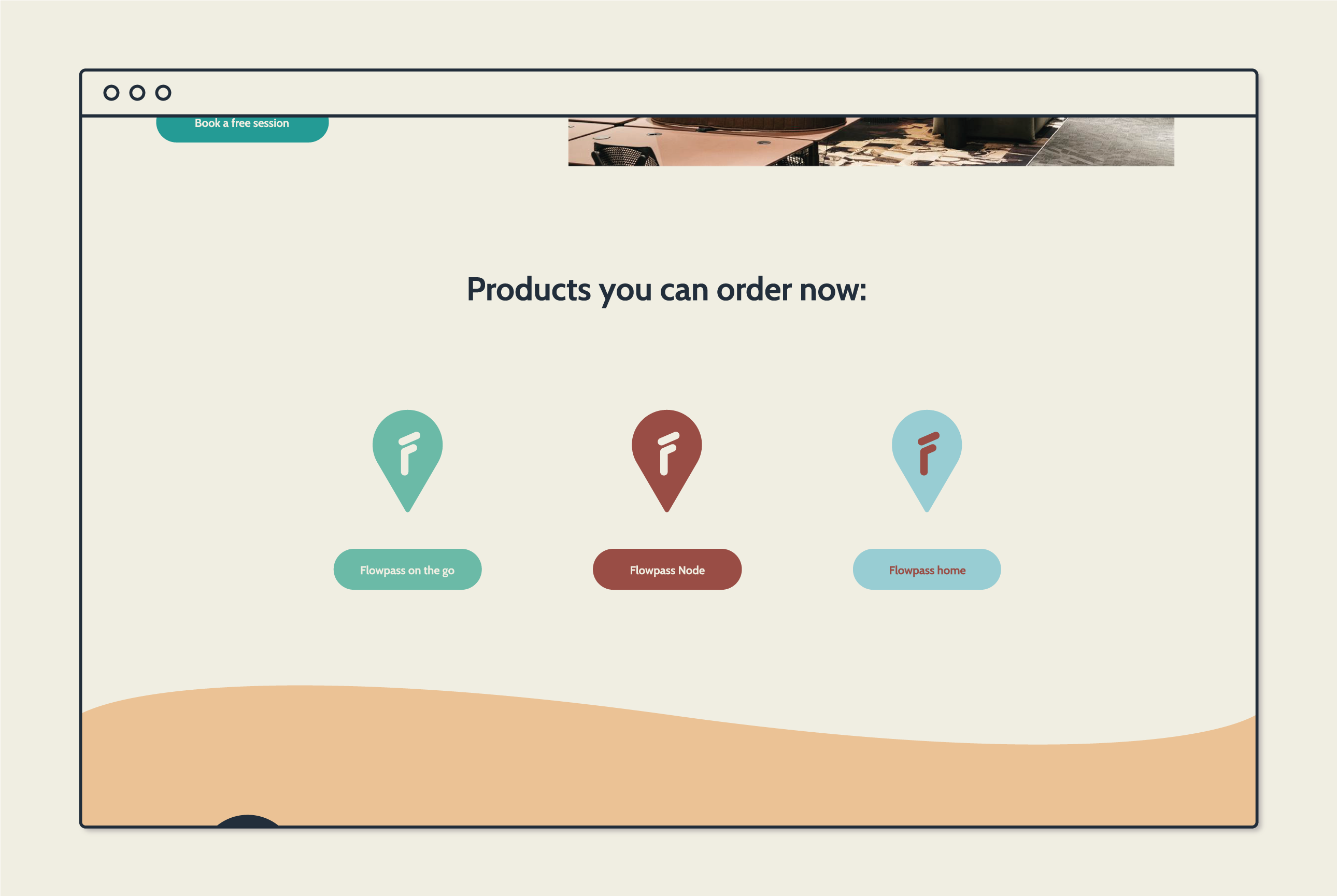
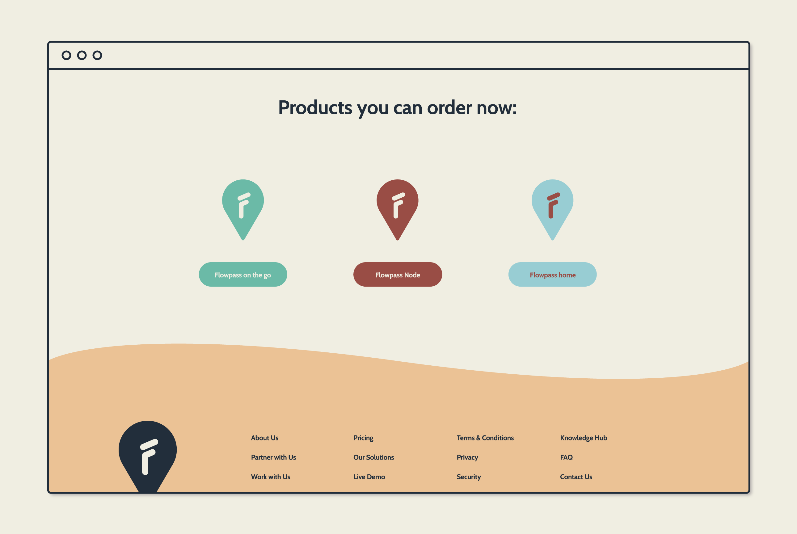
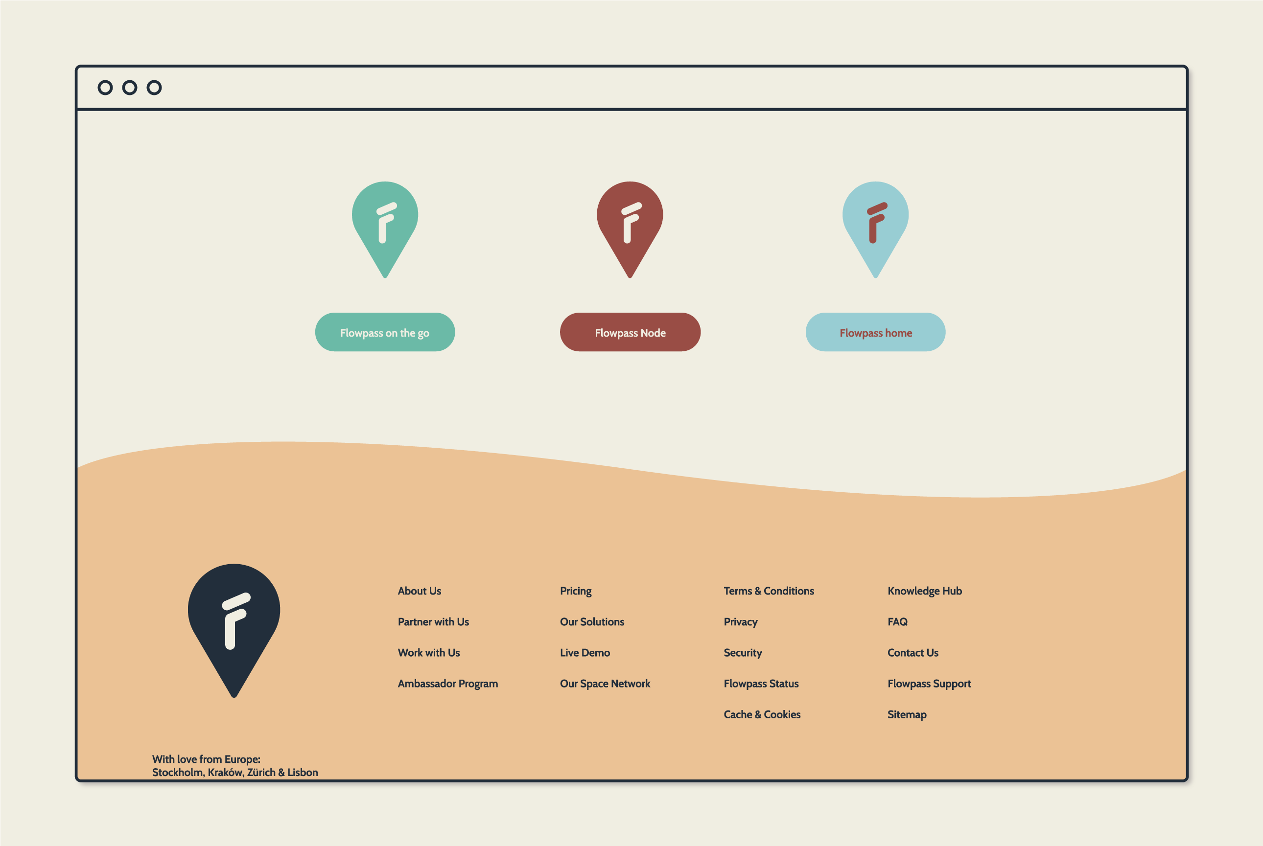
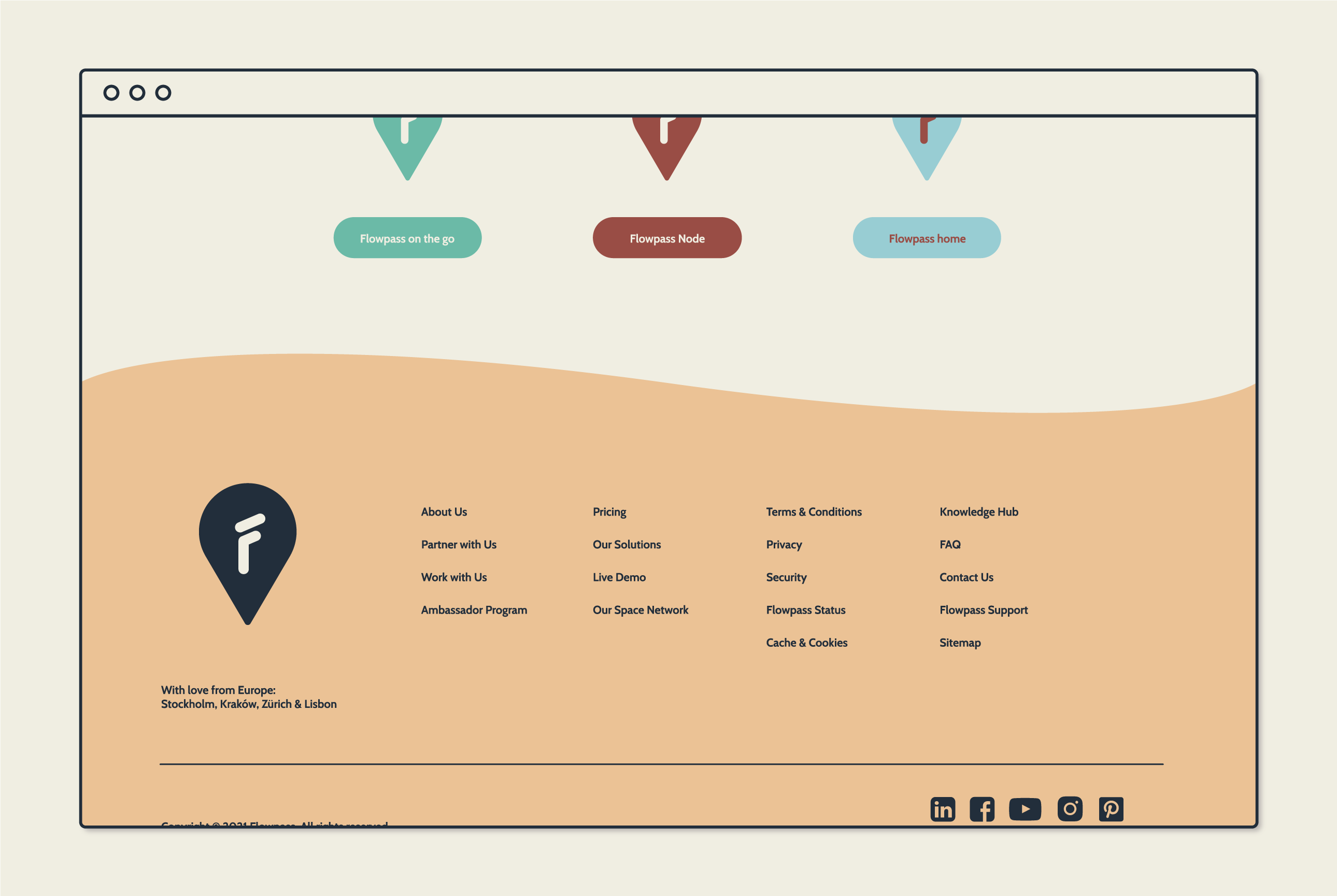
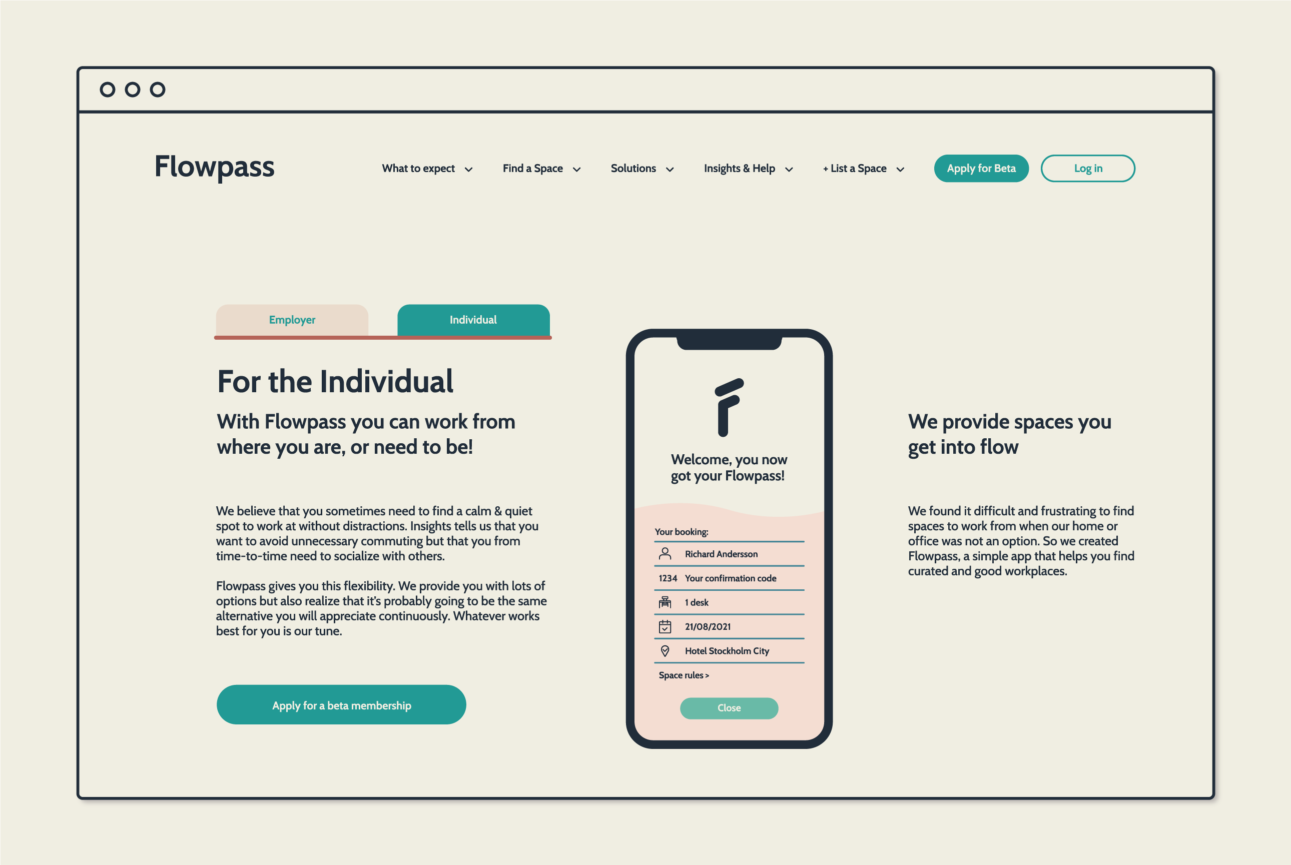
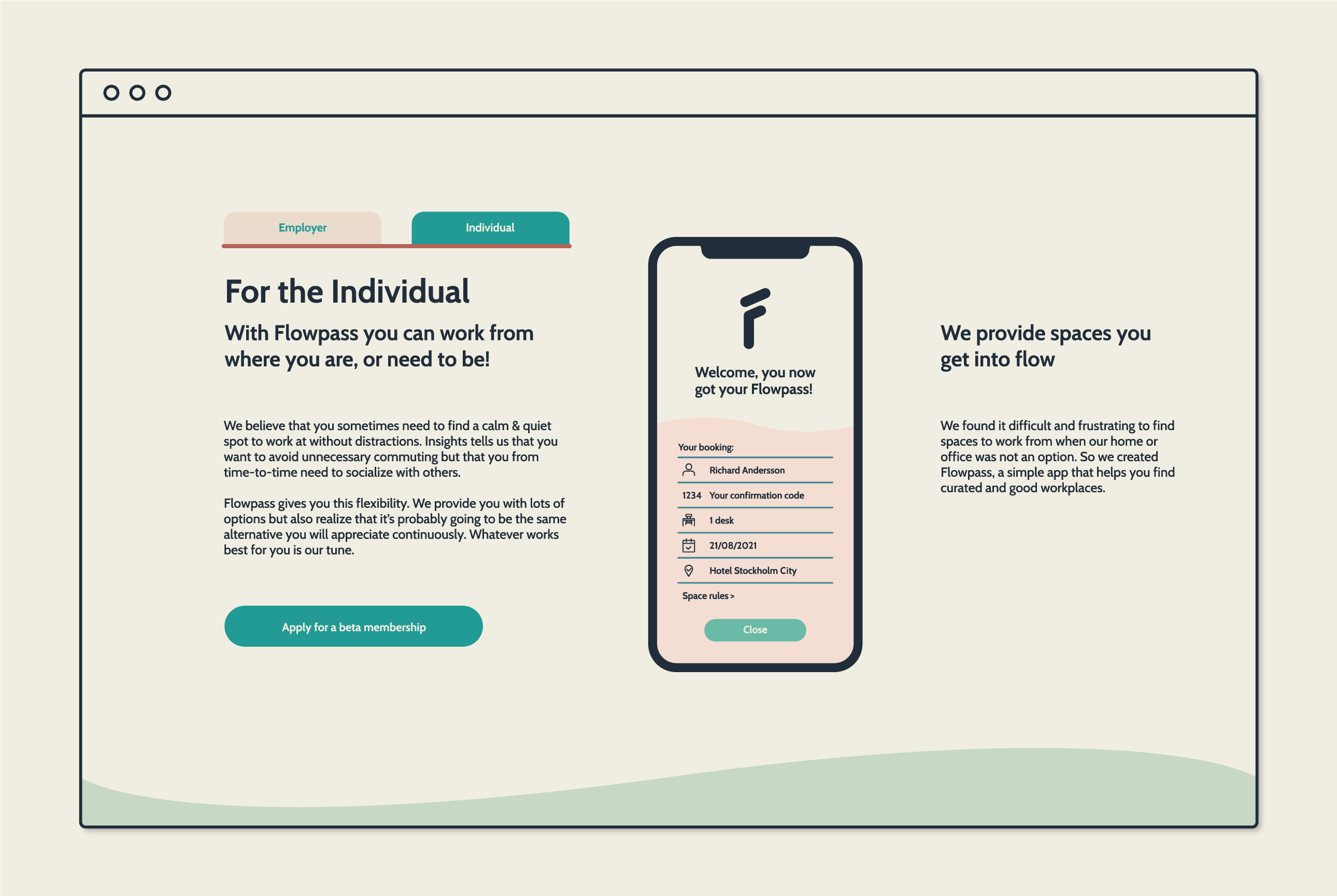
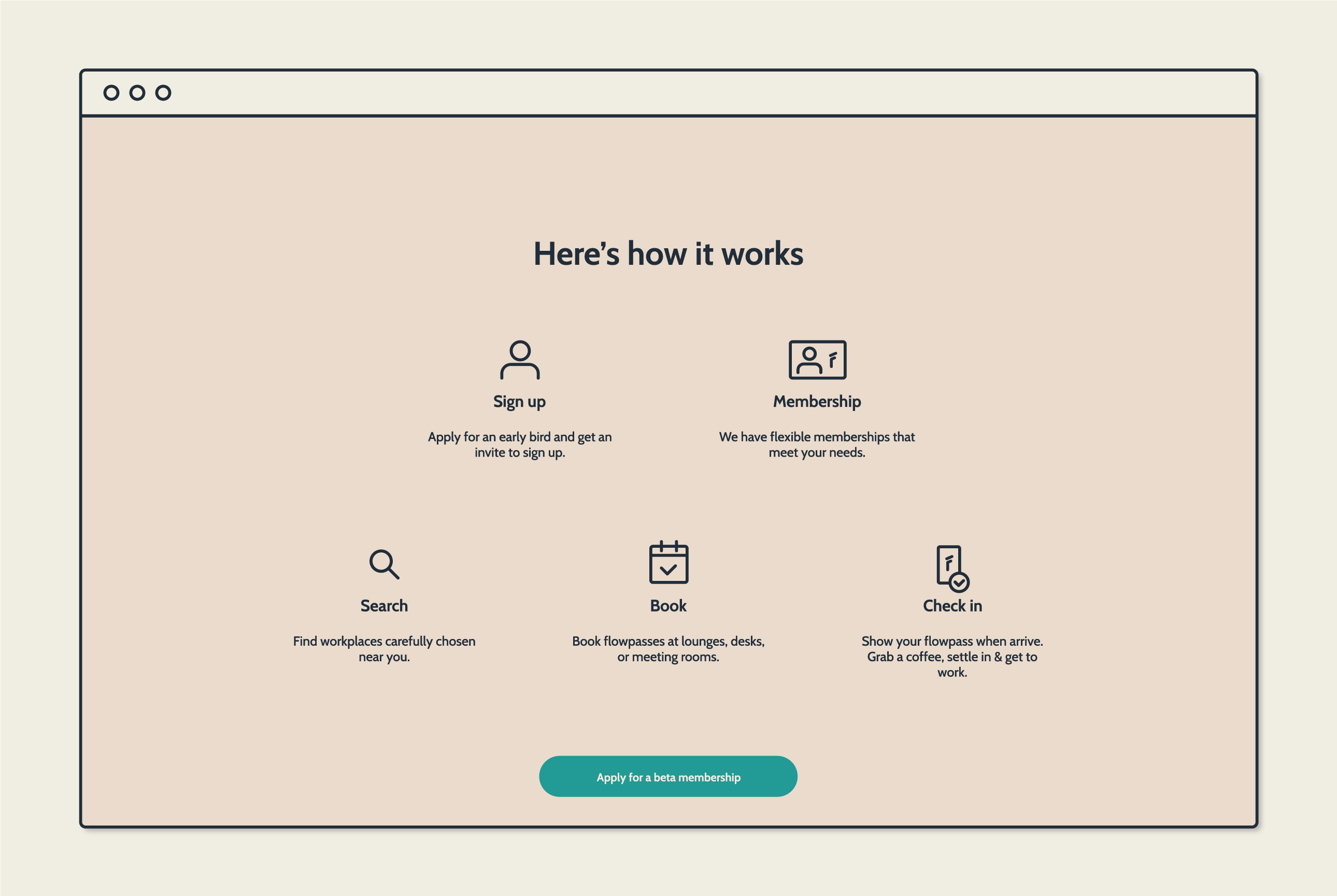
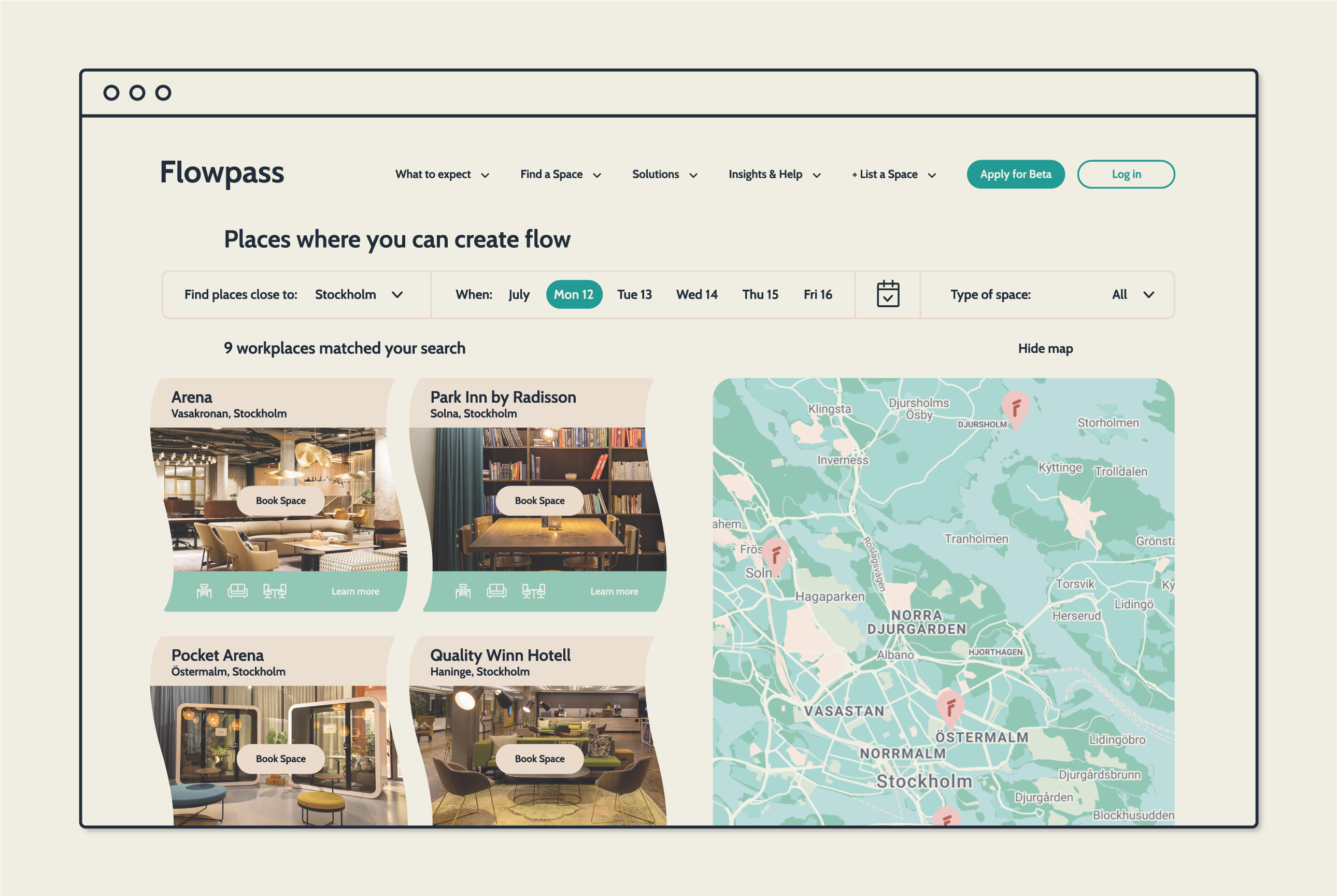
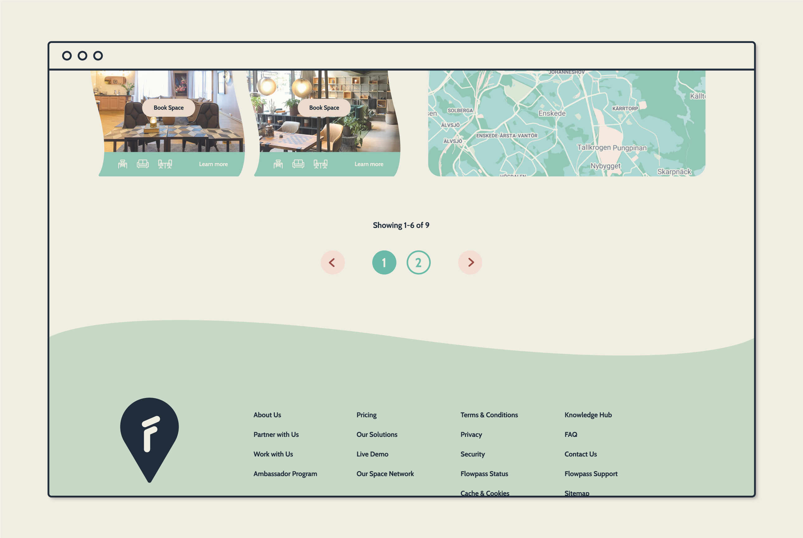
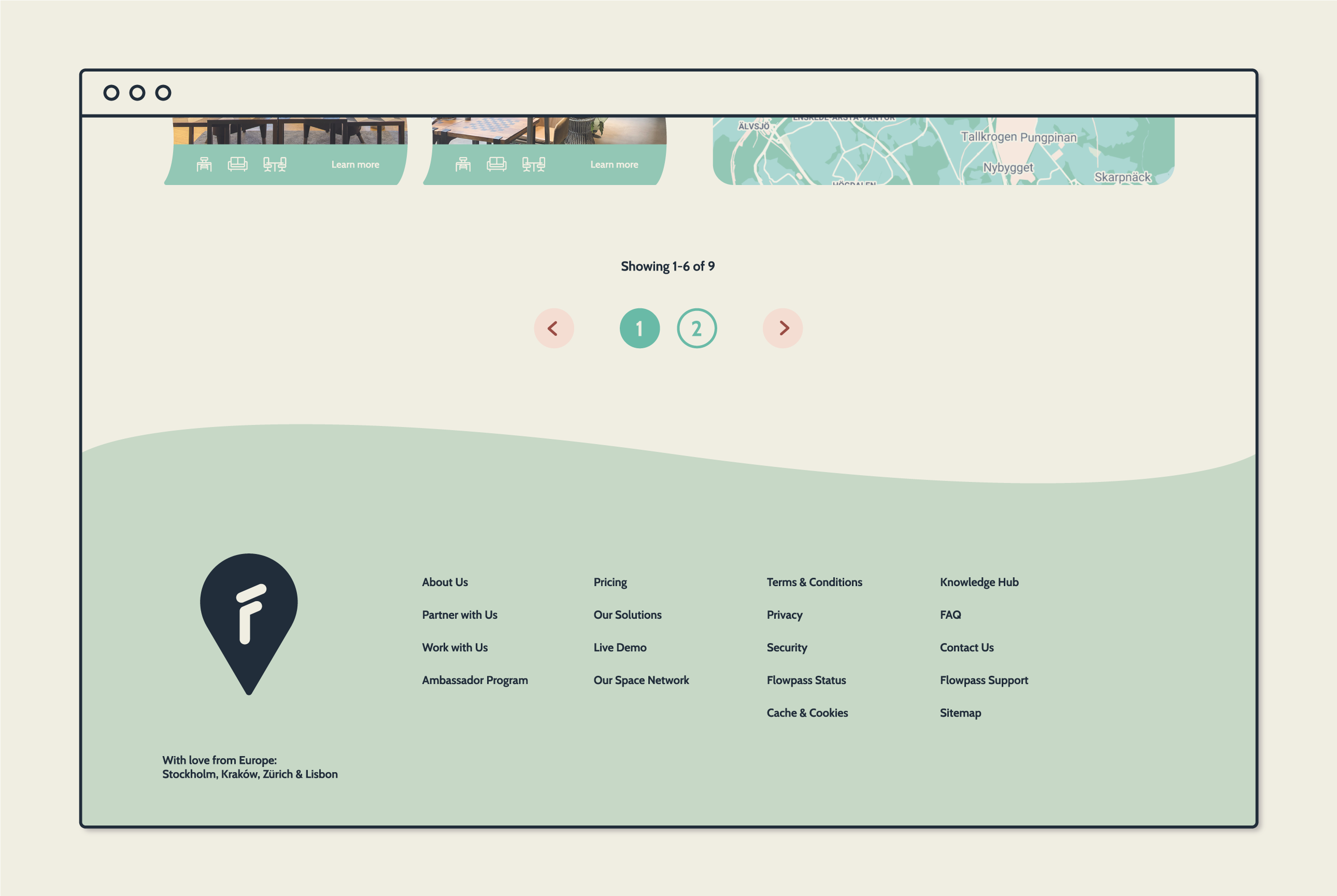
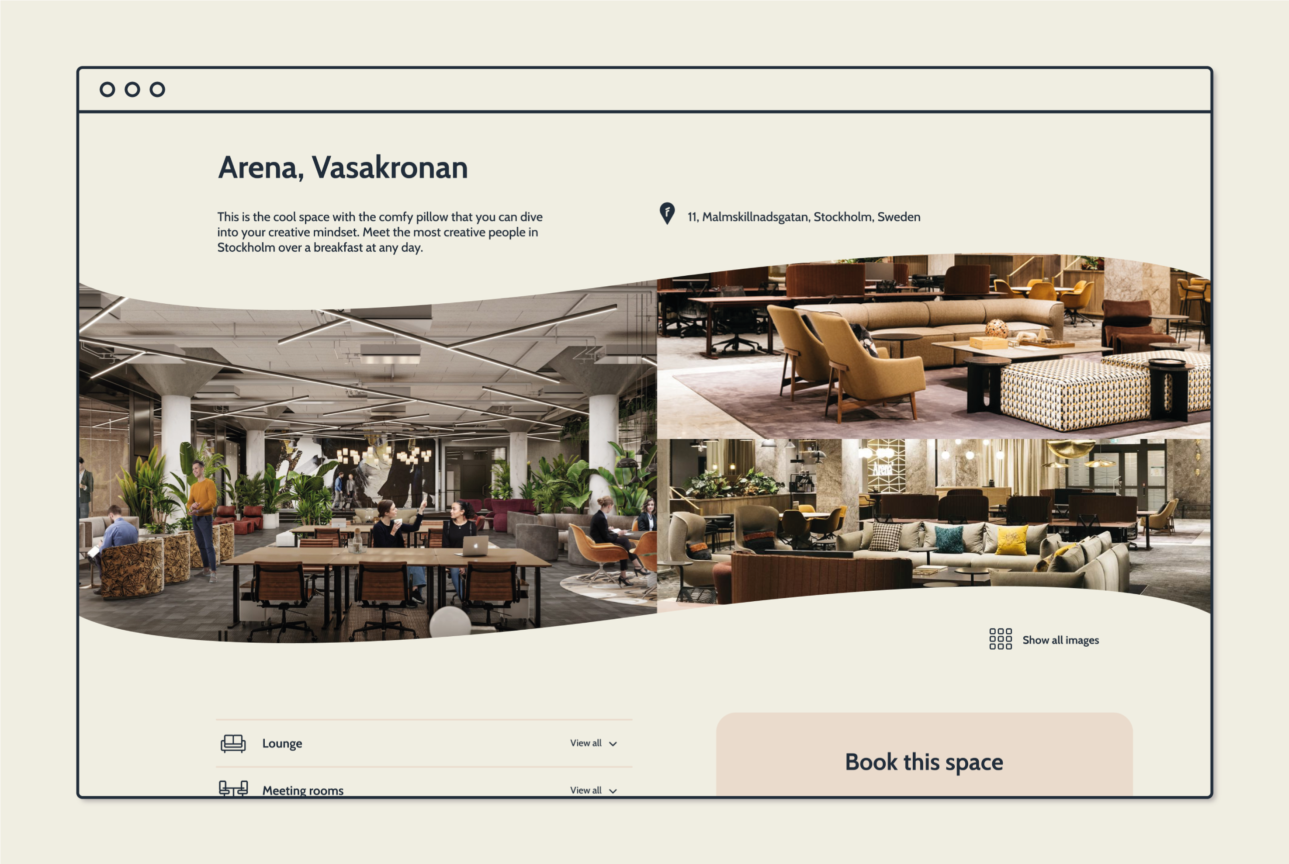
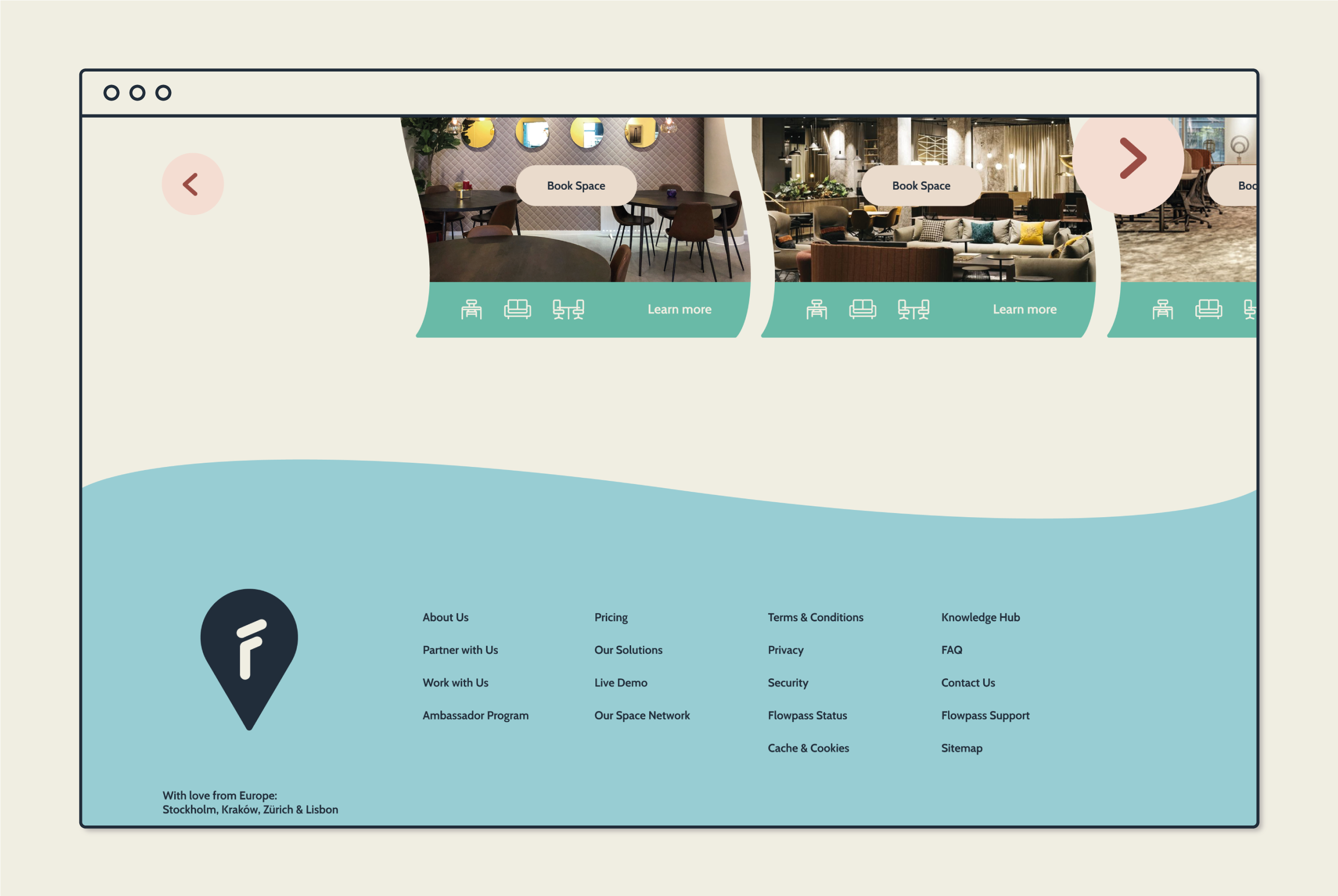
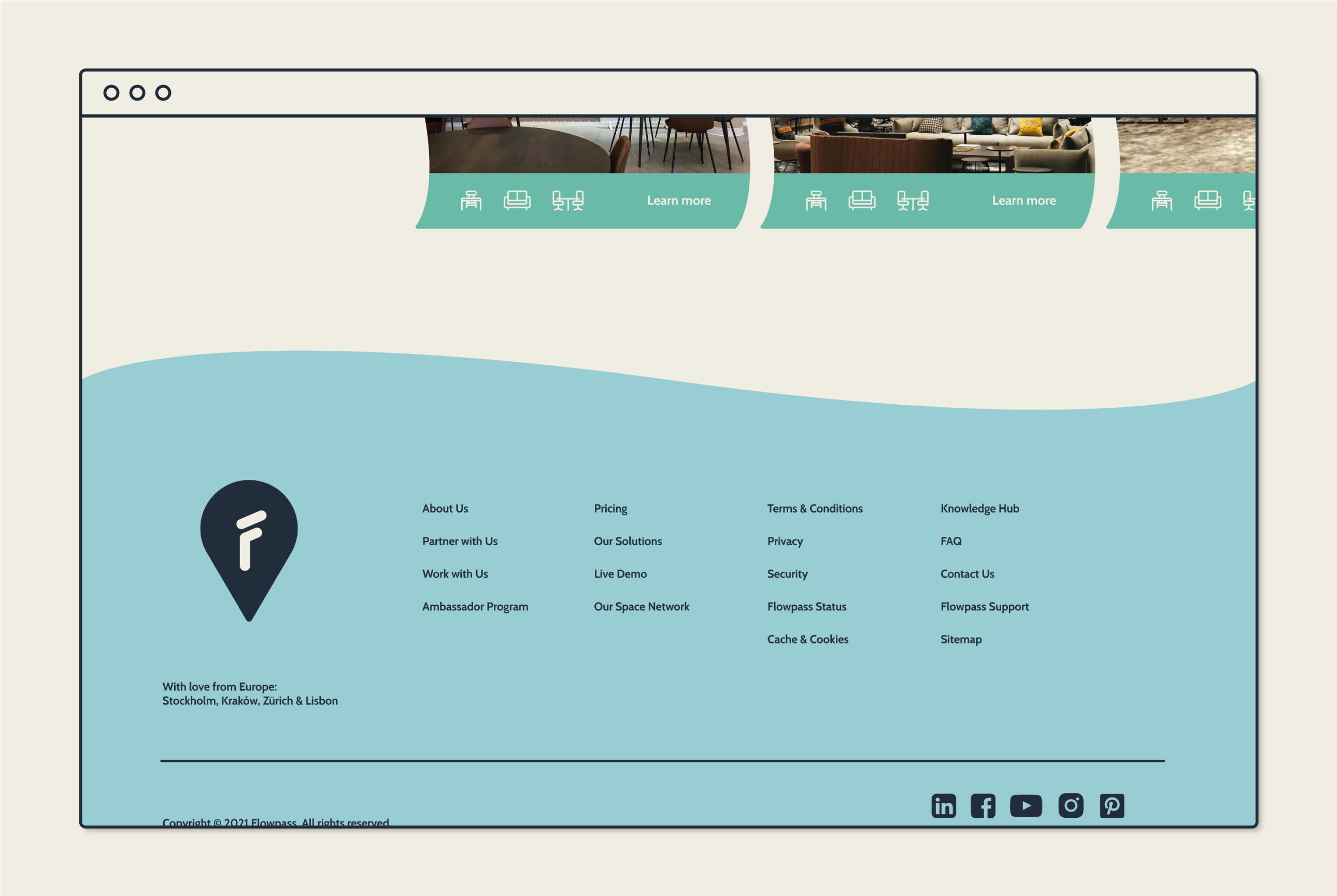
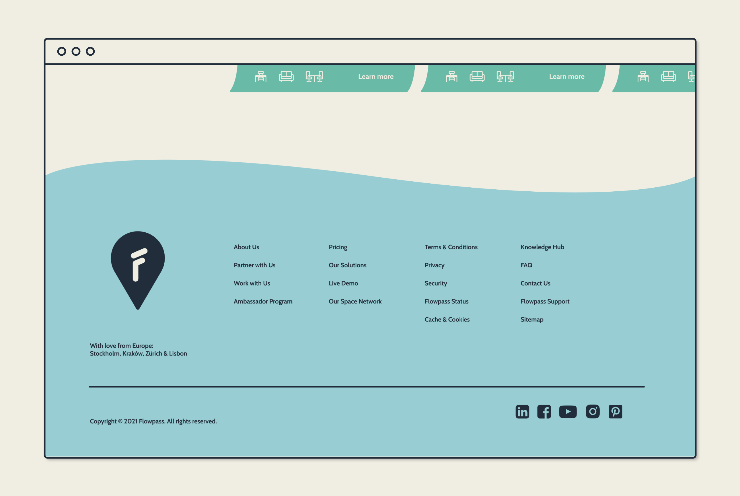
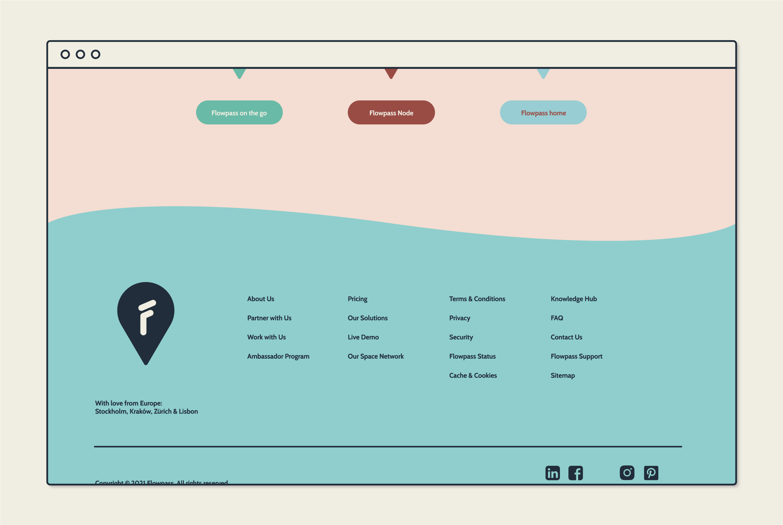
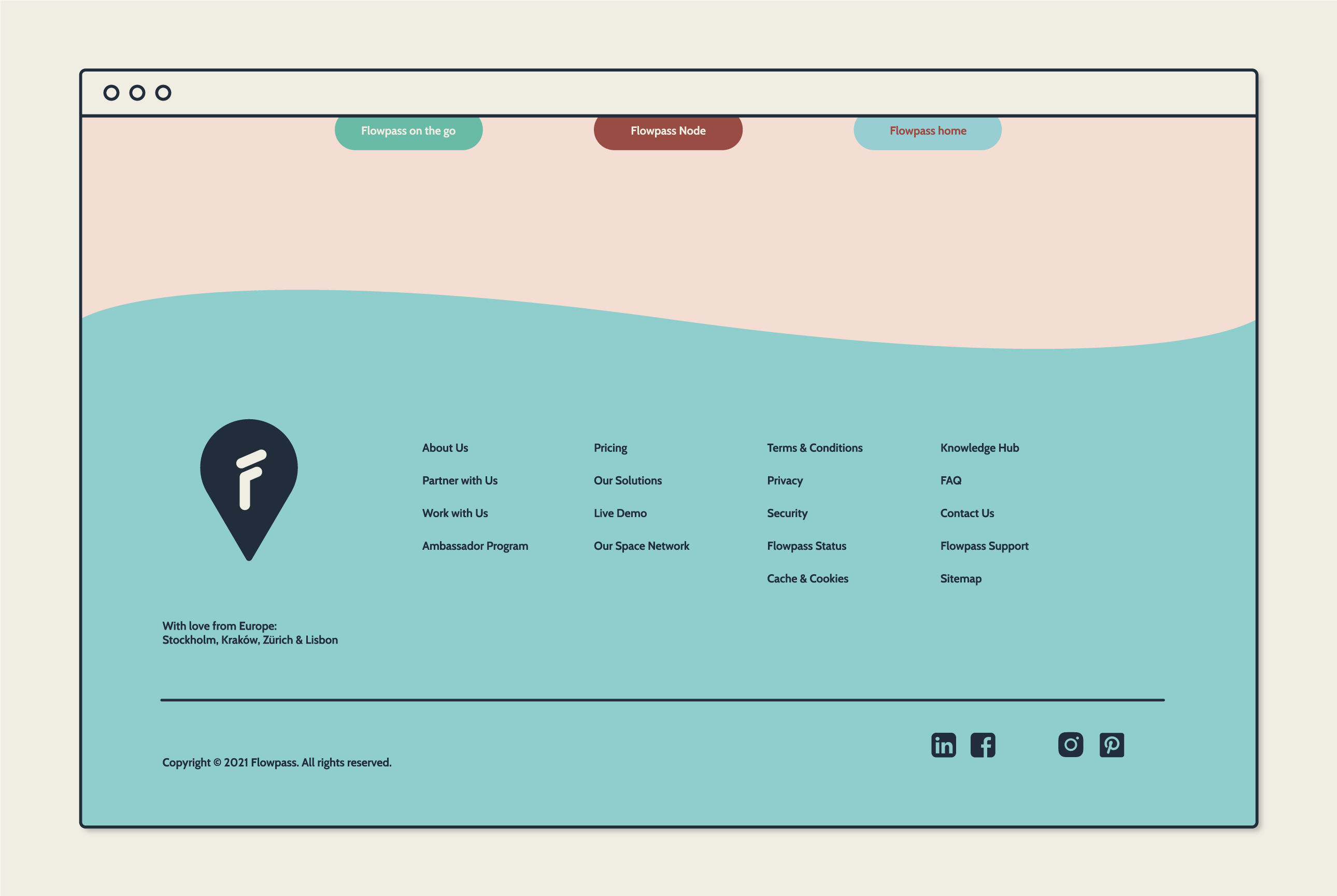
As for the font for the design system, I choose Cabin to represent a serious trusting company, but with some flow. I then designed a symbol with a drop with an F in it, to represent the different spots you can flow between as a user of flowpass. Together or separately they will serve as the visual mark of the company.


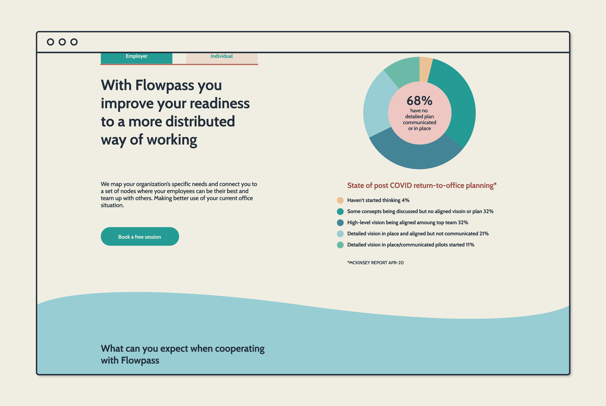
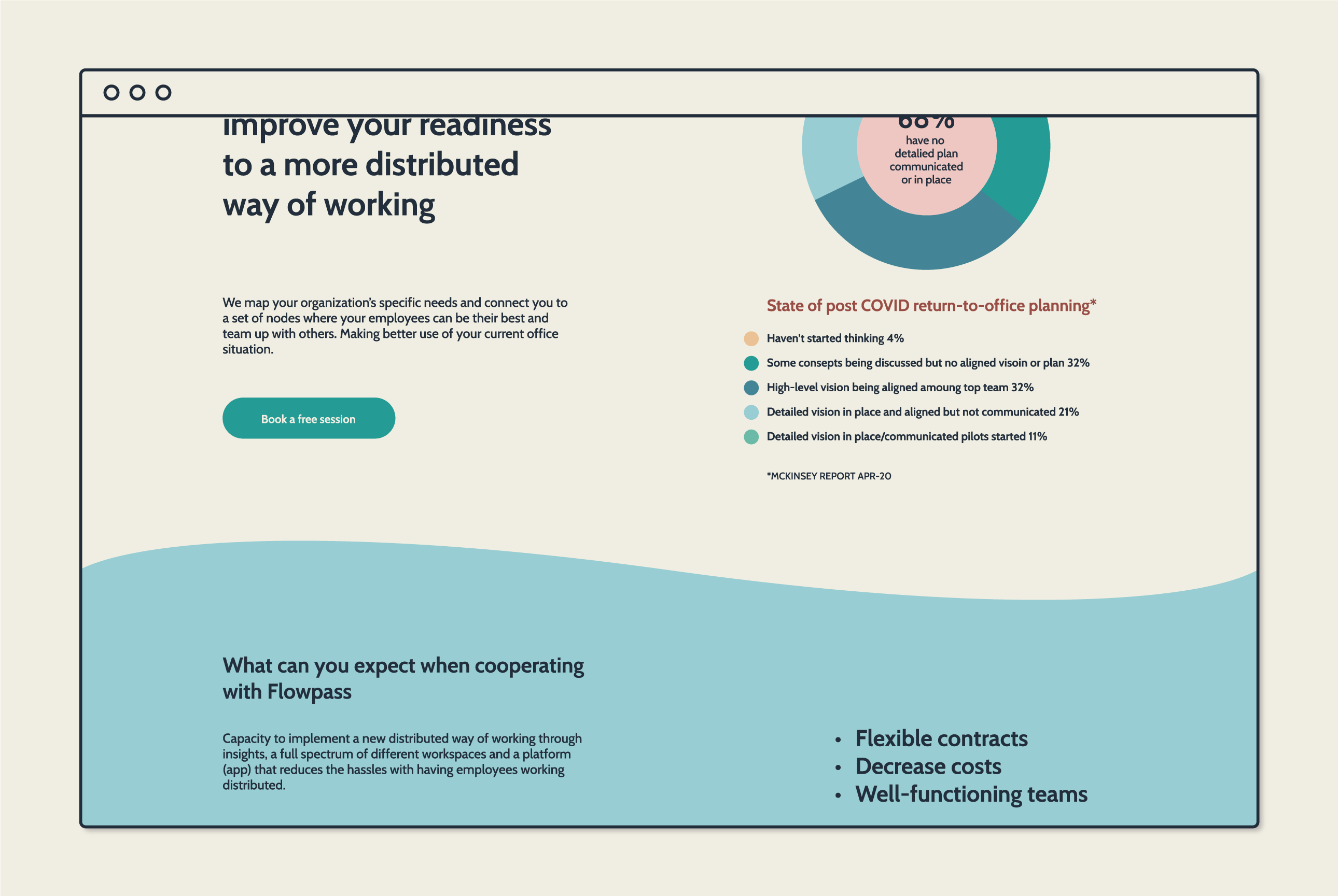
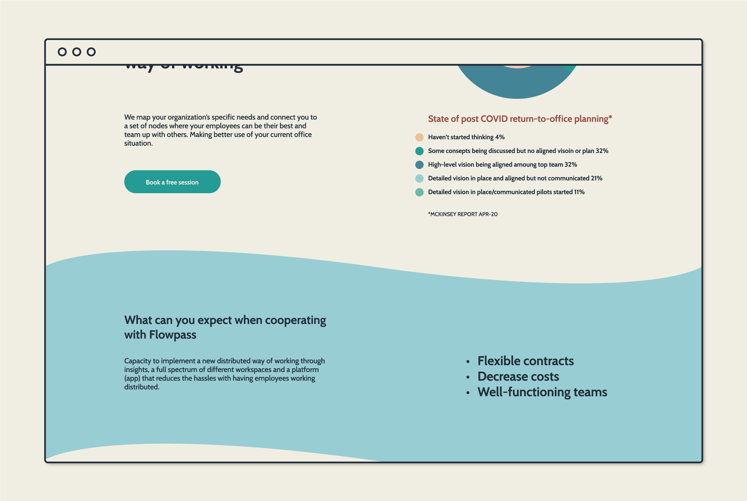
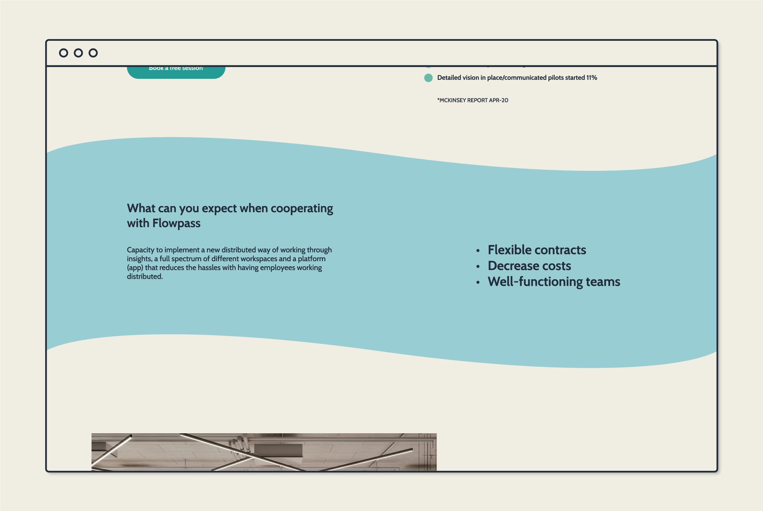
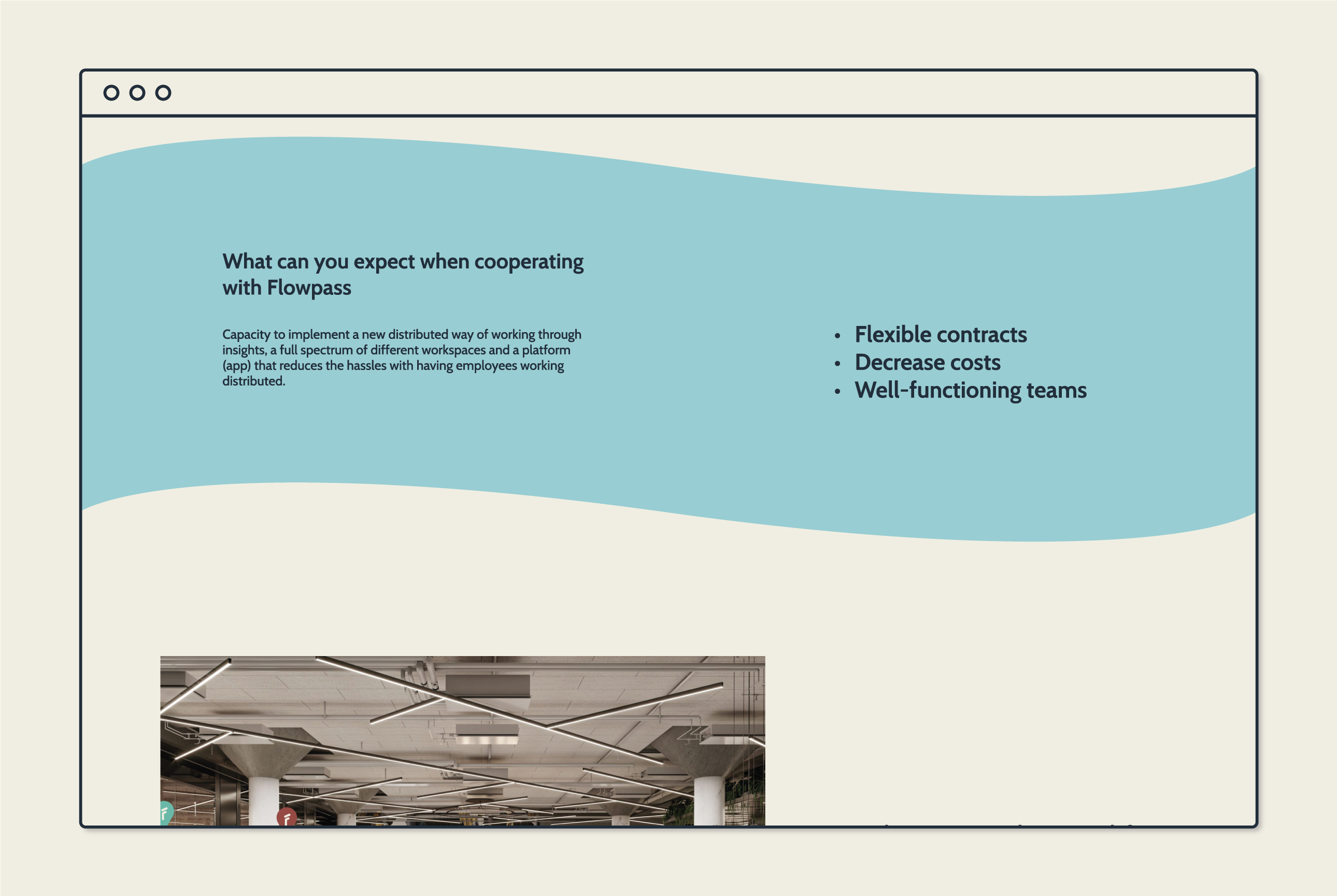
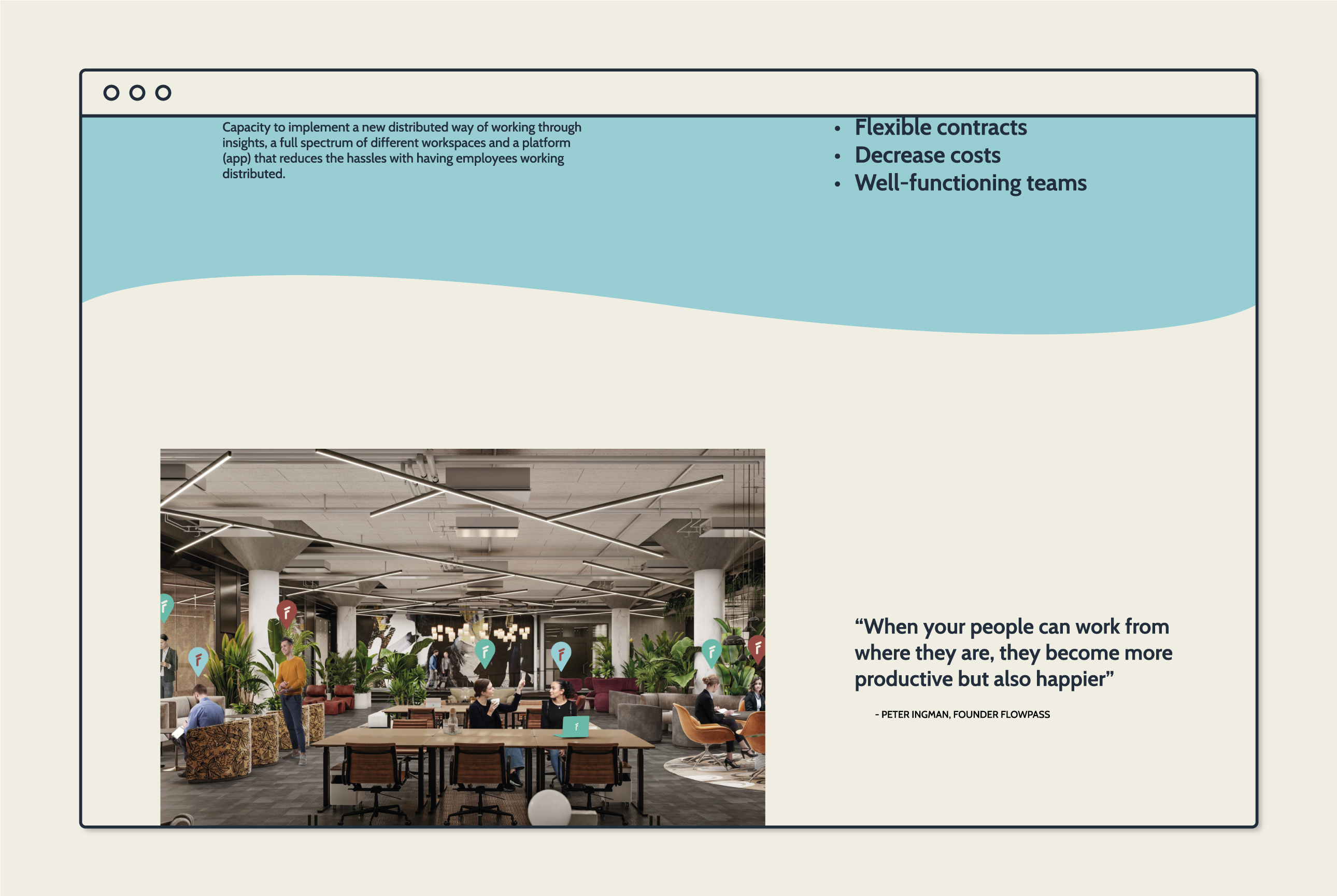
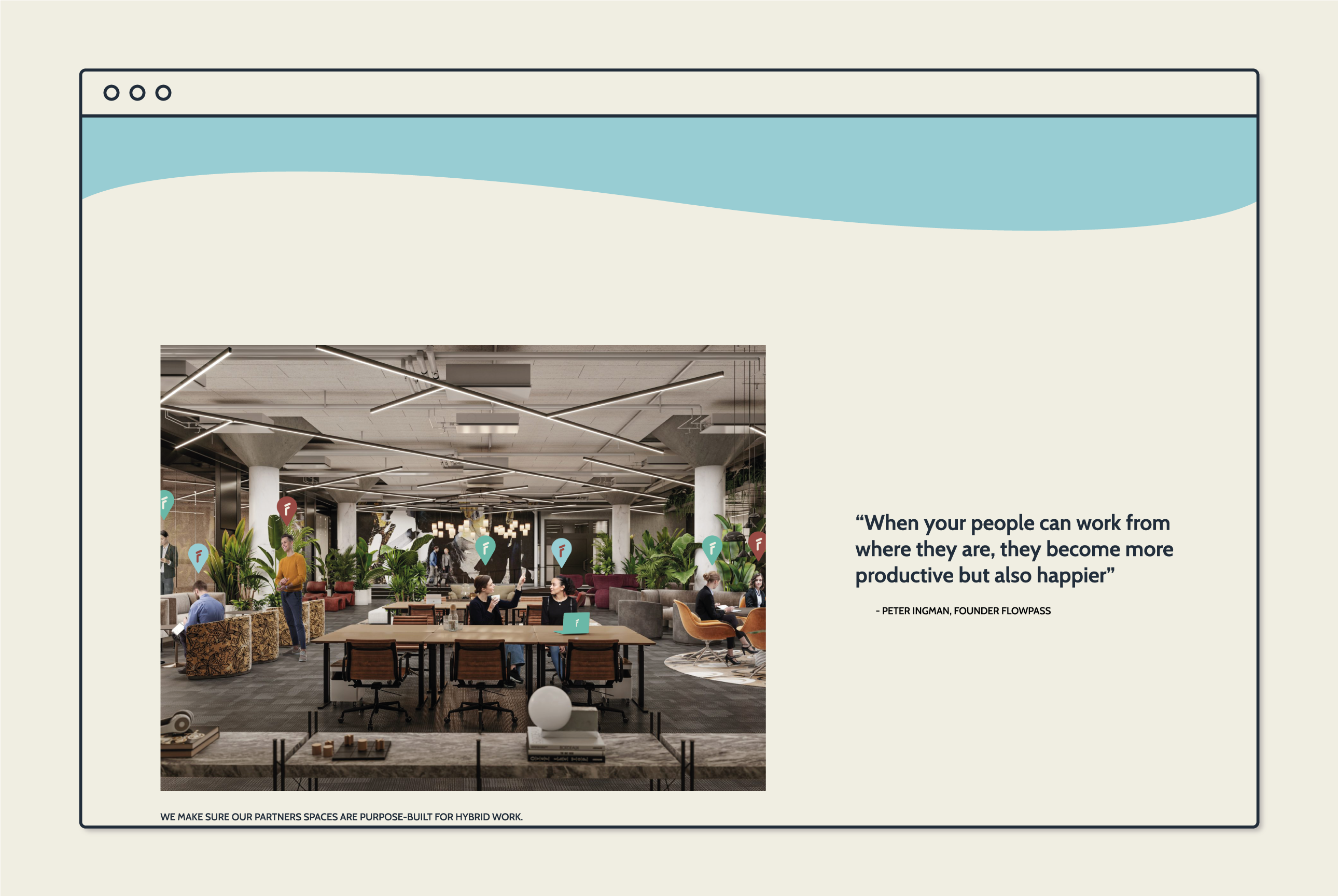
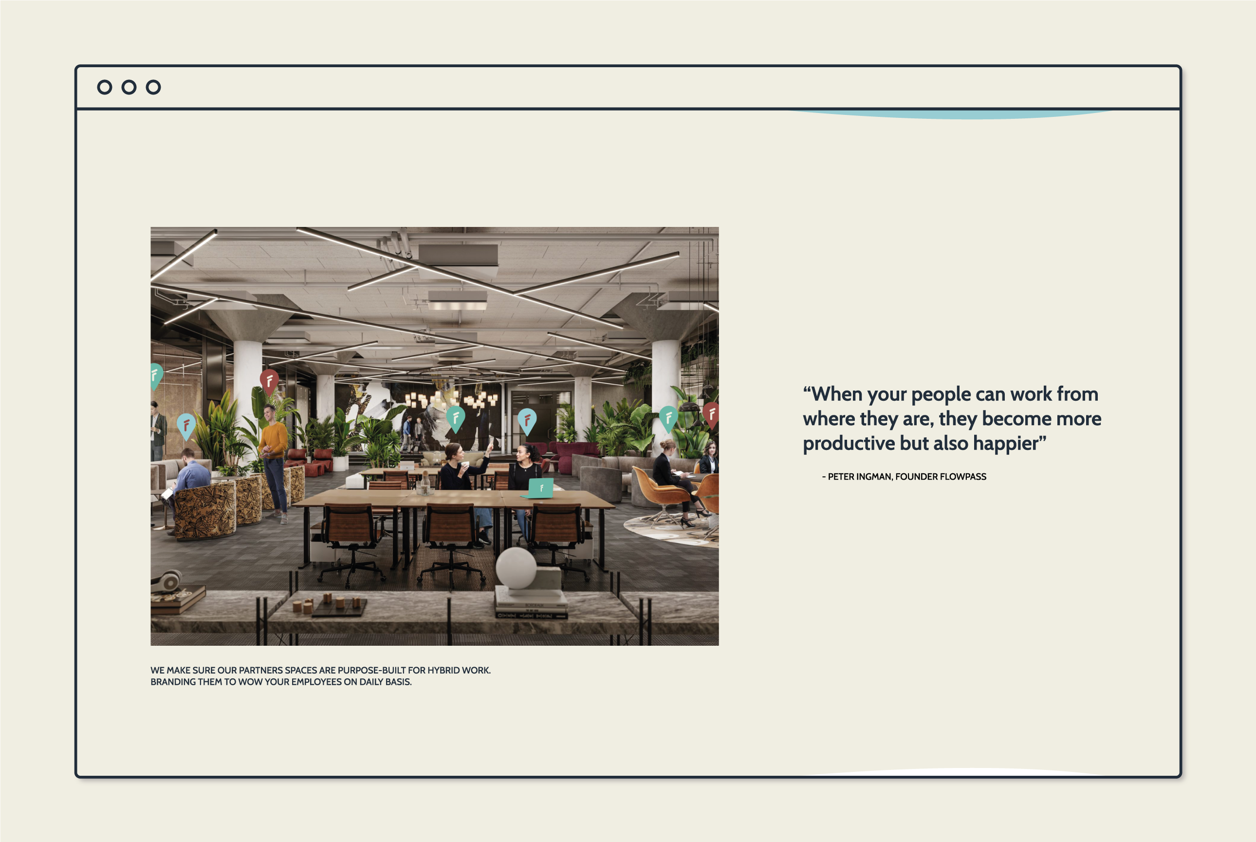
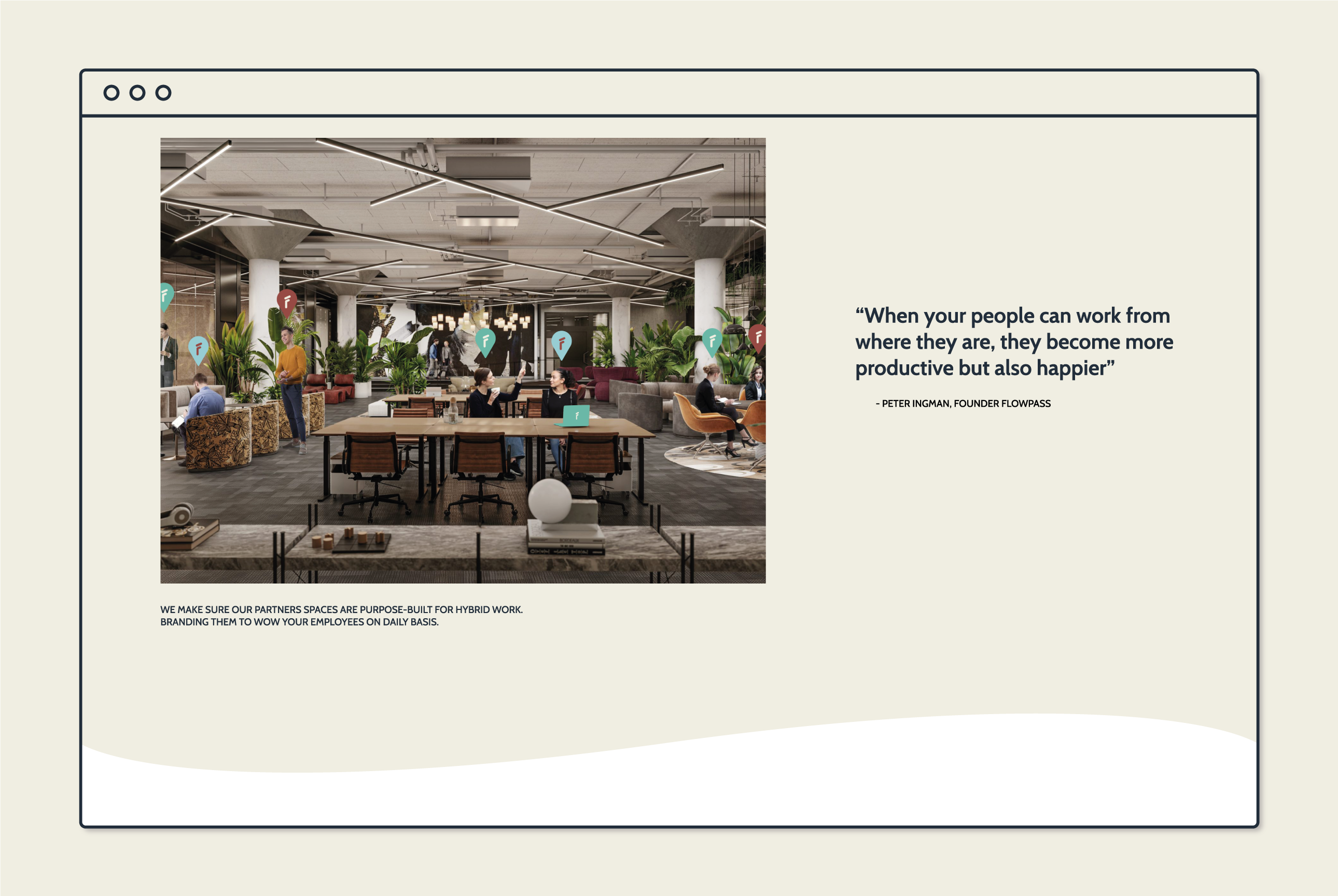
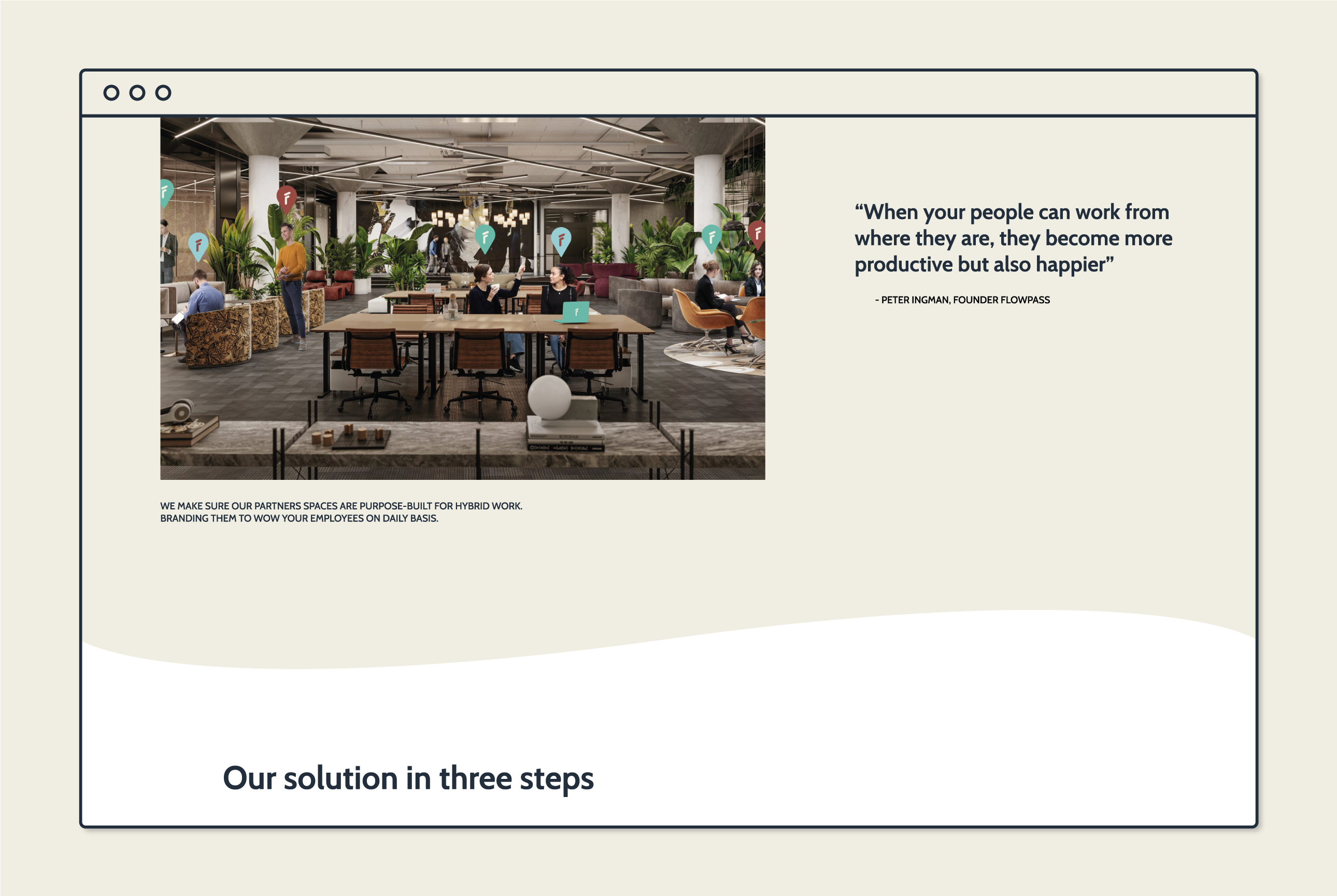
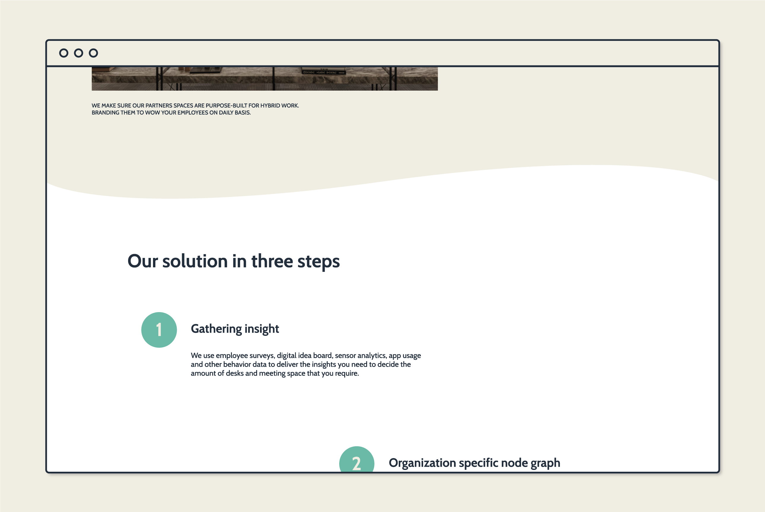
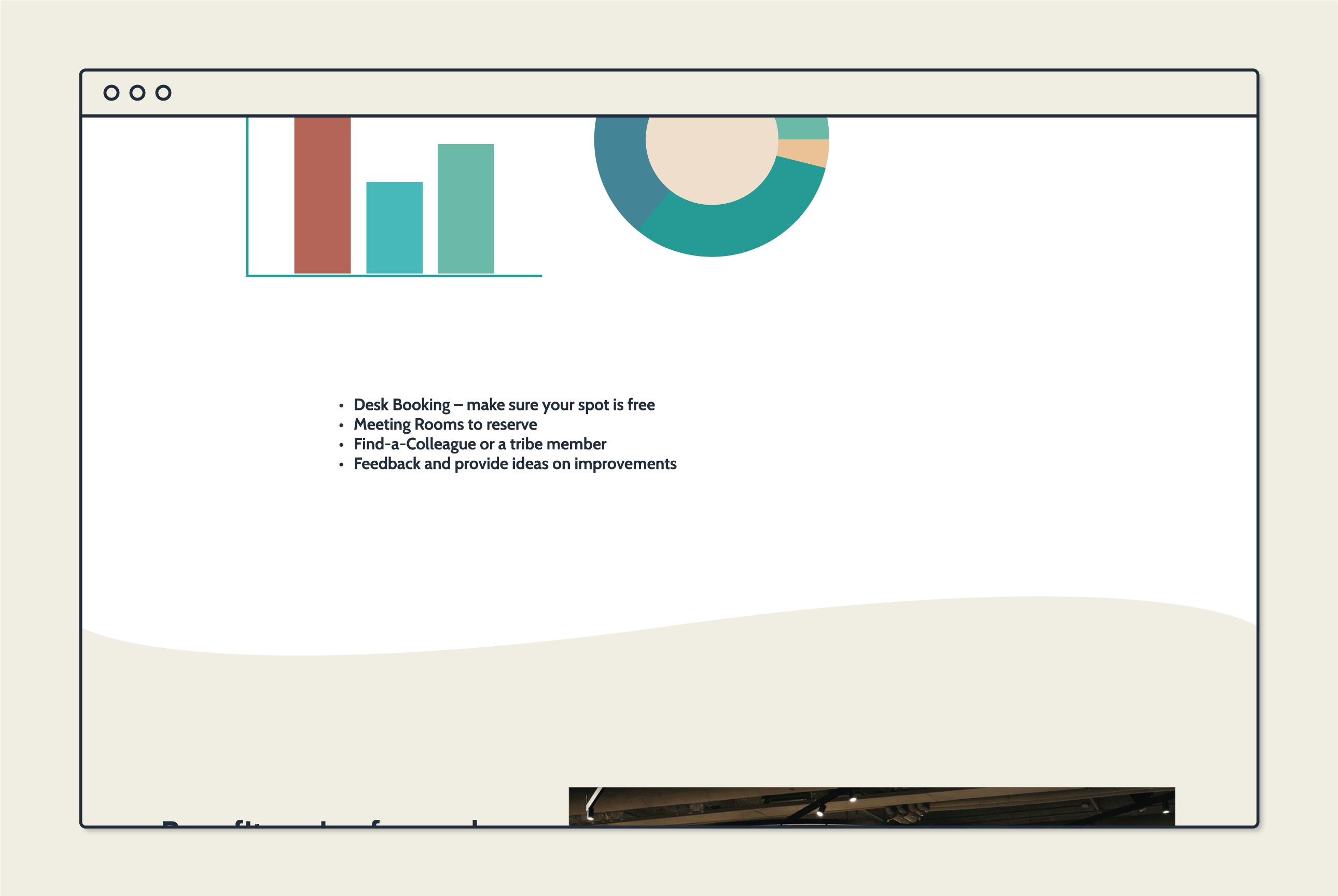
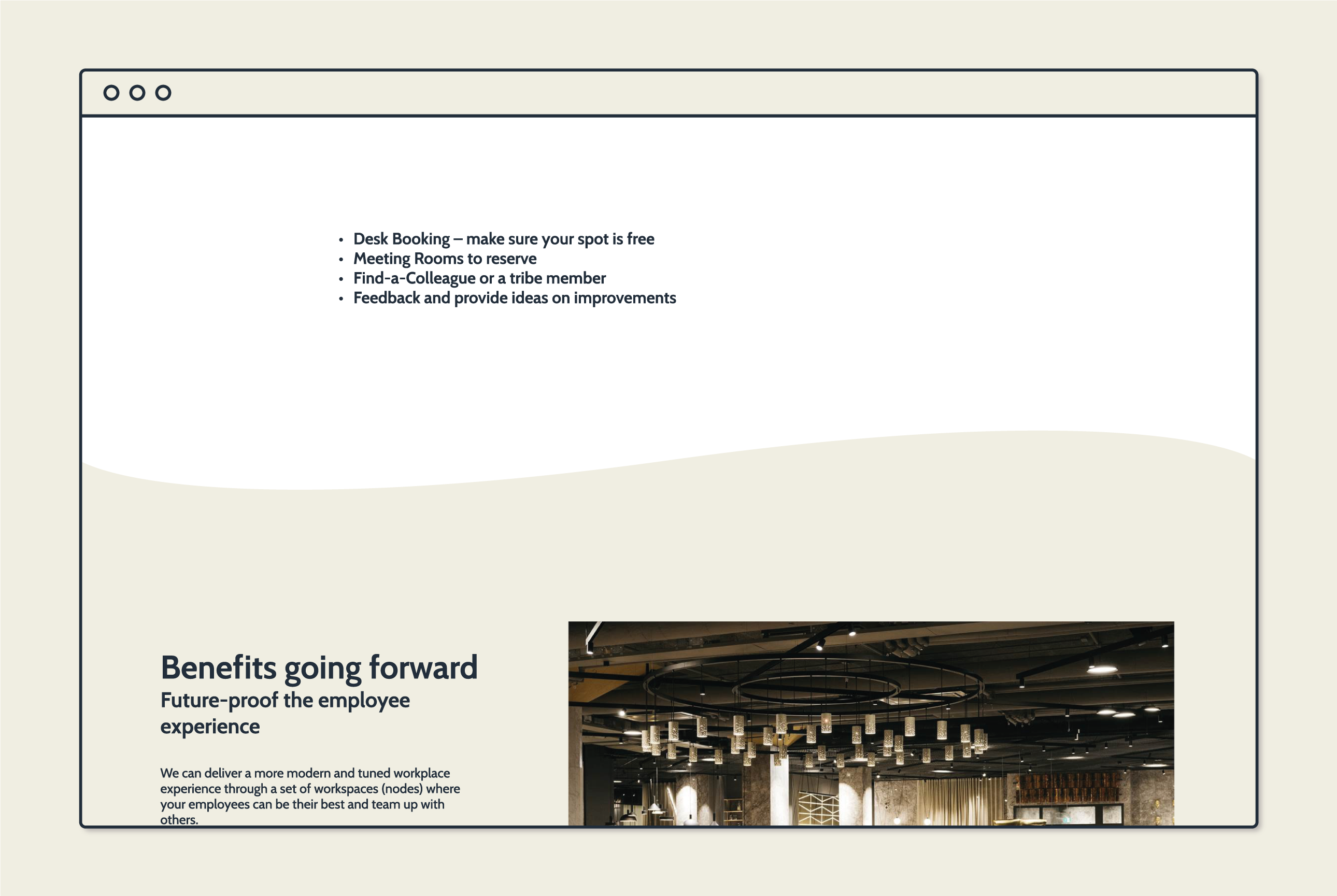
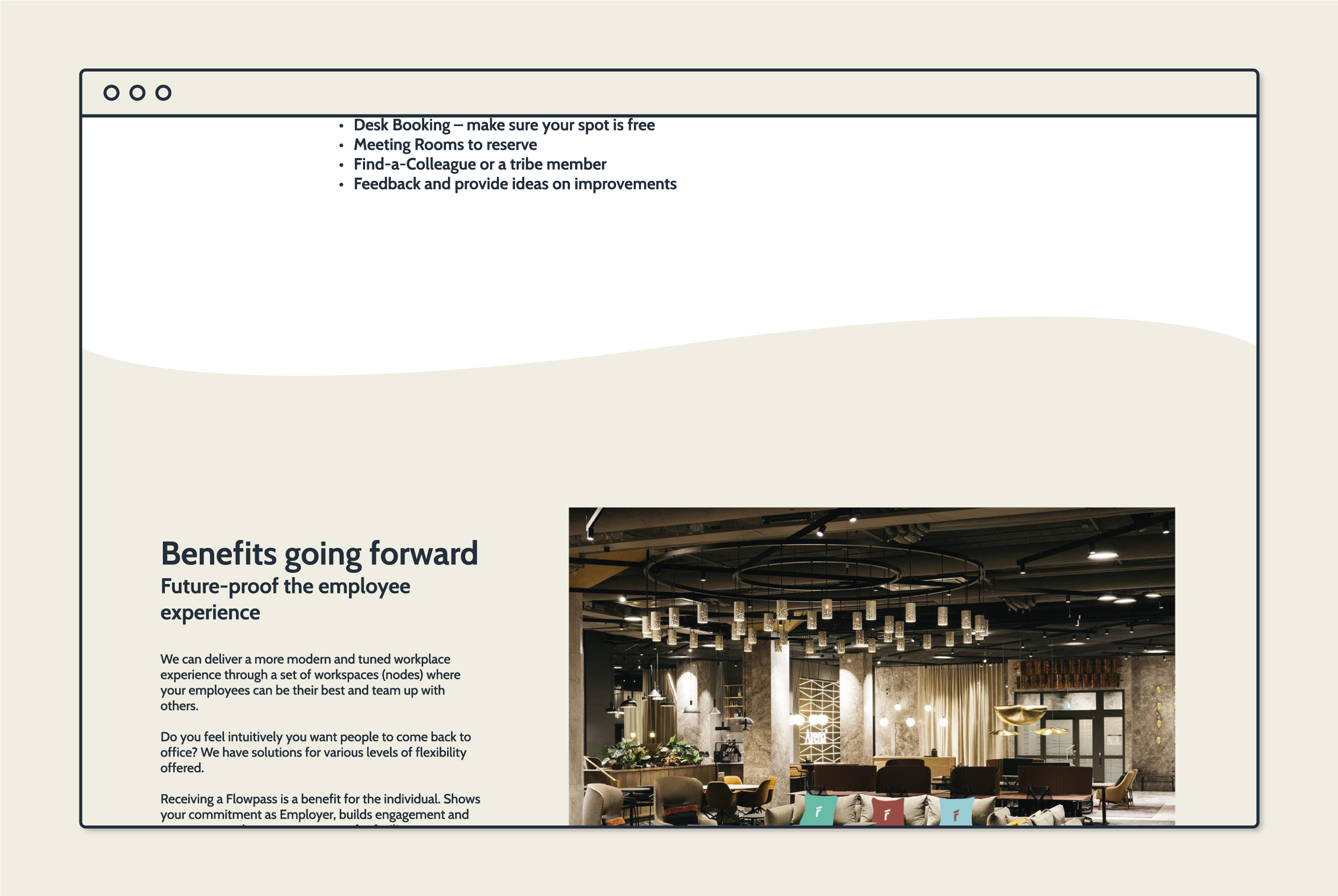
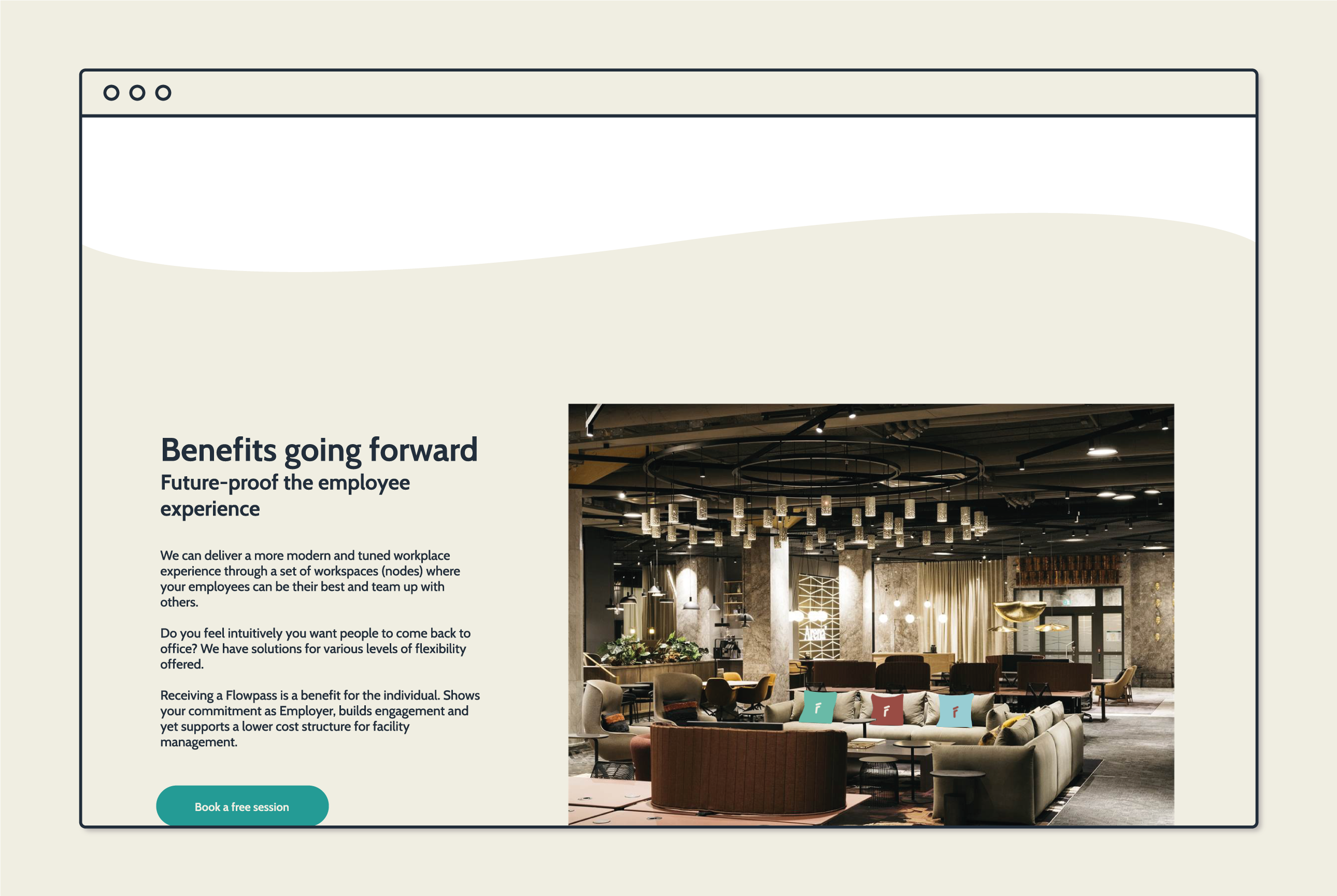
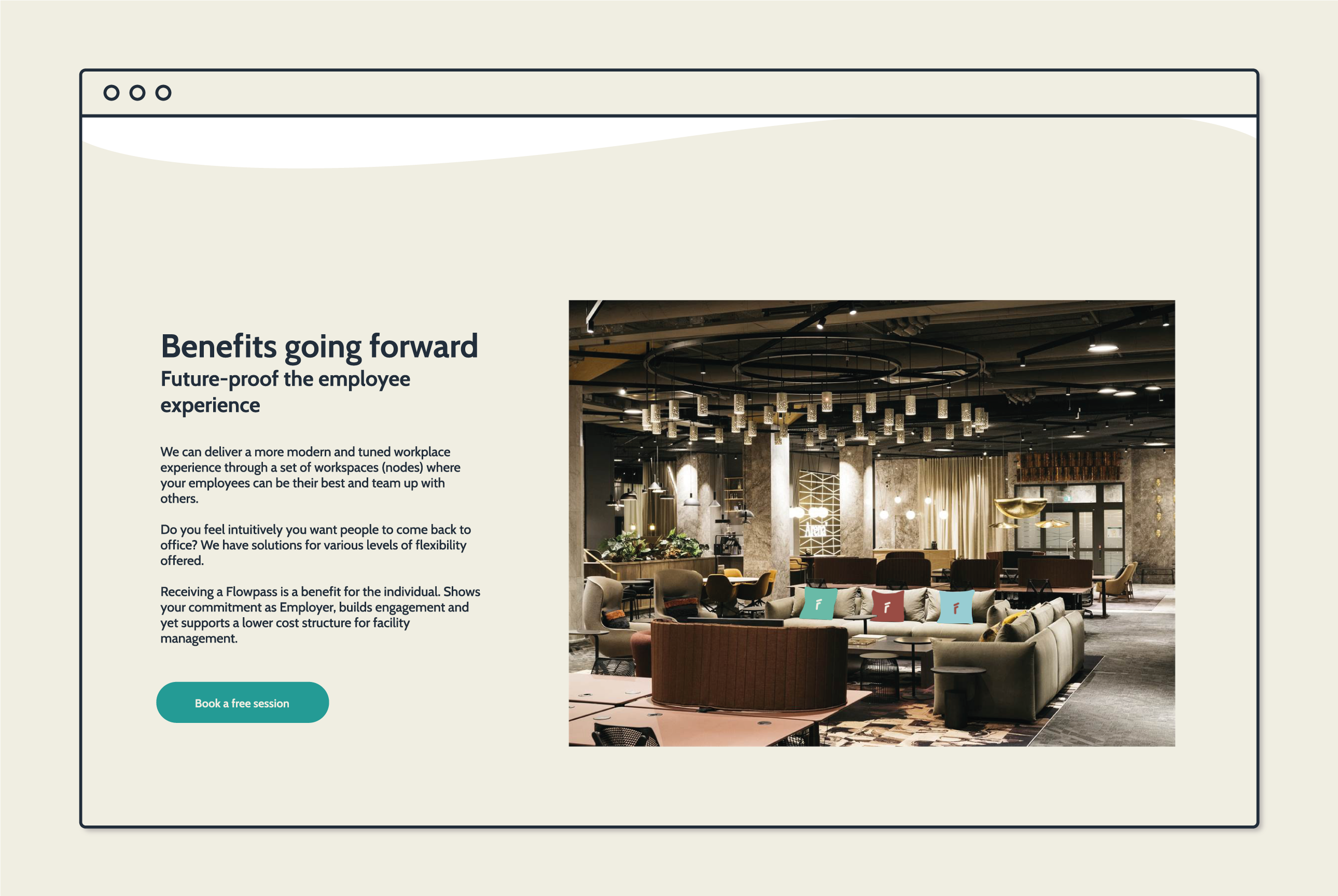
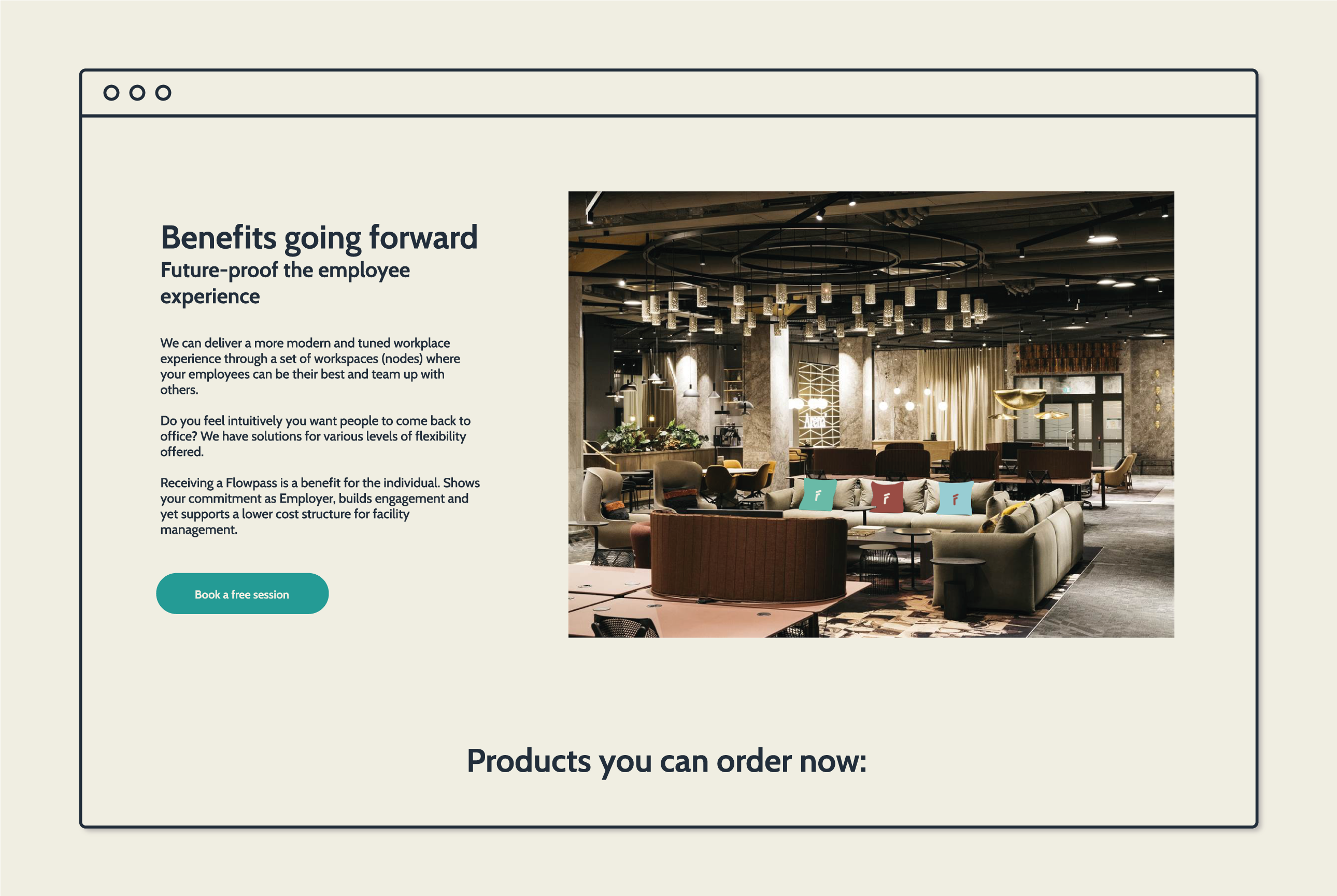
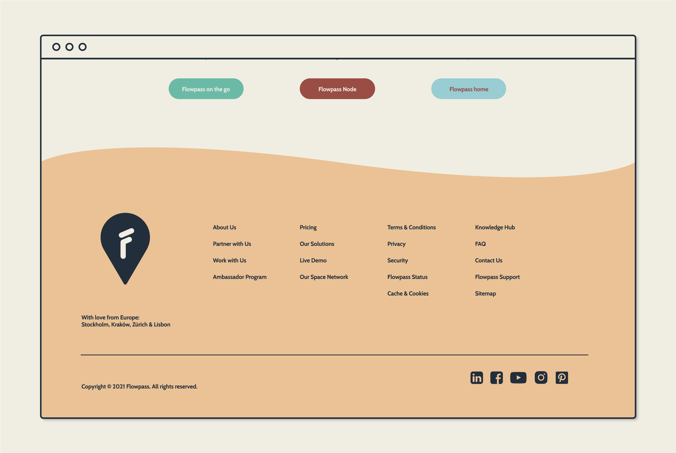
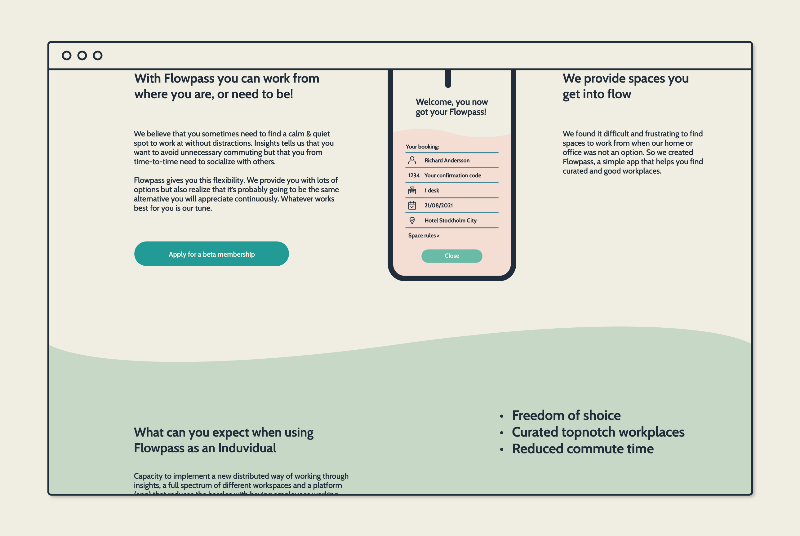
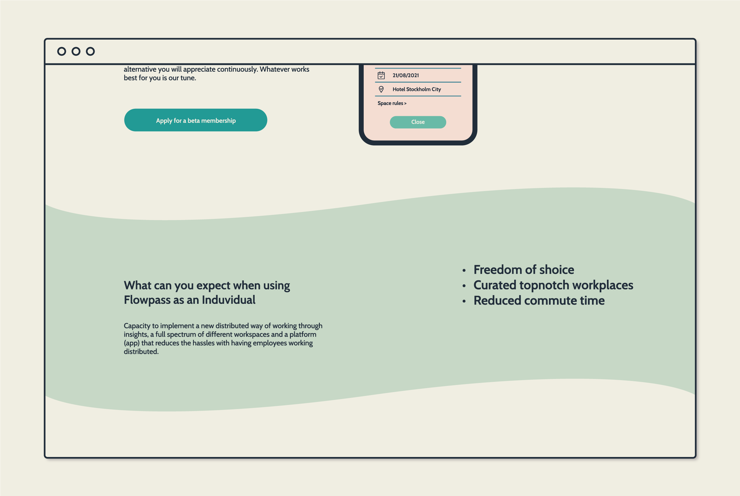
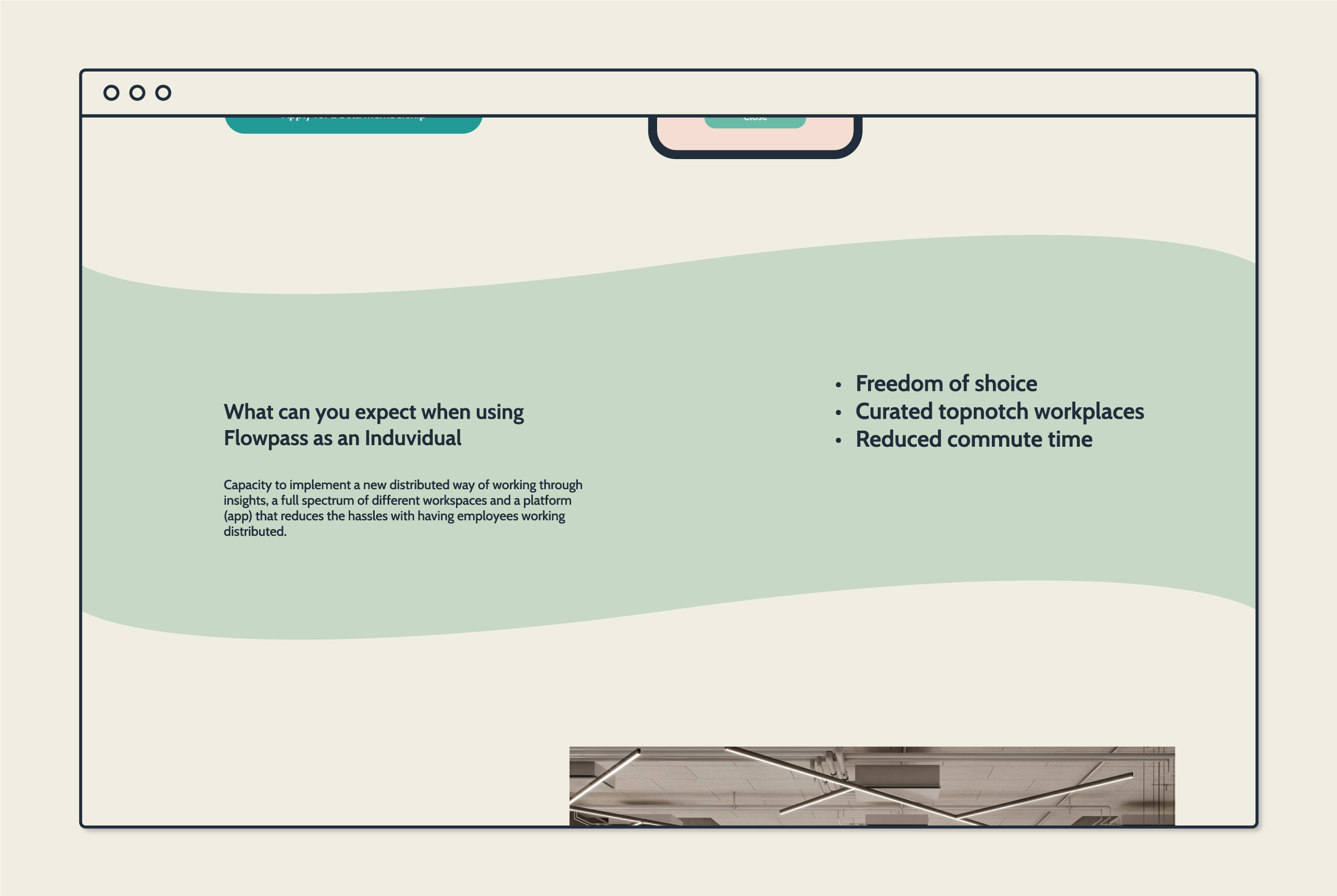
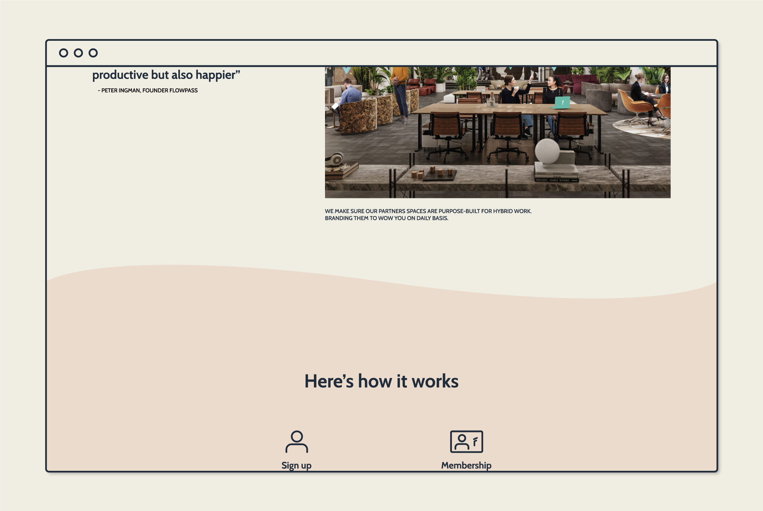
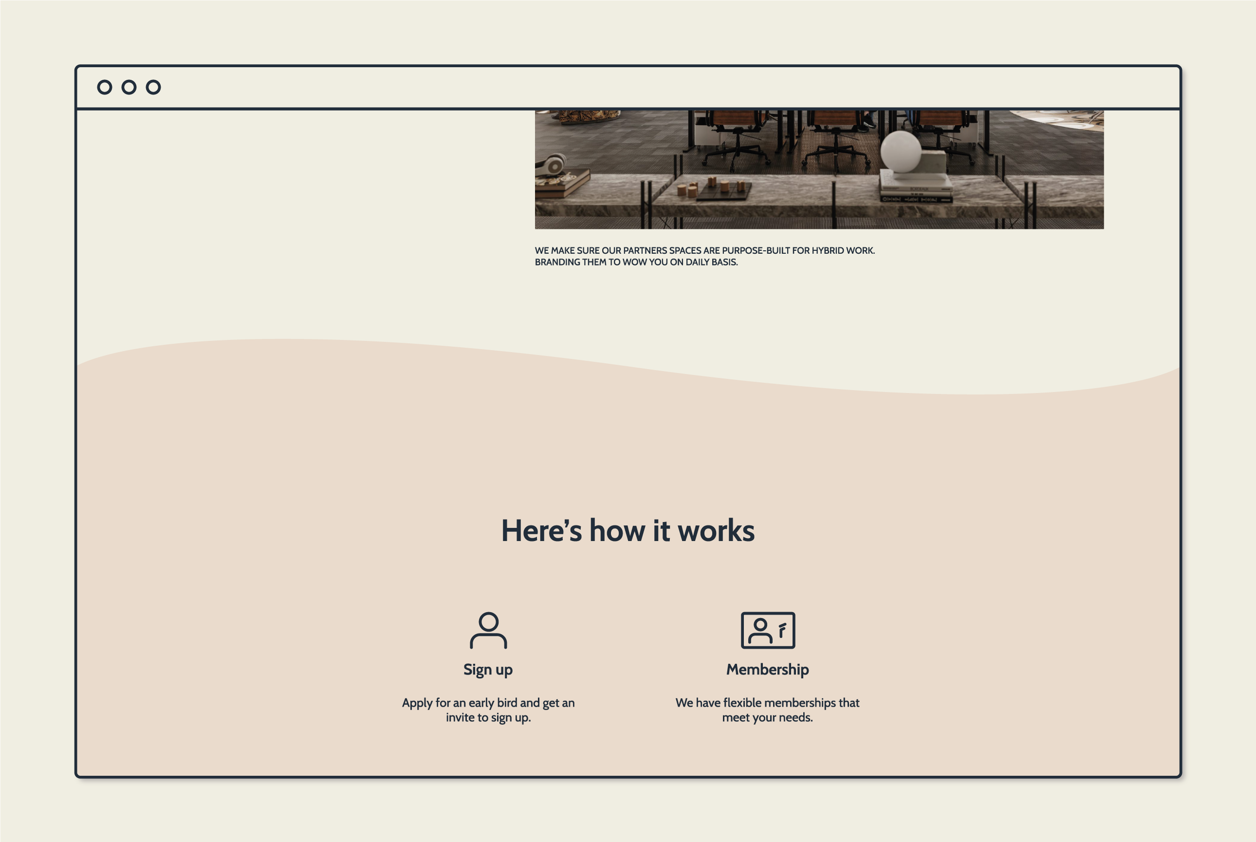
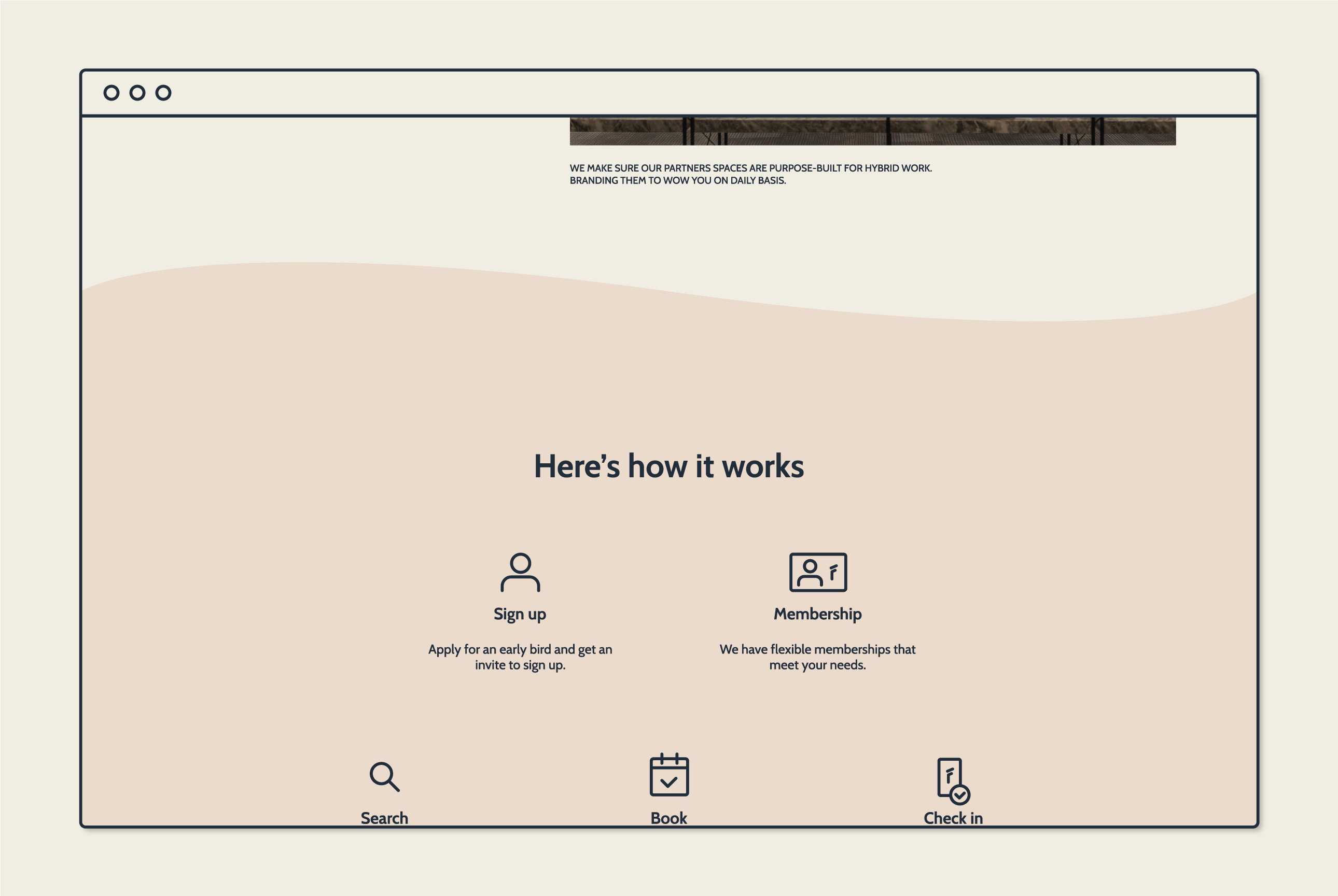
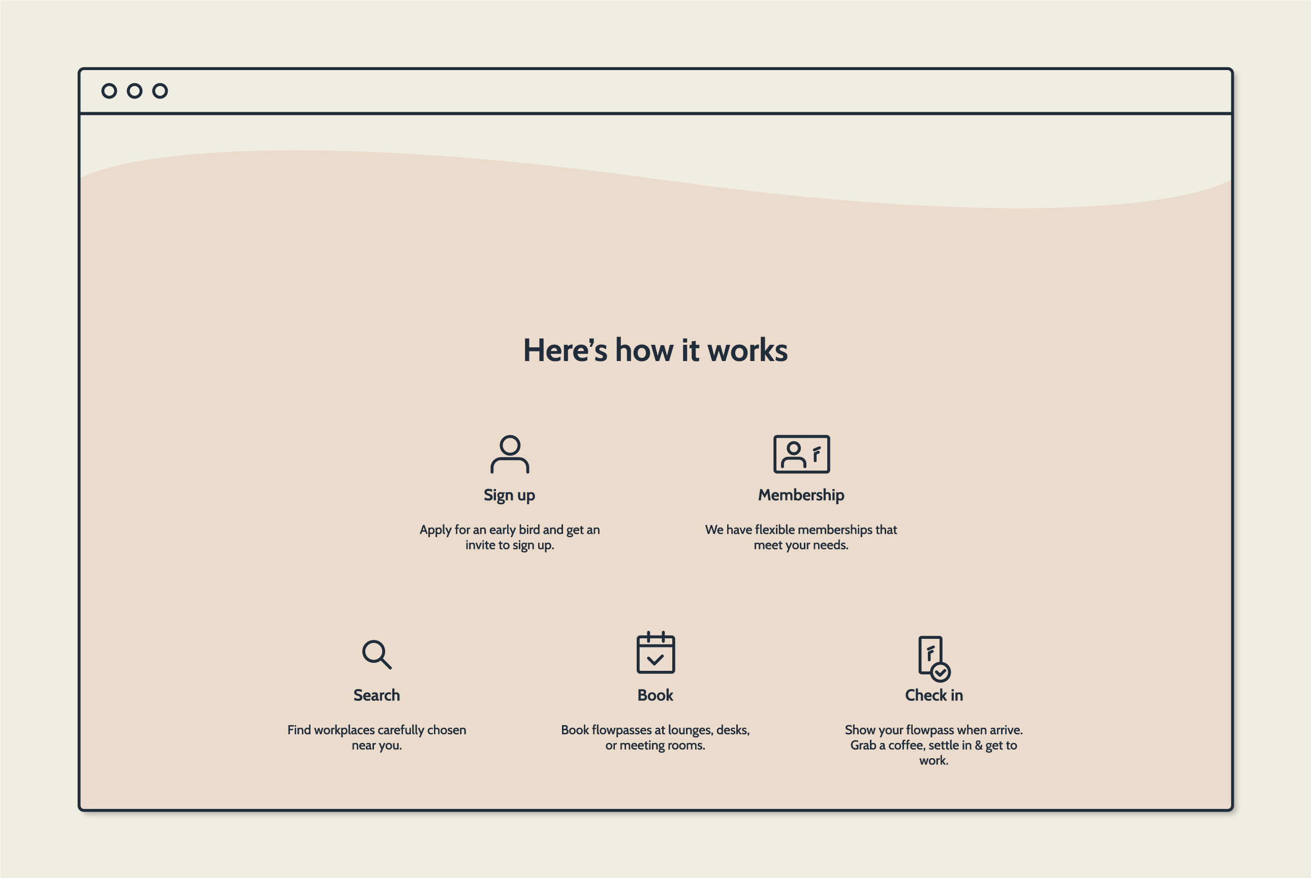
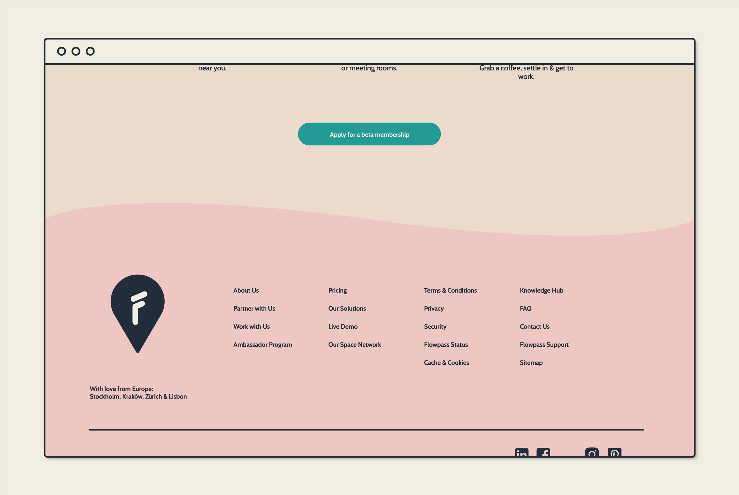
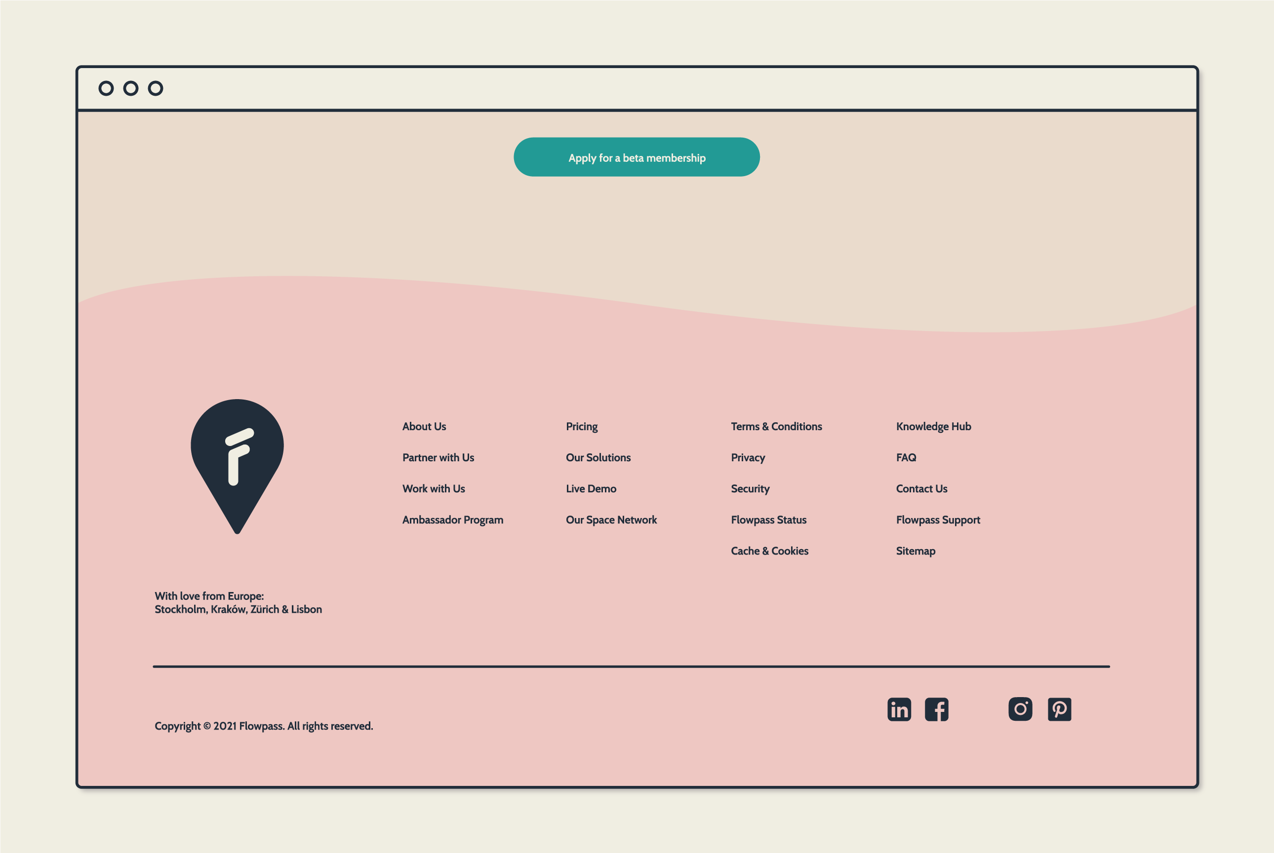
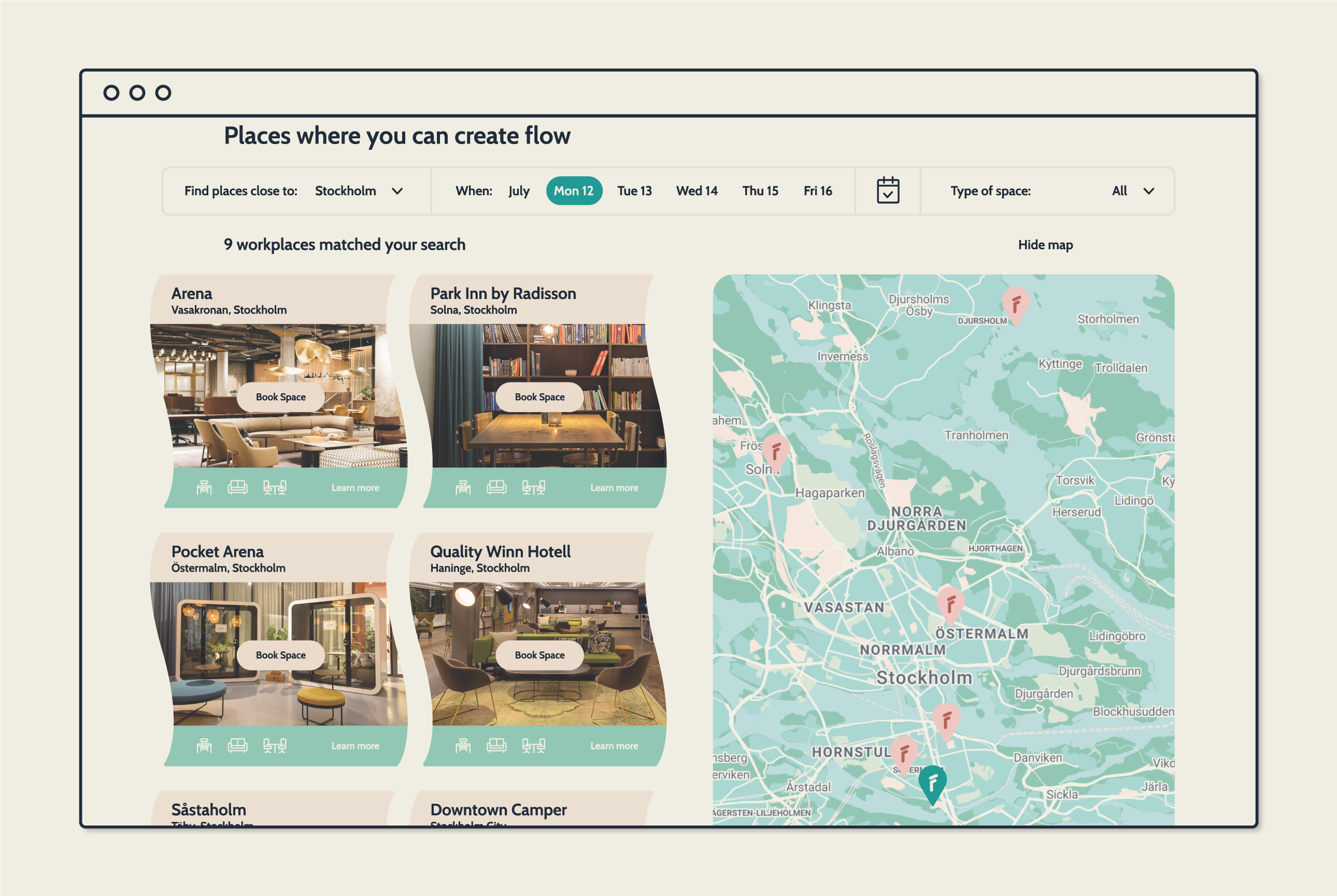
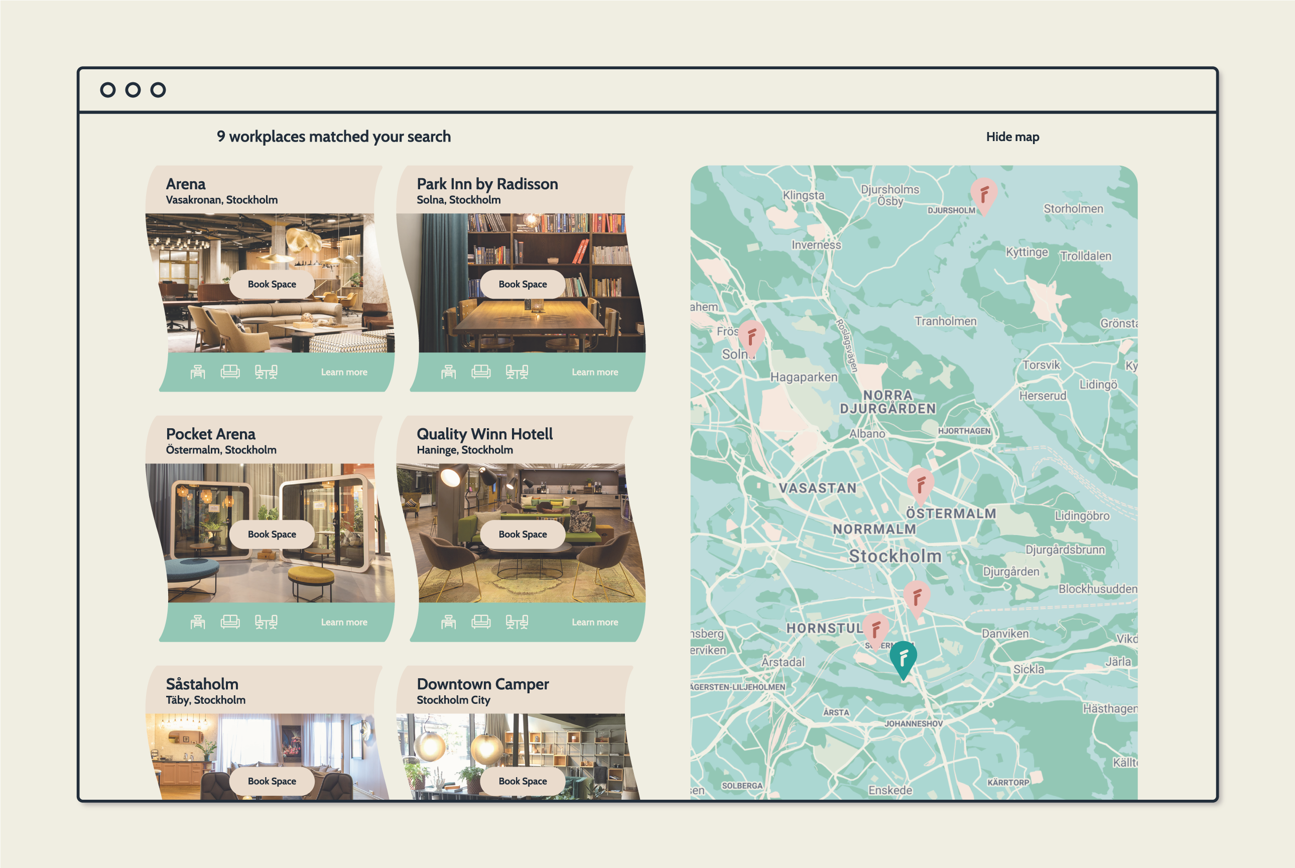
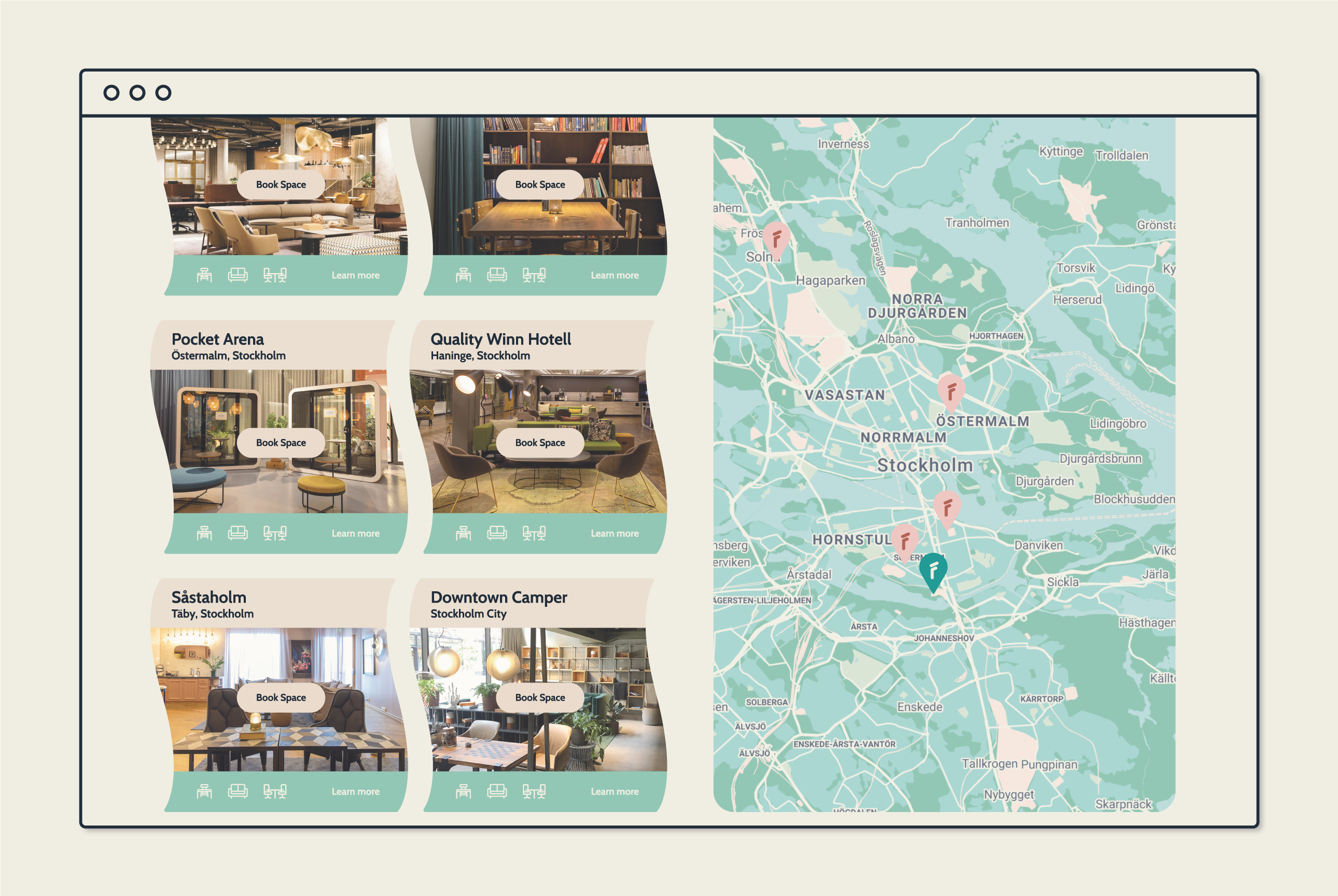
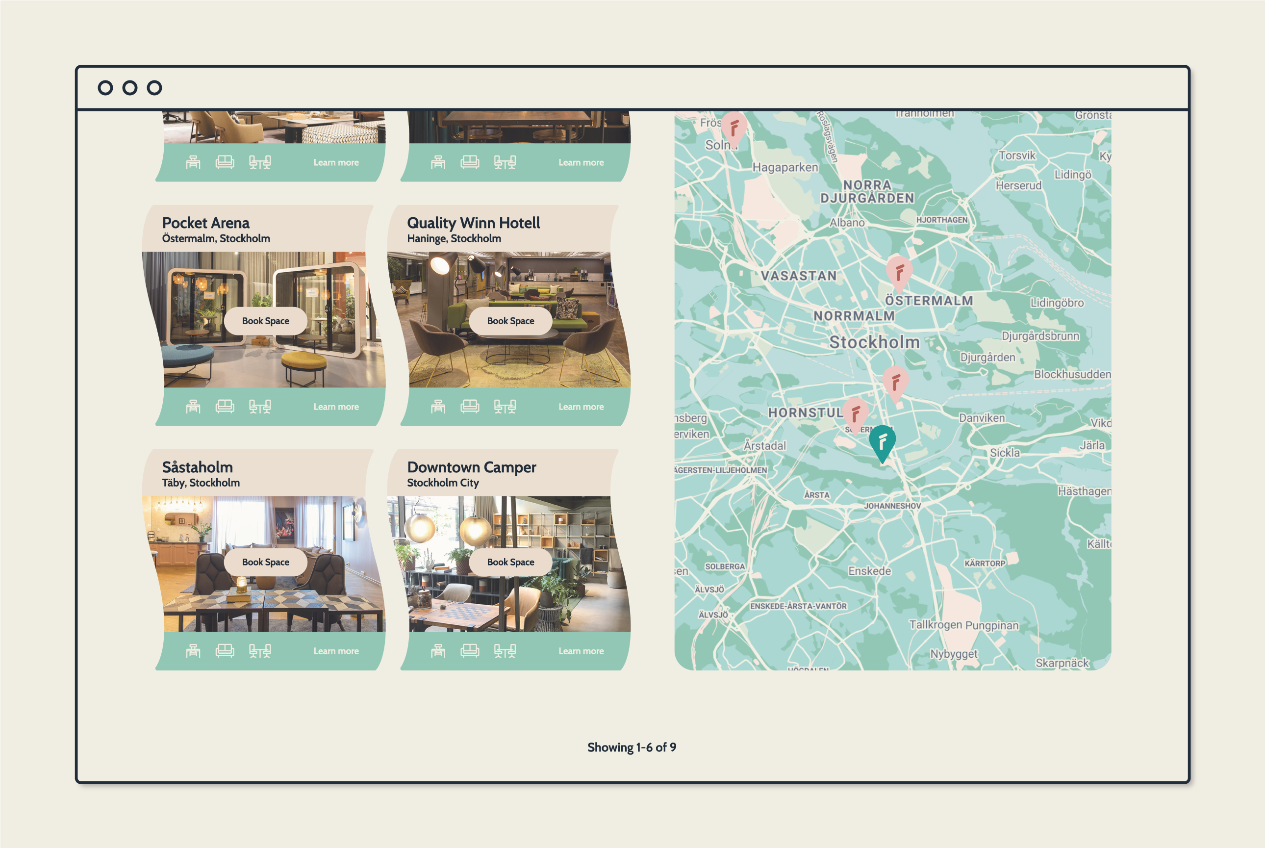
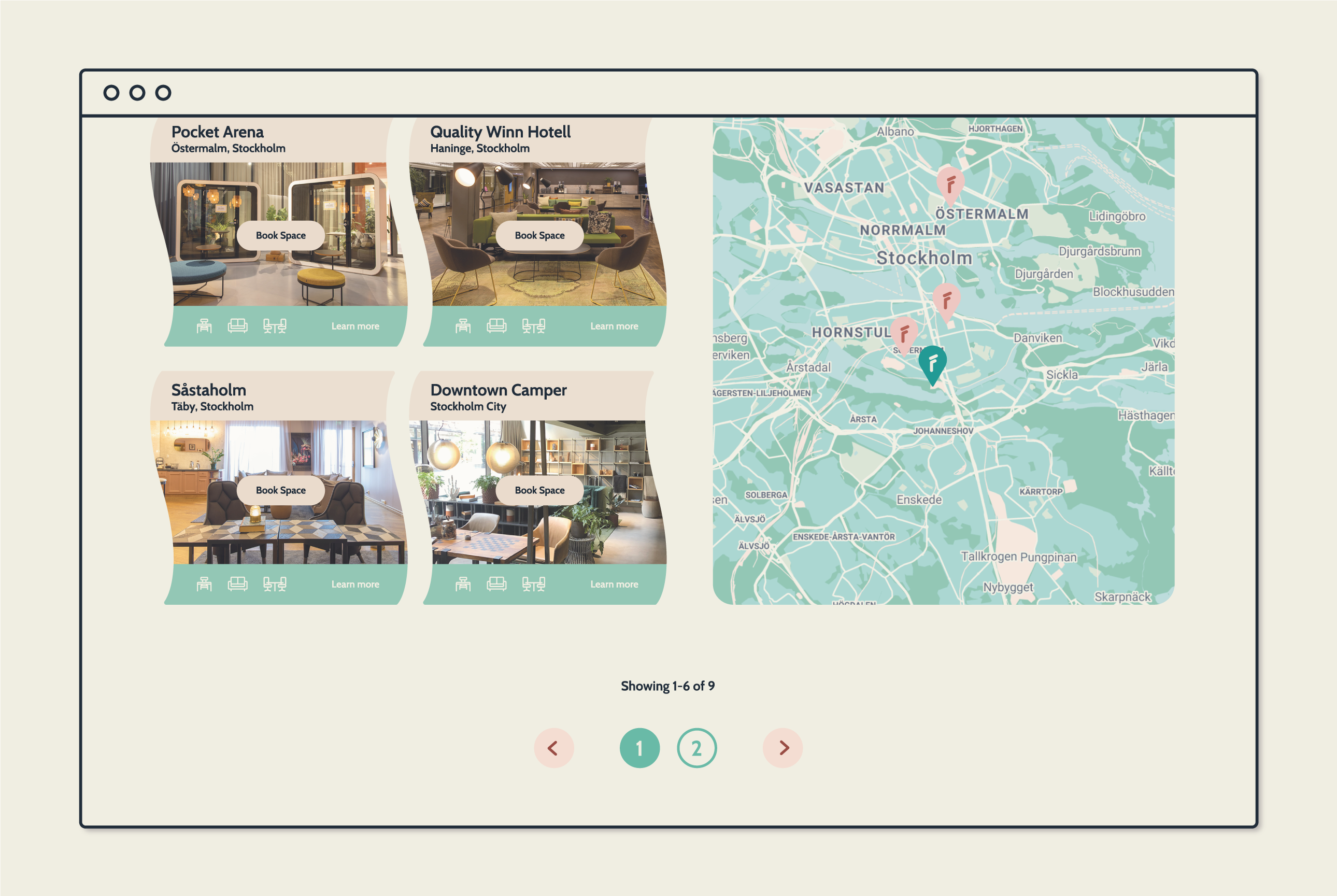
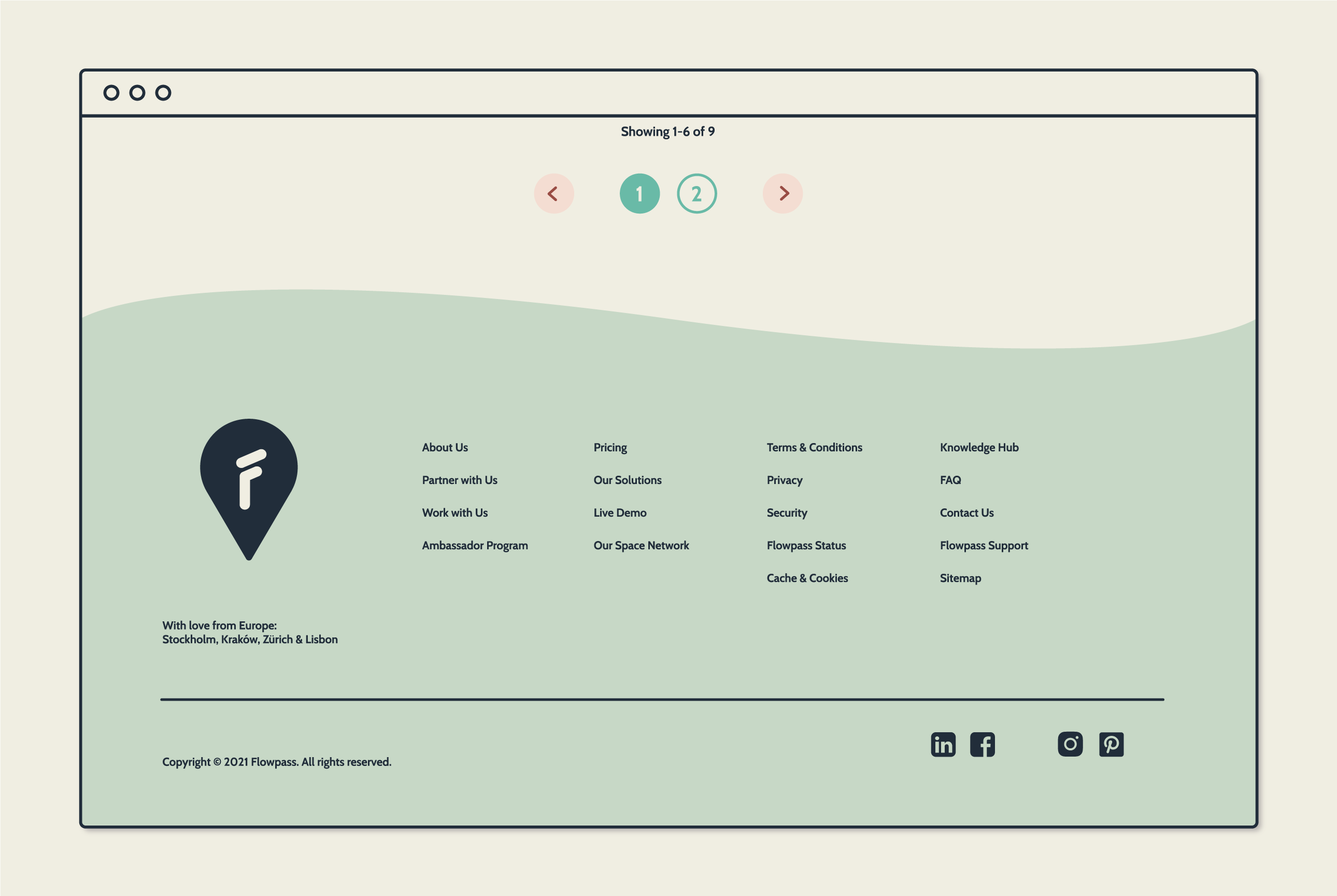
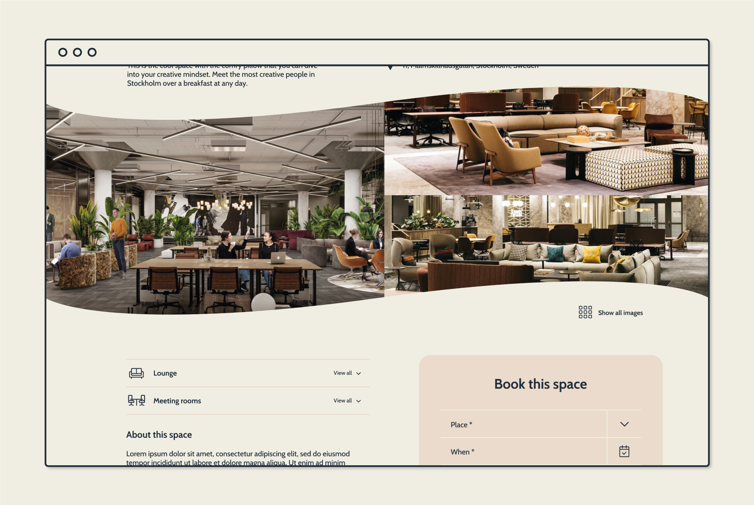
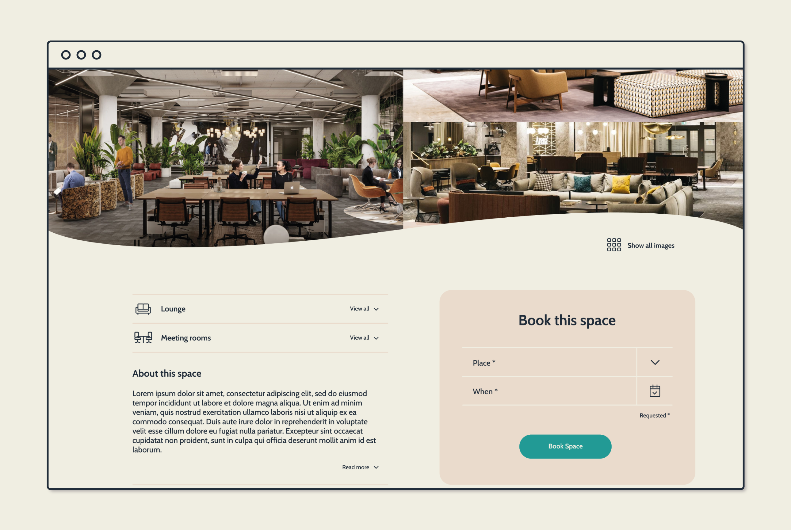
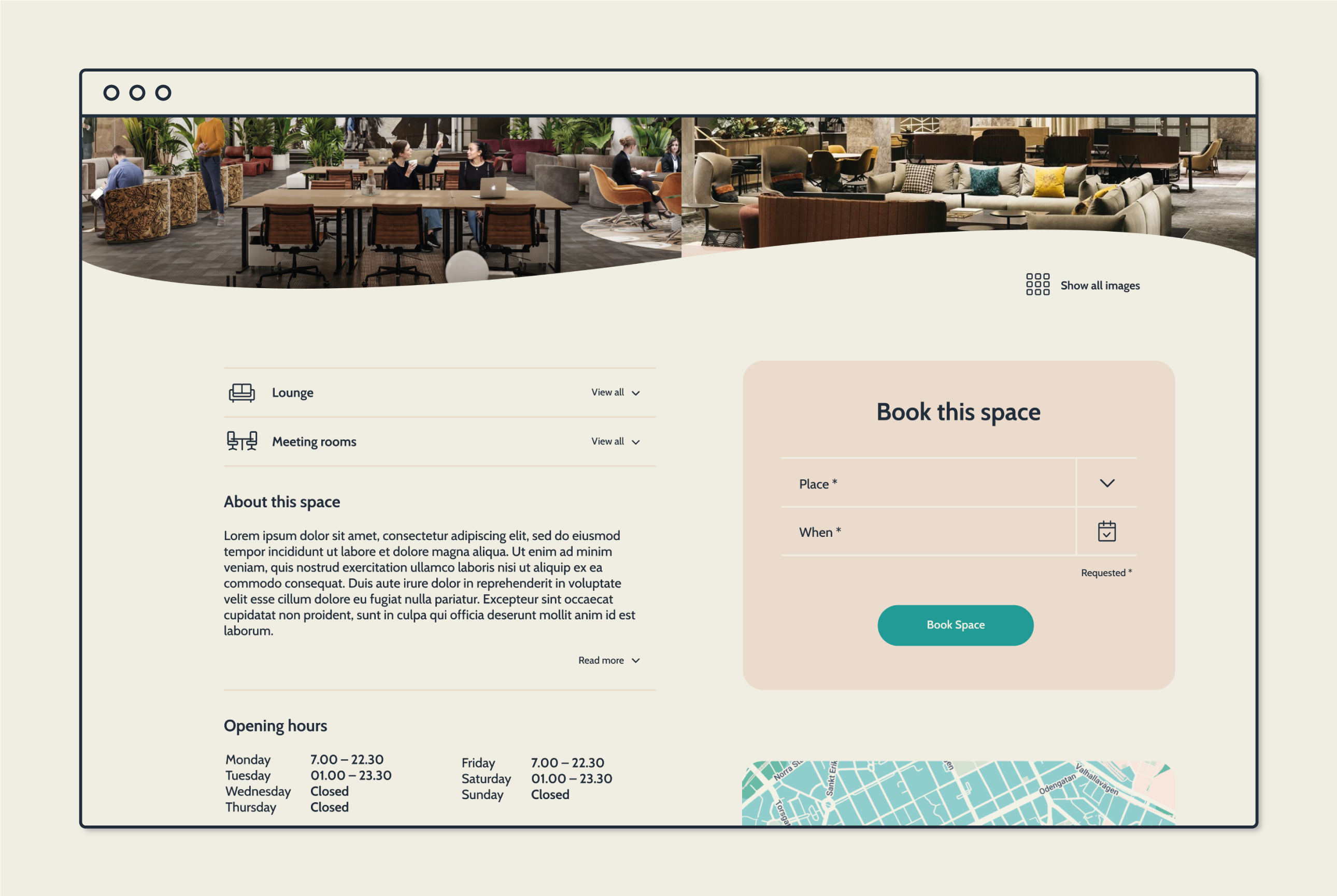
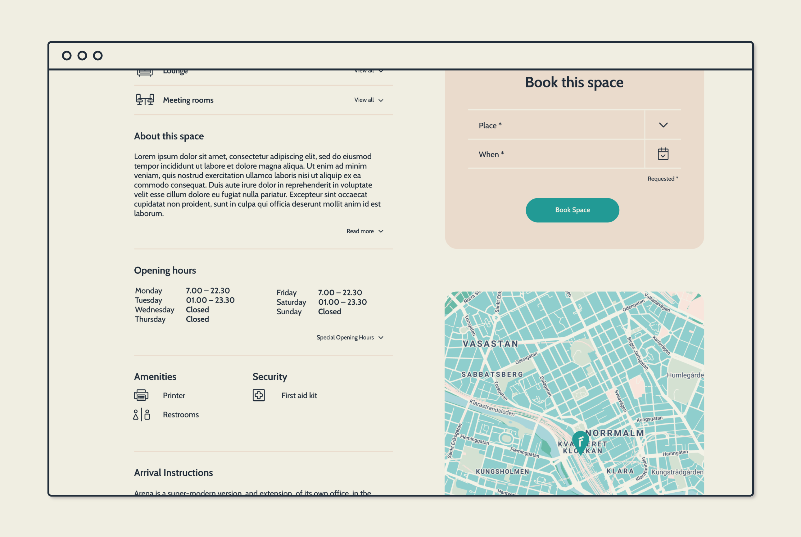
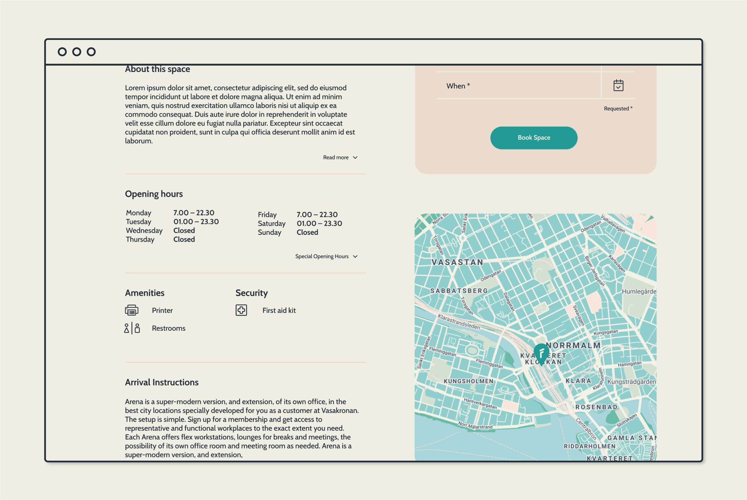
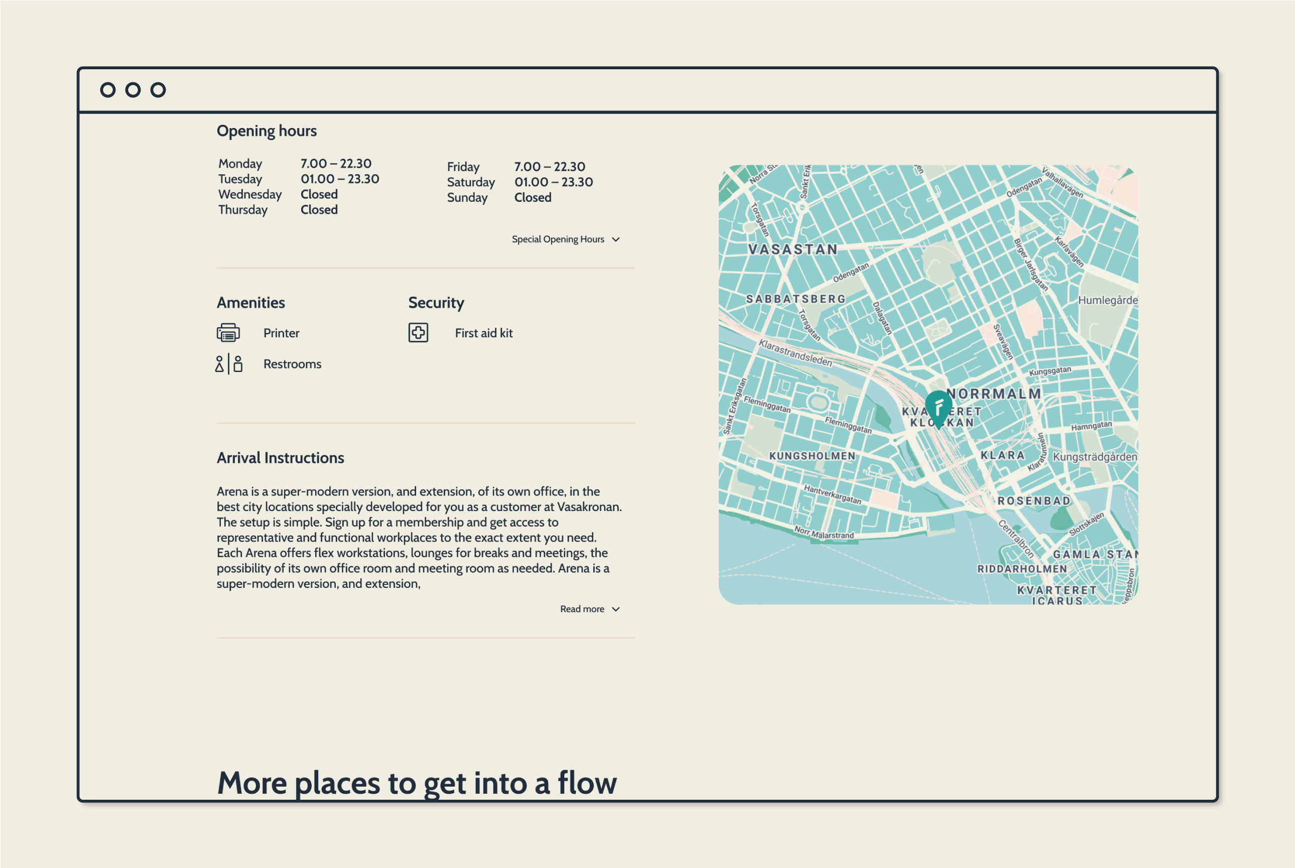
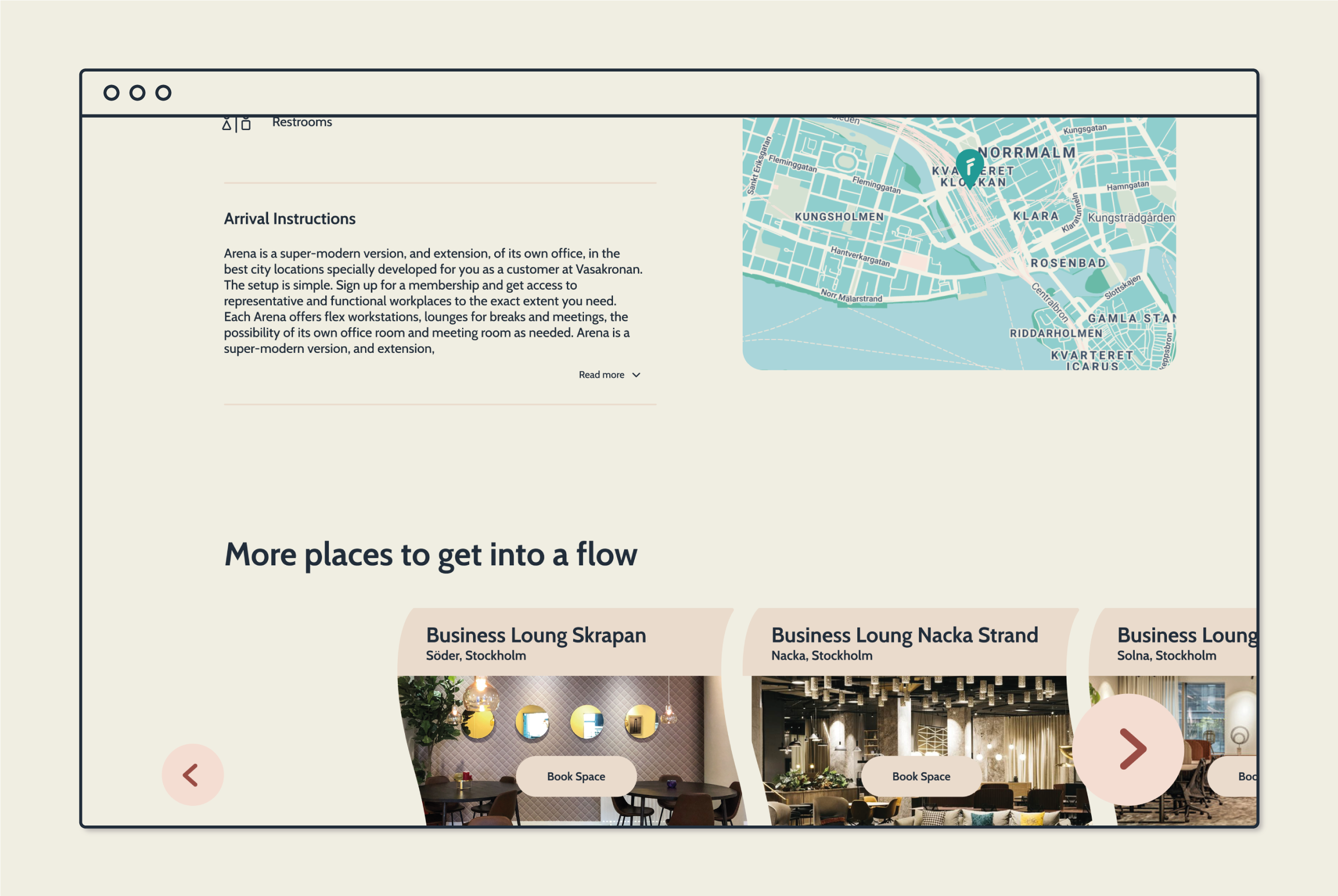
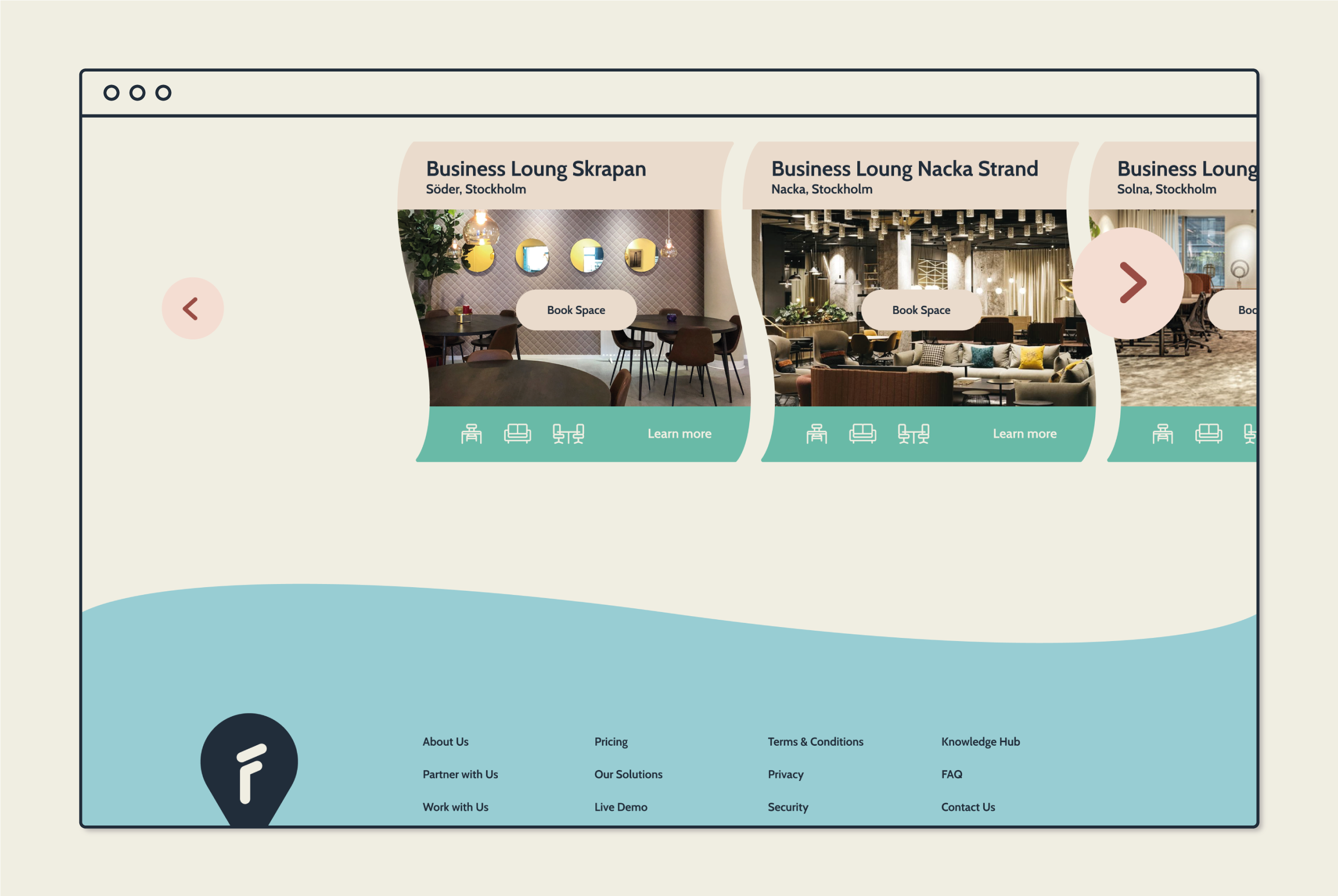
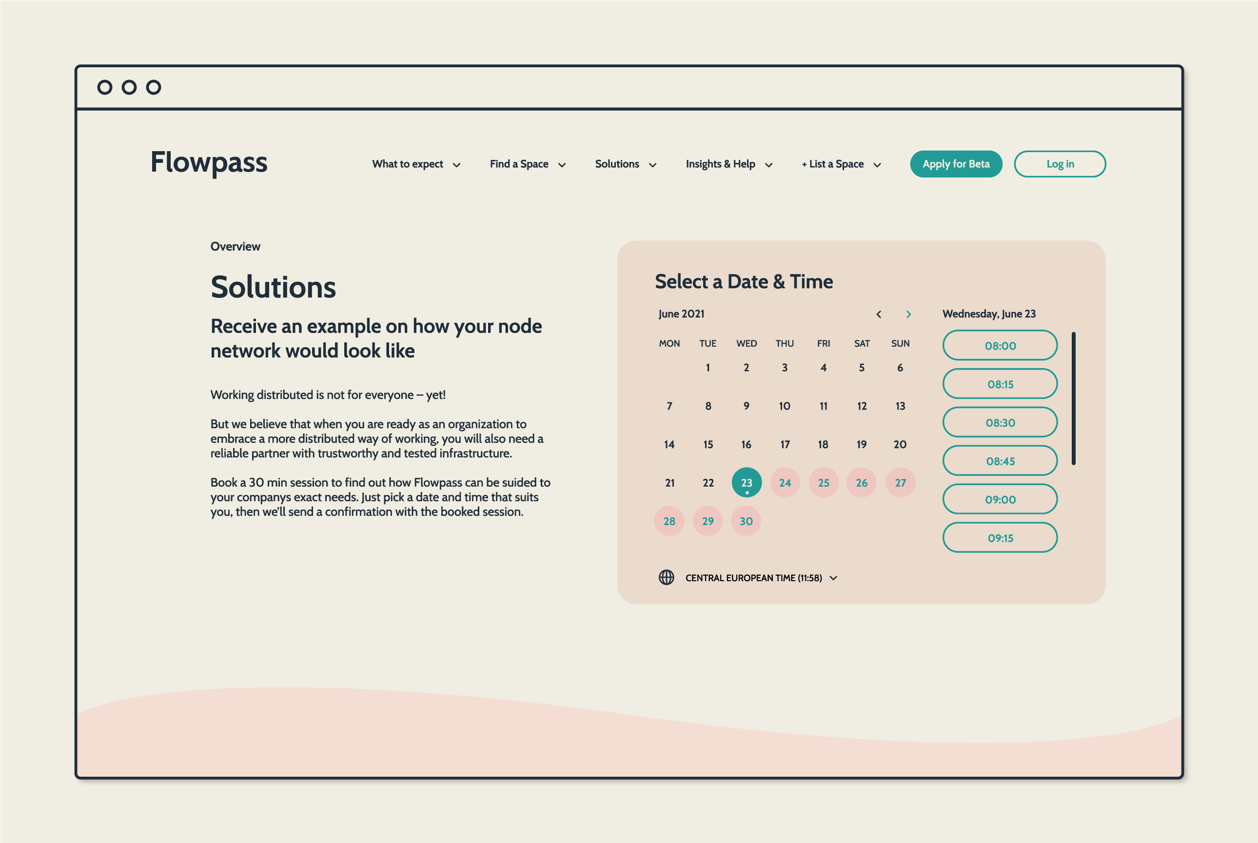
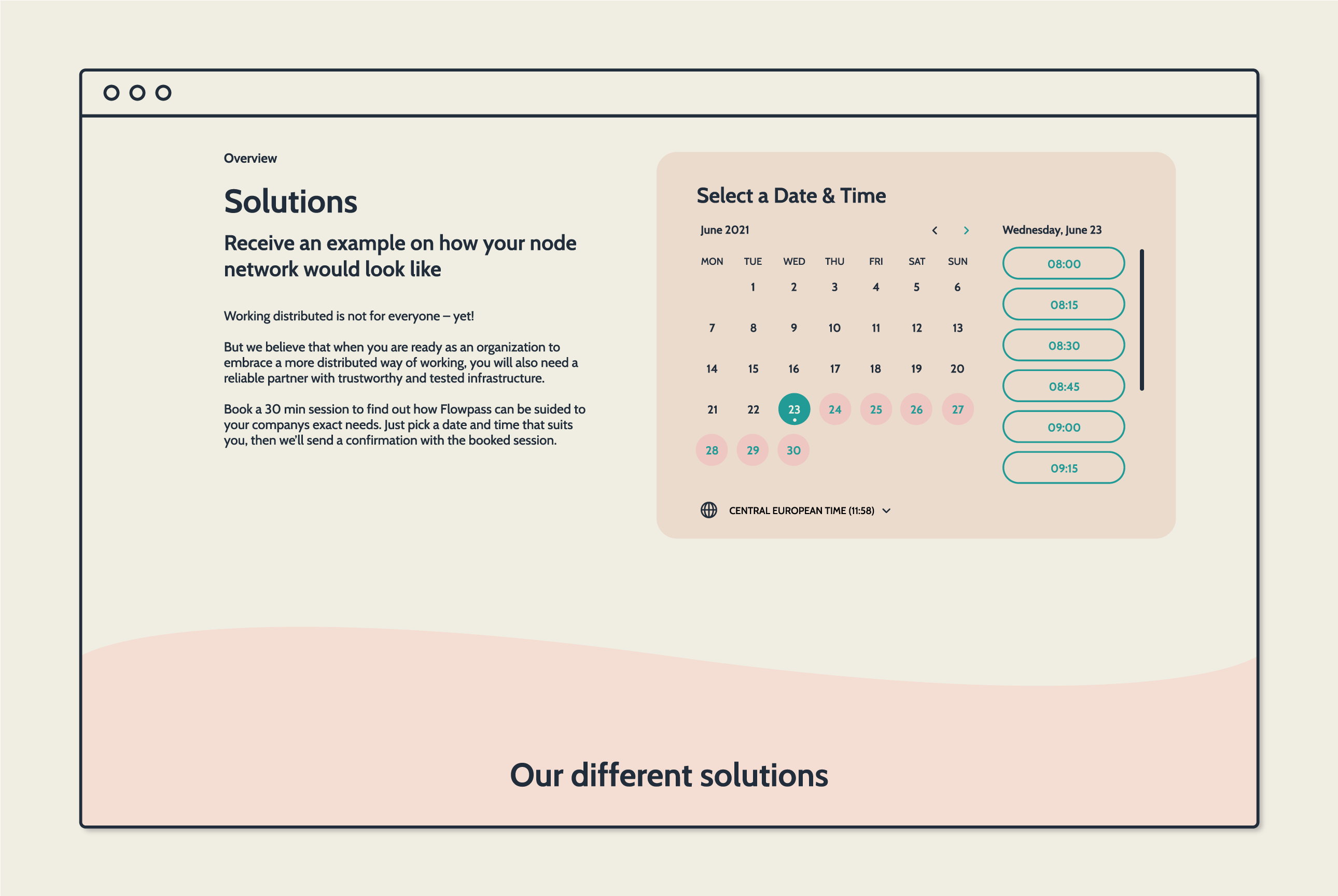
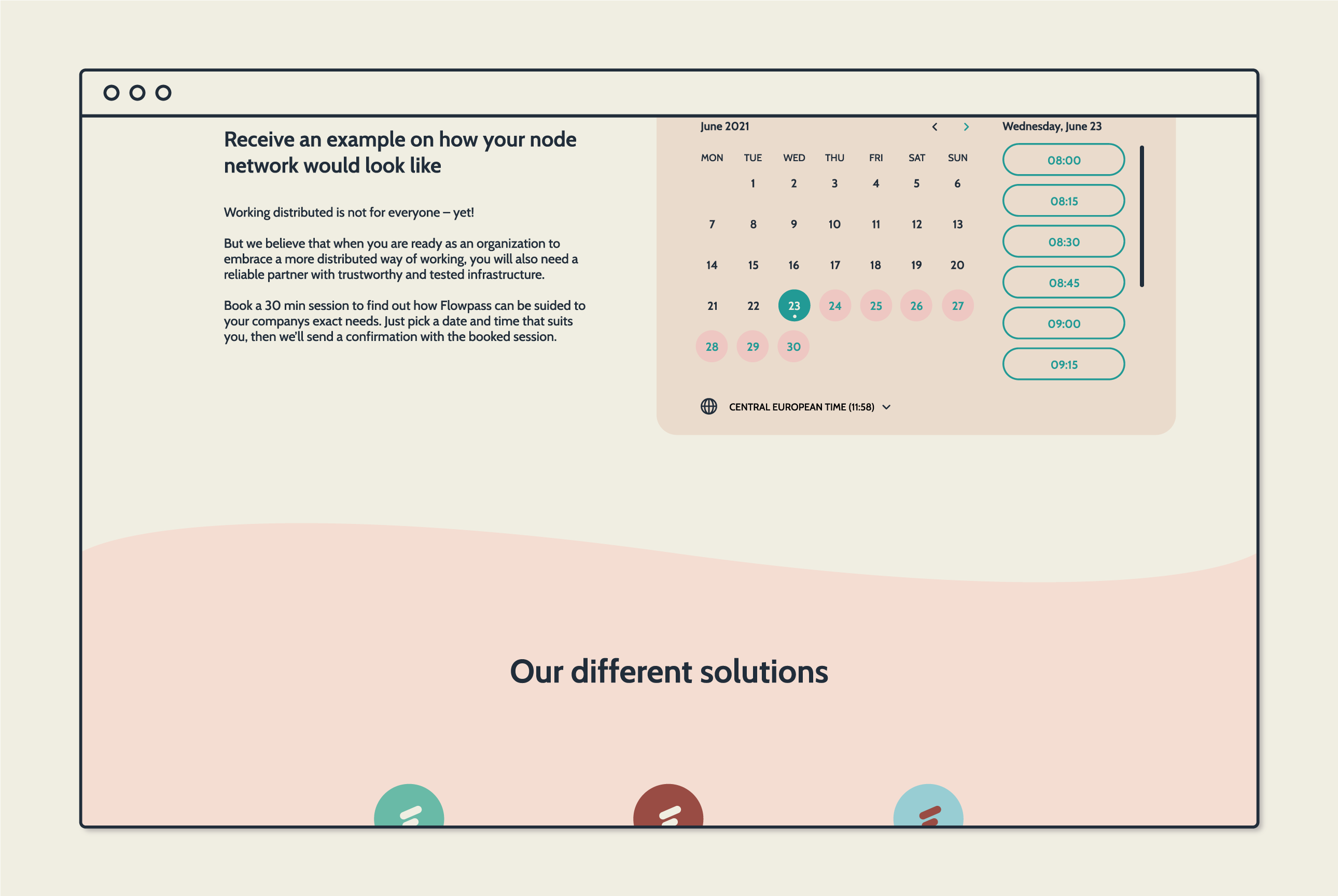
The CTA buttons and symbols all have round edges, to come across as gentle in the interface. To create the feeling of flow all straight lines are avoided and replaced with waves that separate each section.
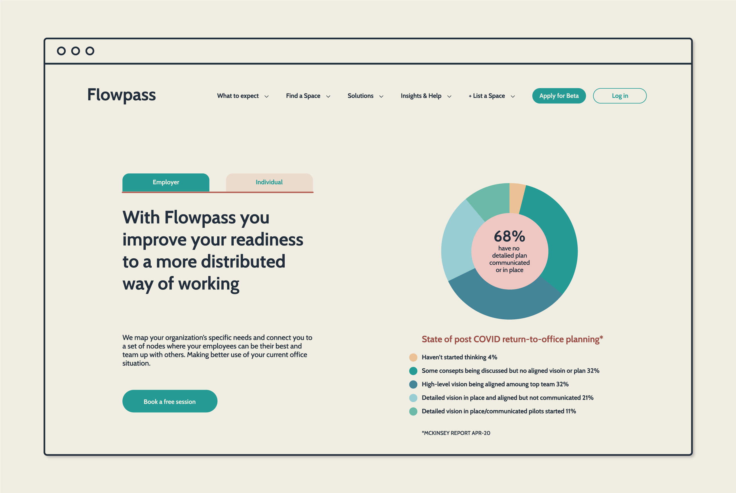
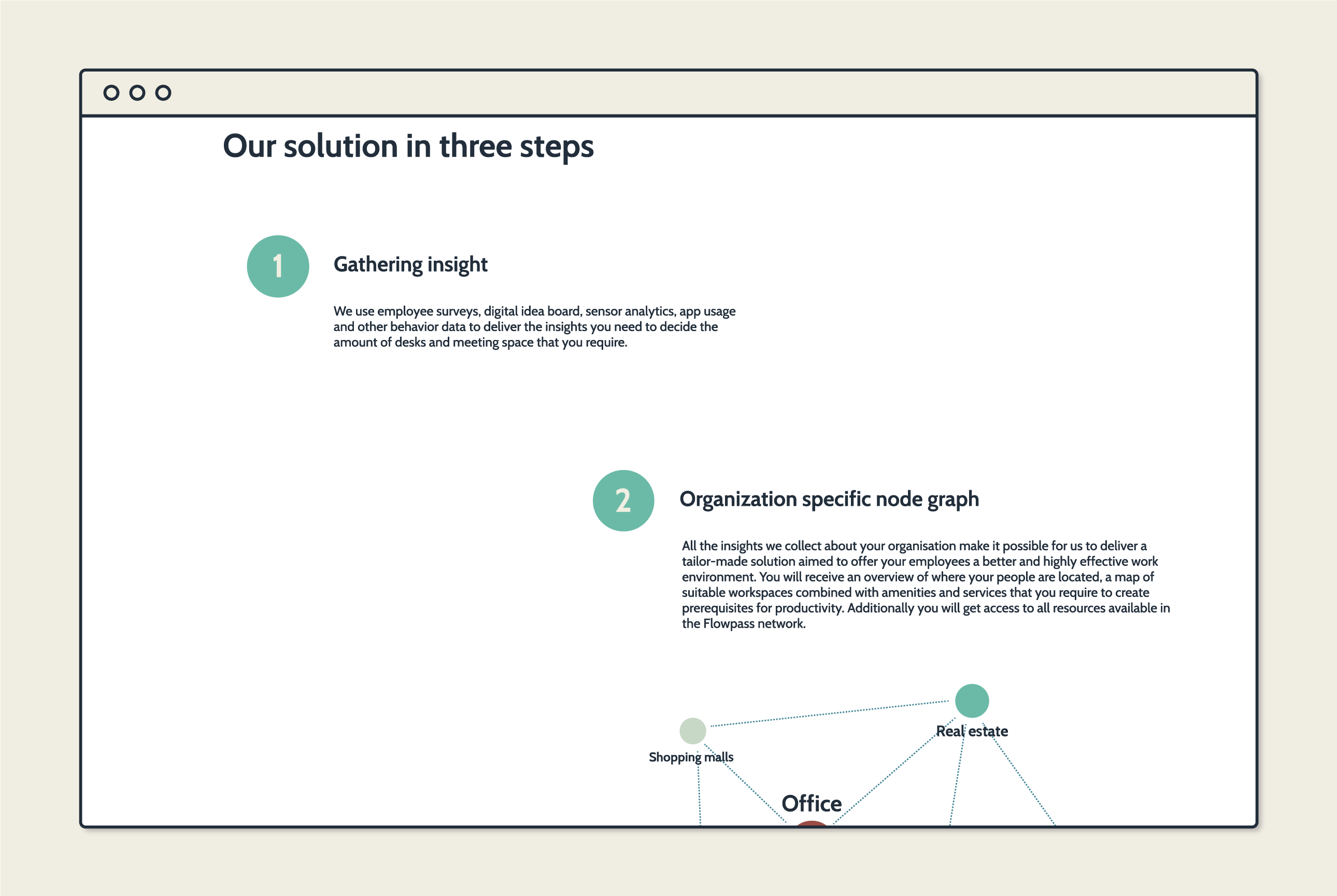
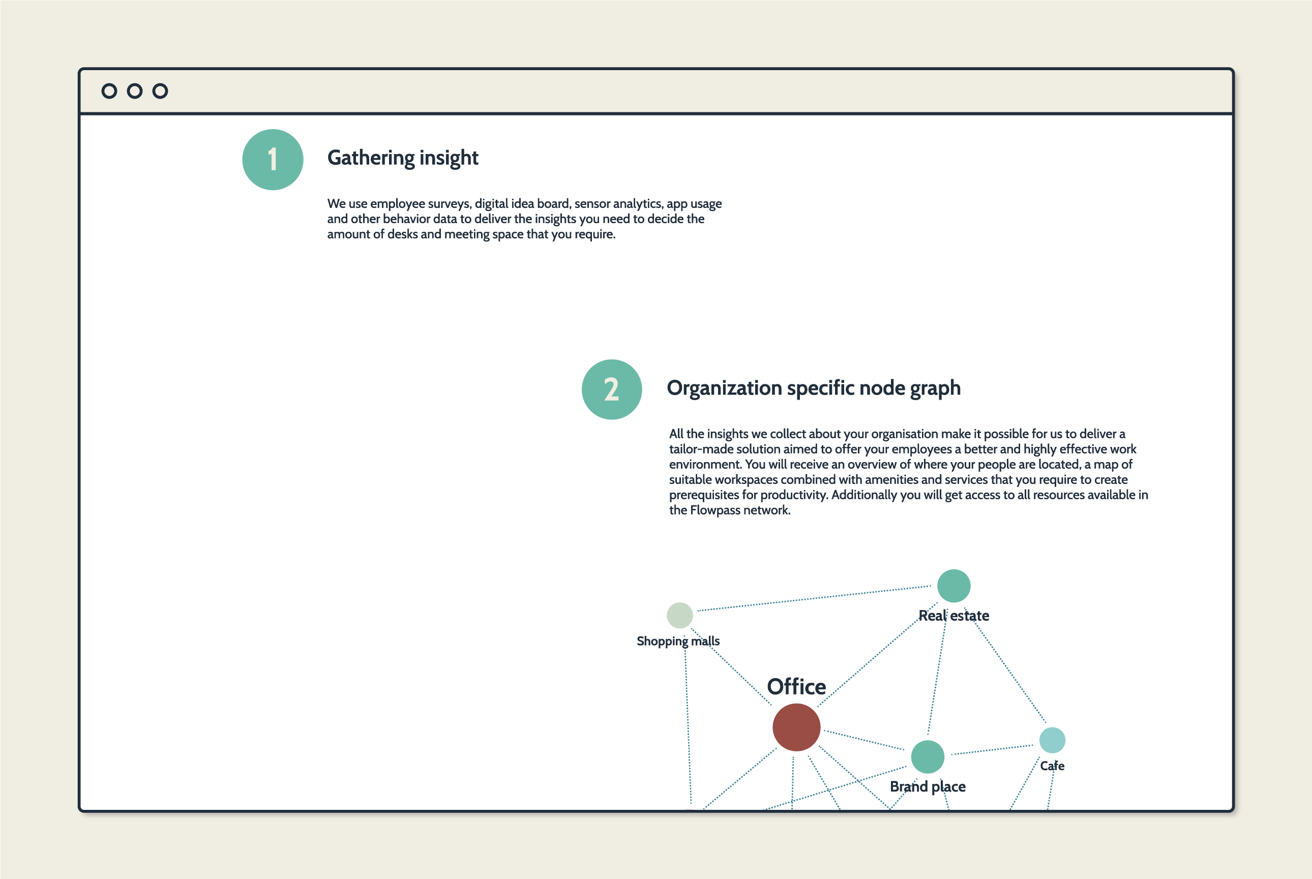
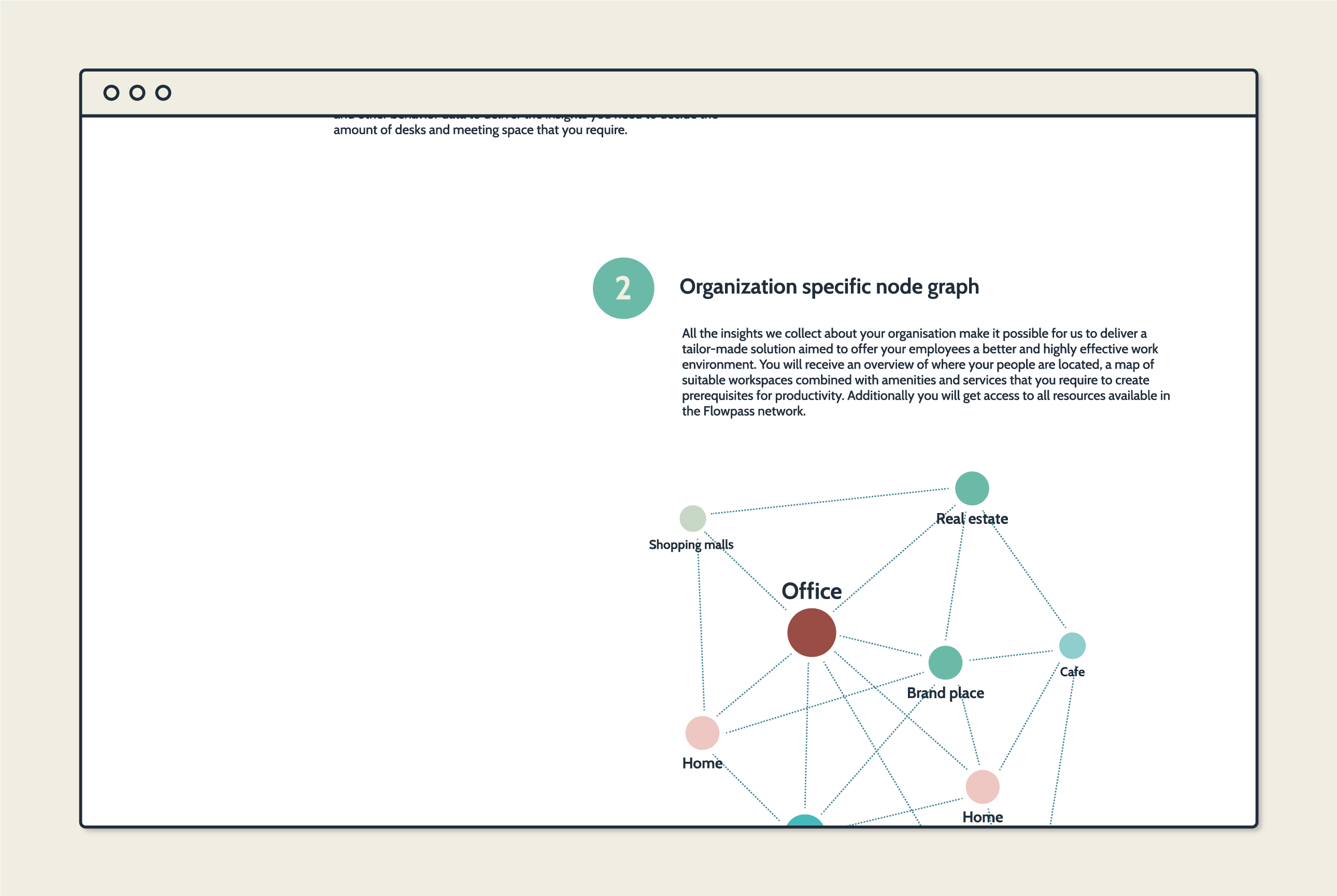
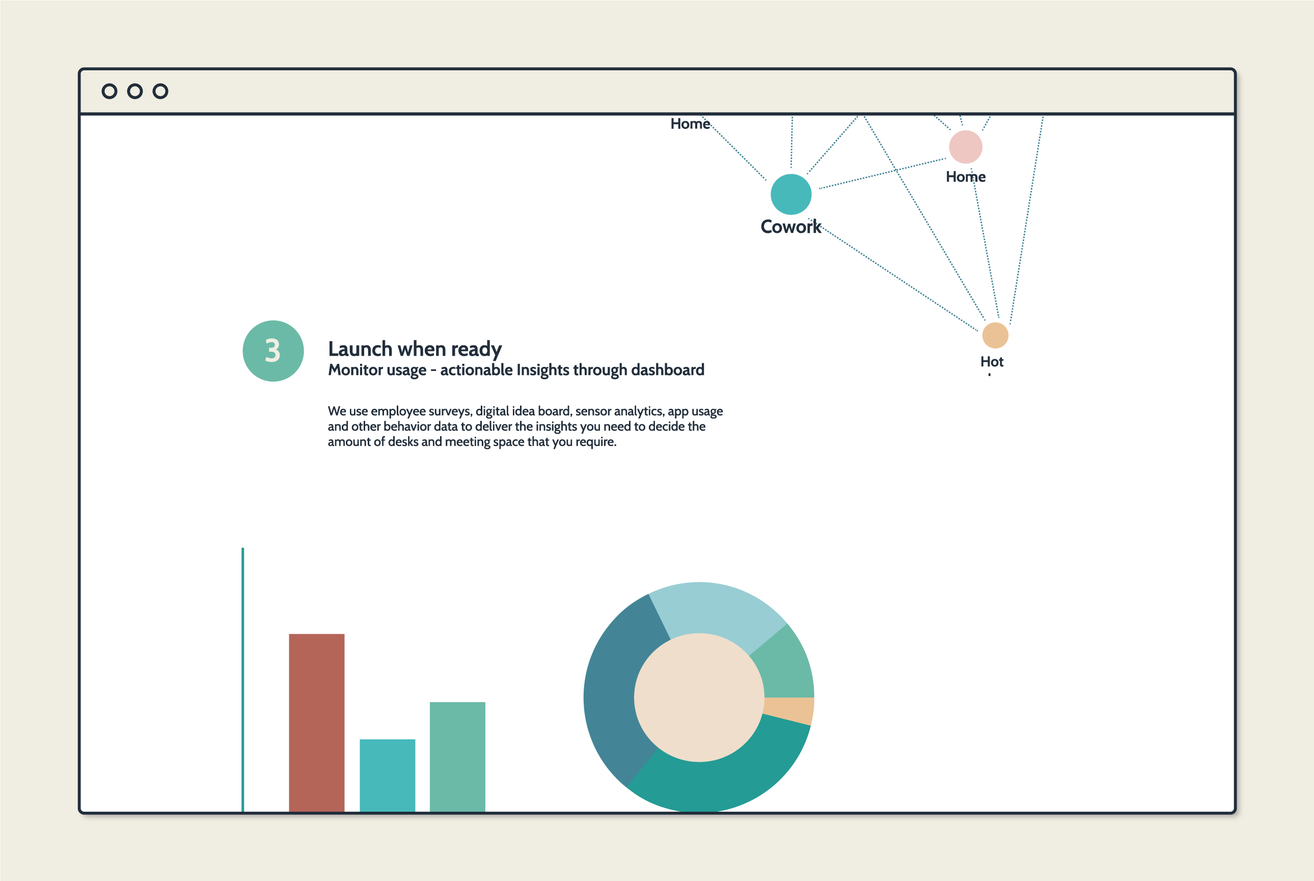
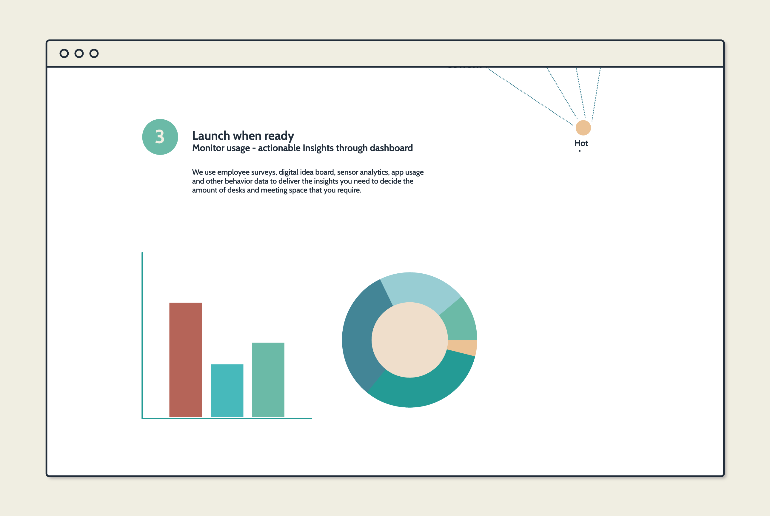
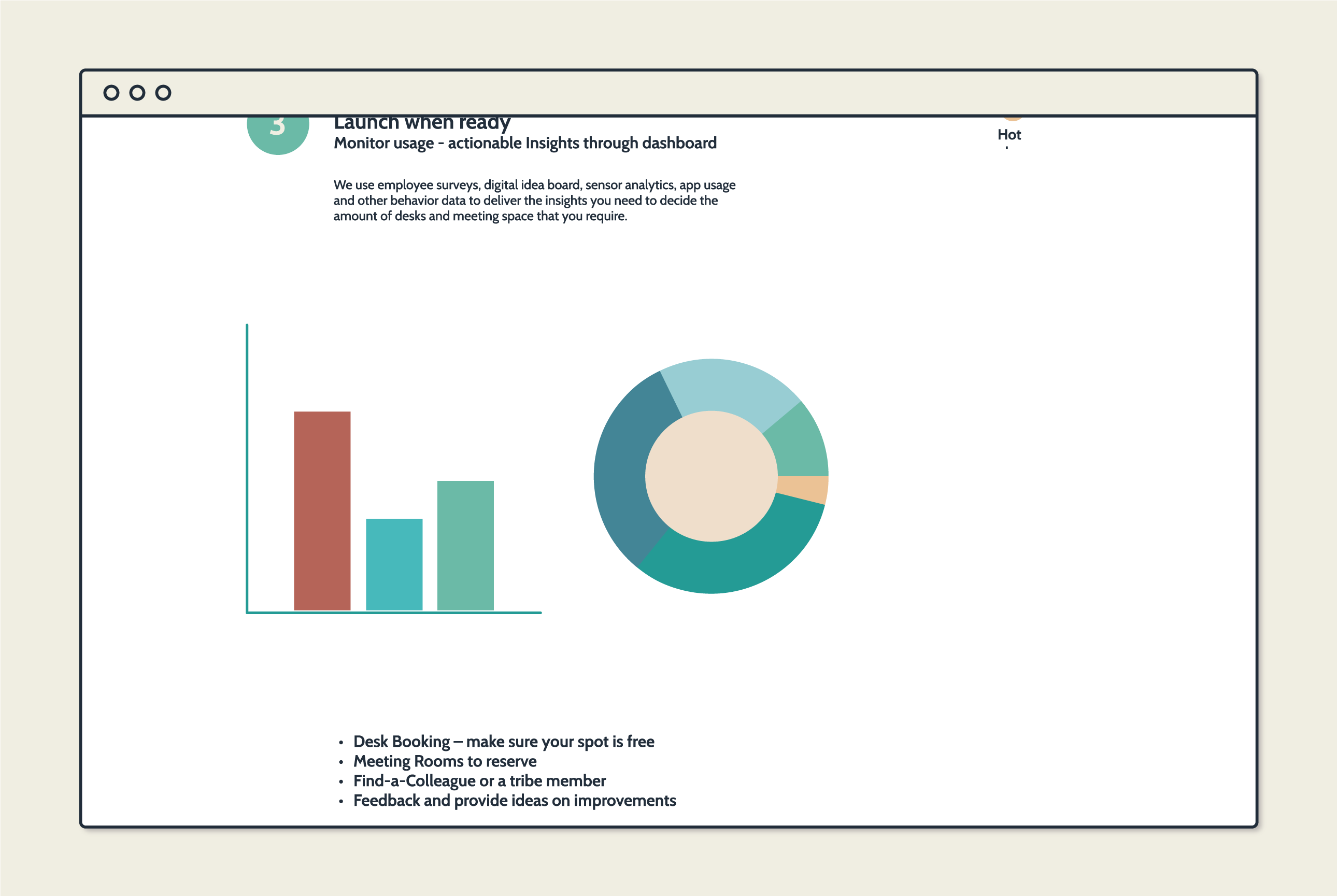
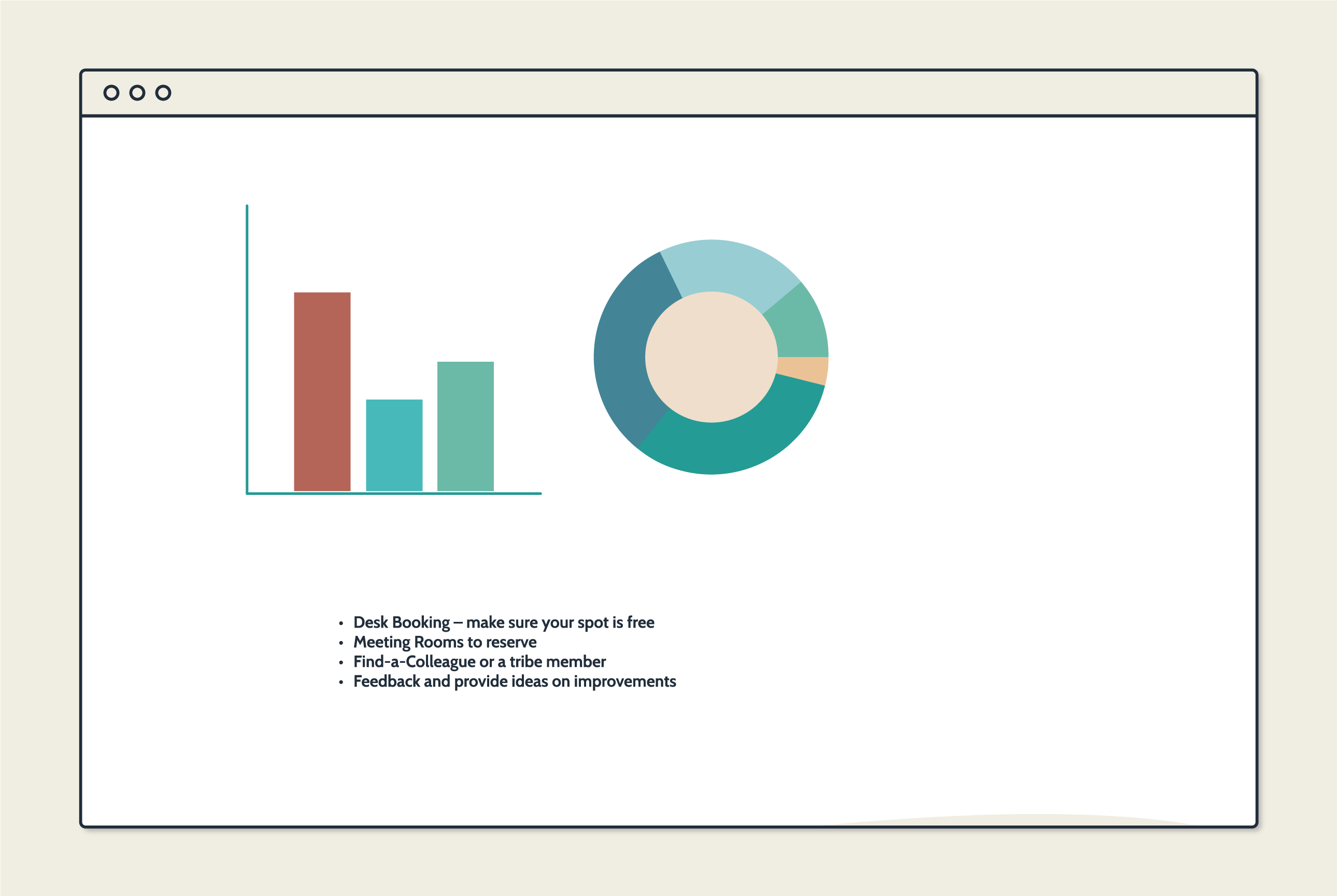
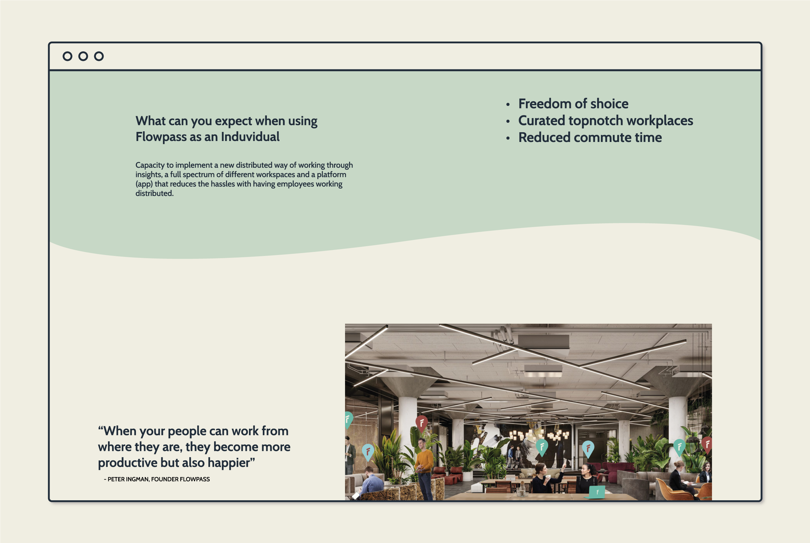
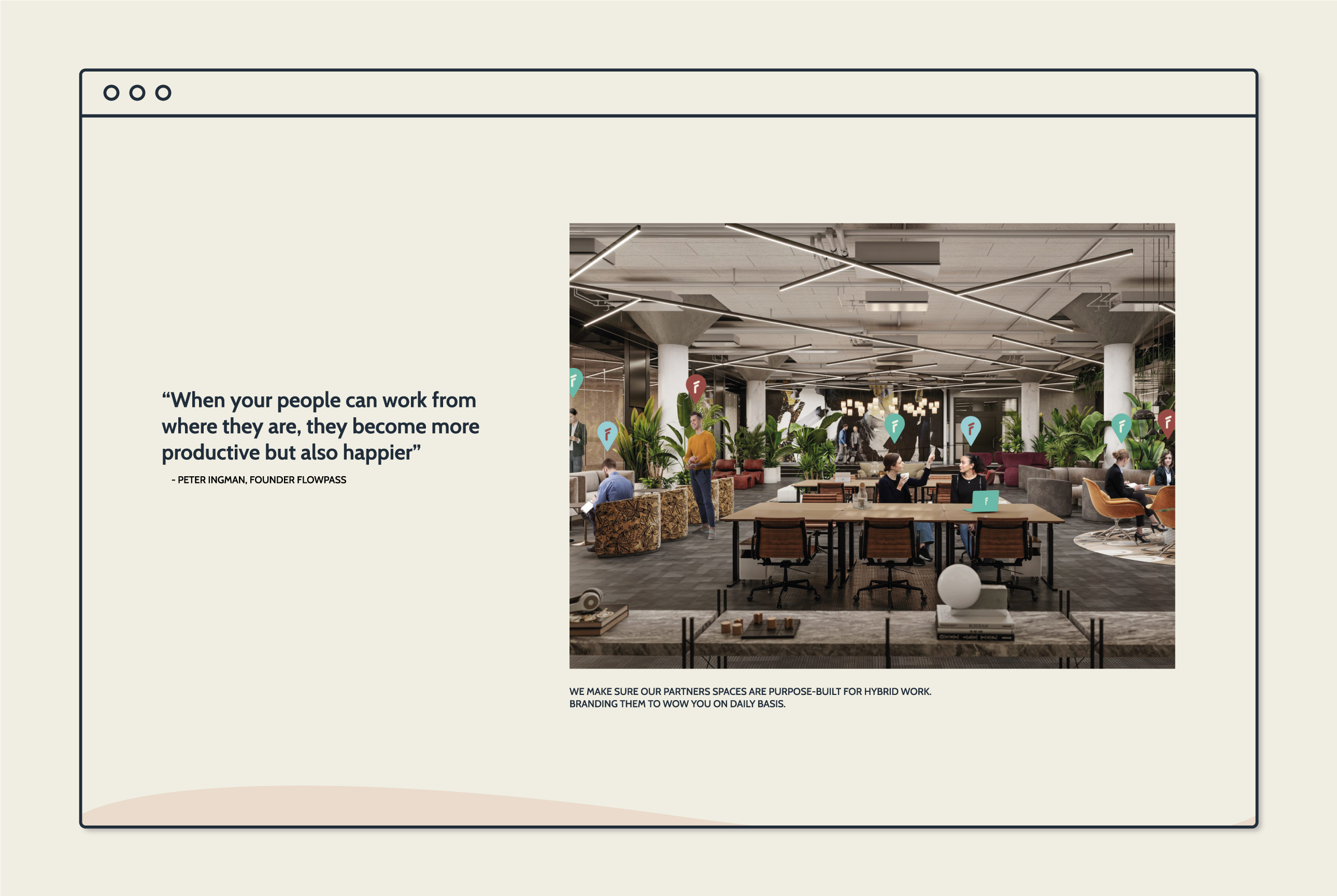
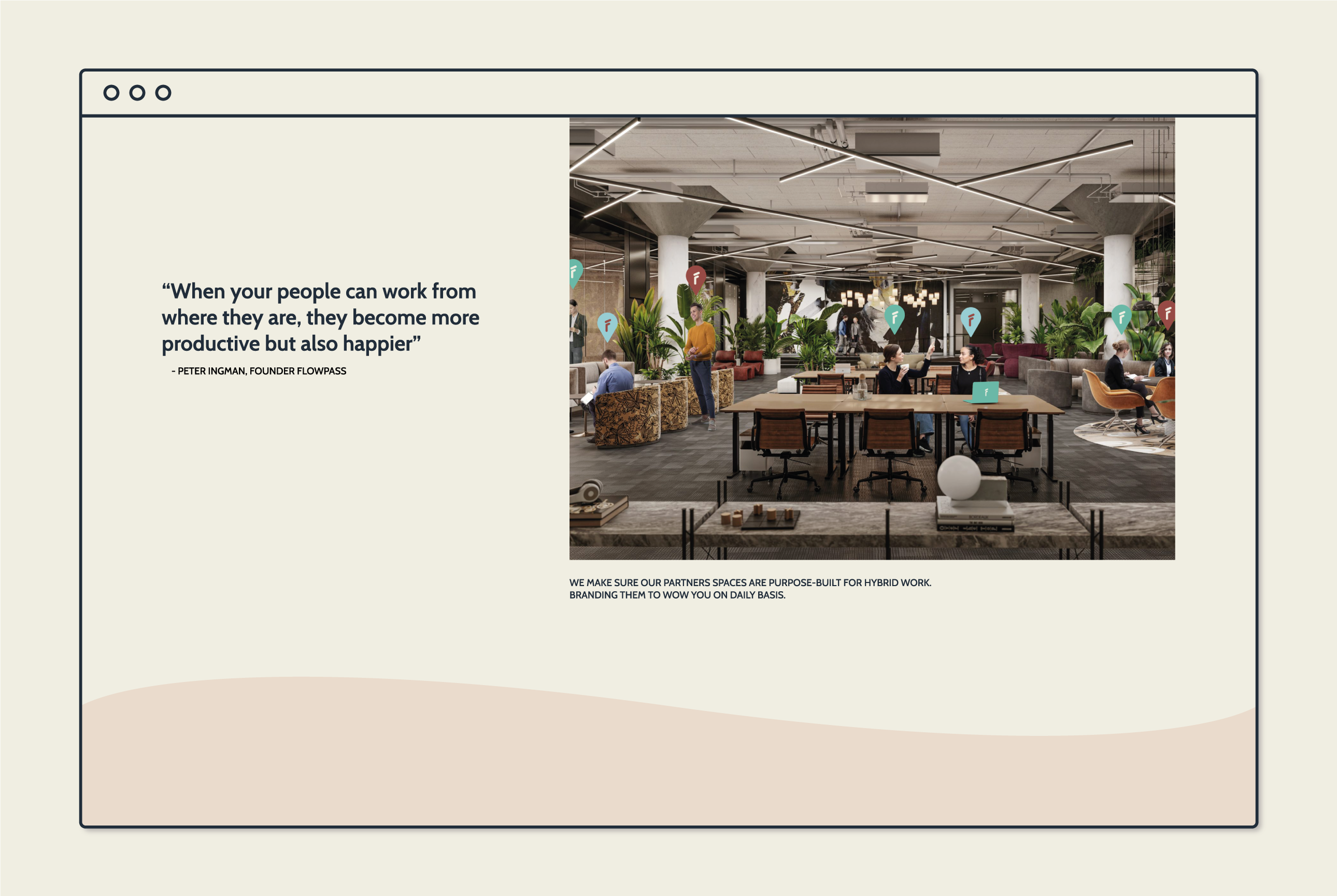
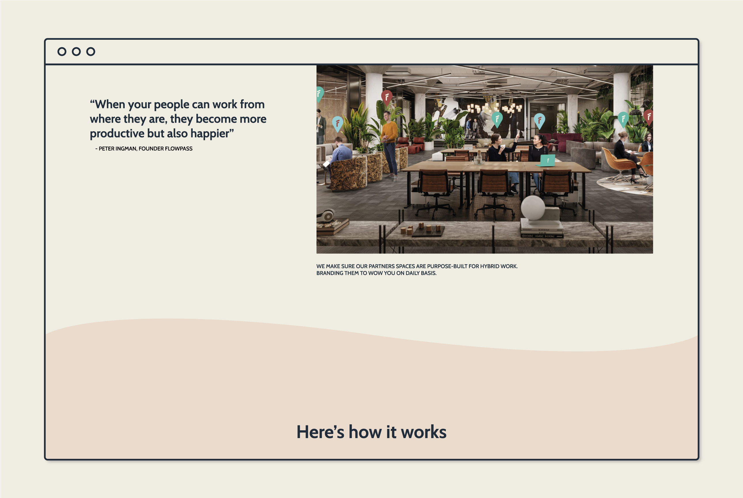
On the interfaces, my idea was to keep it as clean as possible spacing out the information and making it easy for the user to digest the information. But to make it a bit fun and surprising, I added some vector elements to the images used on the pages. The result was an identity and UI design that met the requirements of the brief.


Feel free to click around in the figma prototype